Brands
Celebrate Raksha Bandhan with CaratLane’s Disney-inspired jewellery
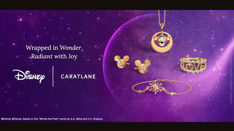
Mumbai: India’s omnichannel jewellery brand, CaratLane – a Tanishq partnership, has launched its latest collection, bringing iconic Disney stories closer to home, in the form of wearable art. With over 80 adorable designs, this collection celebrates beloved characters and stories from Disney’s Mickey & Friends and Winnie the Pooh to Disney Frozen and Disney Princess, appealing to young teens and women. Just in time for Raksha Bandhan, the collection makes the perfect gift to celebrate childhood memories.
Inspired by Disney’s classic stories, this extensive range features contemporary and intricate designs that embody the diverse personalities and nuanced qualities of the beloved Disney characters. Combining Disney’s timeless storytelling with CaratLane’s craftsmanship, the collection offers wearable art perfect for young fans. Standout designs include the “Disney Cinderella Magic Heels Pendant,” “Disney Mickey Mouse Personalised Necklace,” “Disney Frozen Snowflake Pearl Necklace,” and the “Disney Little Mermaid Diamond Star Ring”.
Each piece is designed to evoke nostalgia, allowing fans in India to celebrate their favourite characters and cherished tales with jewellery cast in 14 KT gold, embellished with diamonds, enamel, gemstones, and pearls, with prices starting from Rs 5000.
As Raksha Bandhan approaches, this collection offers a perfect gifting option, celebrating the cherished bond between siblings with enchanting pieces.
CaratLane VP marketing Jennifer Pandya said, “We’re thrilled to weave Disney’s timeless storytelling into our latest collection, allowing customers to wear jewellery inspired by their favourite characters every day. This enchanting collection allows us to become relevant to teens and tweens, along with their mothers.
Leading up to the festival of Raksha Bandhan, this Disney-inspired collection is a wonderful addition to the CaratLane designs, making for thoughtful and memorable gifts that symbolise love and protection.”
Brands
Godrej clarifies ‘GI’ identifier after logo similarity debate
Says GI is not a logo, will not replace Godrej signature across products.
MUMBAI: In a branding storm where shapes did the talking, Godrej is now spelling things out. Godrej Industries Group (GIG) has issued a clarification on its newly introduced ‘GI’ identifier, addressing questions around its purpose and design following a wave of online criticism. At the centre of the debate were two concerns: whether the new mark replaces the long-standing Godrej logo, and whether its geometric design mirrors other corporate identities.
The company has drawn a clear line. The Godrej signature logo, it said, remains unchanged and continues to be the sole logo across all consumer-facing products and services. The ‘GI’ mark, by contrast, is not a logo but a corporate group identifier intended for use alongside the Godrej signature or company name, and aimed at stakeholders such as investors, media and talent rather than consumers.
The need for such a distinction stems from the 2024 restructuring of the broader Godrej Group into two separate business entities. With both continuing to operate under the same Godrej name and signature, the identifier is positioned as a way to differentiate the Godrej Industries Group at a corporate level.
The rollout, however, triggered a broader conversation on design originality. Critics pointed to similarities between the GI mark’s geometric composition and logos used by companies globally, raising questions about distinctiveness.
Responding to this, GIG said its intellectual property and legal review found that such overlaps are common in minimalist, geometry-led design systems. Basic forms such as circles and rectangles appear across dozens of brand identities worldwide, the company noted.
It added that the identifier emerged from an extensive design process and was chosen for its simplicity, allowing it to sit alongside the Godrej signature without competing visually. While acknowledging that elemental shapes may appear less distinctive in isolation, the group emphasised that the mark is part of a broader identity system that includes a custom typeface, sonic branding and other proprietary elements.
Following legal and ethical assessments, the company said it found no impediment to using the identifier, reiterating that the GI mark is a corporate tool not a consumer-facing symbol.
In short, the logo isn’t changing but the conversation around it certainly has.


