Brands
Burger King India’s new TVC celebrates Whopper for all tastes!
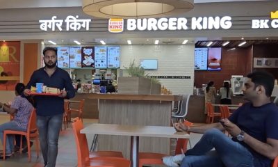
Mumbai: India, renowned for its rich and diverse culture, languages, and most notably, its deep-rooted affection for food and spices, boasts a culinary landscape as varied as its population. Seamlessly capturing this love for flavours and spices, Burger King India, one of the country’s fastest-growing Quick Service Restaurant (QSR) brands, has unveiled a new TVC campaign “Whopper: Swaad Aisa, India Jaisa’, which celebrates the Whopper which has been specially made to suit the Indian taste palate.
Burger King has crafted multiple Whopper films to cater to different regions of the country. Each film shows the journey of a protagonist who like many others believes that Western QSR brands do not understand the meaning of Indian Swaad and that their products are bland in nature. At the beginning of the TVC, the protagonist doubts the taste of the Whopper and post-consumption enjoys the Whopper a lot as it fulfils all taste expectations. Regional music is used as a hook to build cultural context as well as an expression of taste.
The TVCs will be aired in multiple languages, including Hindi, Gujarati, Kannada, Marathi, Bengali, and Telugu, in a nod to India’s diverse cultures and flavours. In addition to the television commercial, the campaign will be promoted through digital platforms, social media, digital influencers, out-of-home advertising (OOH) and in-restaurant displays.
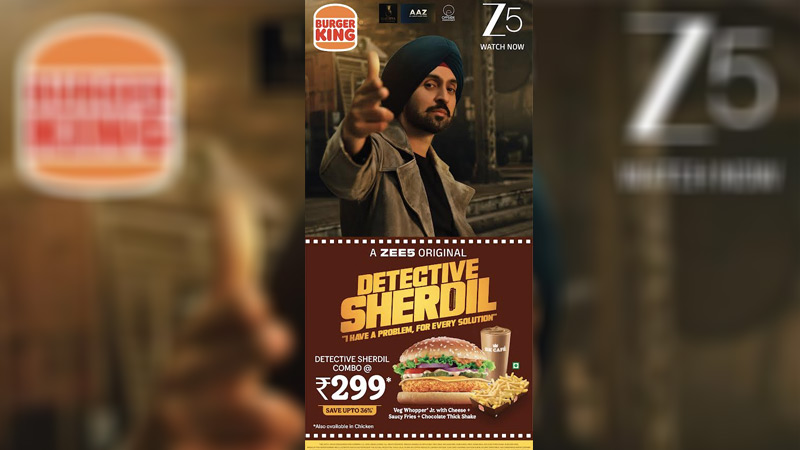
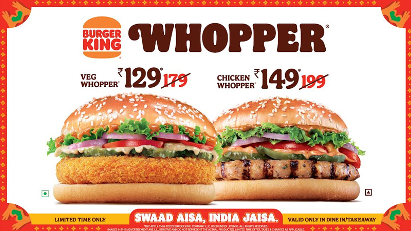
With this campaign, Burger King has also introduced Glazed Premium Buns in the Whopper range. As part of continuous improvement, these Glazed Premium Buns not only add to the taste of the bun but also enhance the freshness. To encourage more guests to come try the Whopper at Burger King restaurants, the brand has also launched a Limited Time Offer in which the Extra Crunchy Veg Whopper is priced at Rs.129 instead of Rs.179 and Flame Grilled Chicken Whopper is priced at Rs.149 instead of Rs.199. This is a Dine In/Takeaway exclusive offer.
Speaking about the campaign, Kapil Grover, chief marketing officer said, “The Whopper served in India is unique and unlike any other in the world as it is customized to suit the Indian taste palate. Our new campaign, ‘Whopper: Swaad Aisa, India Jaisa,’ with its various regional edits perfectly embodies our commitment of serving tasty food which meets guests’ taste expectations. With the launch of premium glazed buns, we want to give the best Whopper experience to our guests. We are also rolling out an invitational Price Offer for our Veg and Chicken Whopper to encourage more and more guests to try our unique Whopper which is unlike any other burger.”
Black Pencil head of creative Pravin Sutar said, “One thing that we all know is that Indians are very particular about their food. They don’t just want it to taste good, they want it to be a perfect match for their Indian taste buds. They crave that desi masala, those spices, perfect quantity and the crispiest crunch in every bite. Well, that’s exactly what Burger King’s Whopper offers. Our films capture the taste expectations of every Indian, and how Whopper transforms those expectations into reality in a truly Indian way. The music used in the films is not just a device, it’s got a regional twist to it that makes it the sound and feeling of satisfaction when Indians enjoy their favourite desi flavours in the Whopper. The vibe, the treatment, the swaad, everything is Indian for every Indian.”