Brands
Bold Care and Odd Not Even unveil streetwear with a statement
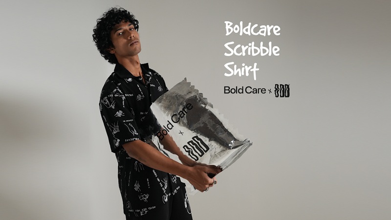
MUMBAI: Bold prints, bold statements, and an even bolder message that’s what Bold Care and Odd Not Even bring to the streets with their exclusive ‘Take your pleasure seriously’ collection. This limited-edition drop fuses men’s wellness with street fashion, proving that confidence isn’t just an attitude, it’s a way of life.
Designed for those who own their individuality, the Bold Care x Odd Not Even collection is a fearless mix of edgy graphics, bold prints, and striking accents across T-shirts, cargo pants, and dresses. More than just streetwear, it’s a statement of self-expression, blending unapologetic style with the freedom to embrace pleasure and well-being.
Bold Care has consistently challenged outdated taboos surrounding men’s wellness, and this collaboration takes that conversation beyond words and into fashion. “Wellness is an attitude, a facilitator of confidence, and how you show up in the world. This collection isn’t just about bold prints; it’s about owning your choices whether in fashion or in life,” said Bold Care co-founder Rajat Jadhav.
The collection has already caught fire online, with fans hailing it as a refreshing, unapologetic take on street fashion. Social media is buzzing with appreciation for its striking aesthetics and powerful messaging, making it more than just a trend, it’s a cultural movement.
With style, confidence, and self-expression at its core, the Bold Care x Odd Not Even collab is proof that fashion isn’t just about what you wear, it’s about what you stand for.
Brands
Godrej clarifies ‘GI’ identifier after logo similarity debate
Says GI is not a logo, will not replace Godrej signature across products.
MUMBAI: In a branding storm where shapes did the talking, Godrej is now spelling things out. Godrej Industries Group (GIG) has issued a clarification on its newly introduced ‘GI’ identifier, addressing questions around its purpose and design following a wave of online criticism. At the centre of the debate were two concerns: whether the new mark replaces the long-standing Godrej logo, and whether its geometric design mirrors other corporate identities.
The company has drawn a clear line. The Godrej signature logo, it said, remains unchanged and continues to be the sole logo across all consumer-facing products and services. The ‘GI’ mark, by contrast, is not a logo but a corporate group identifier intended for use alongside the Godrej signature or company name, and aimed at stakeholders such as investors, media and talent rather than consumers.
The need for such a distinction stems from the 2024 restructuring of the broader Godrej Group into two separate business entities. With both continuing to operate under the same Godrej name and signature, the identifier is positioned as a way to differentiate the Godrej Industries Group at a corporate level.
The rollout, however, triggered a broader conversation on design originality. Critics pointed to similarities between the GI mark’s geometric composition and logos used by companies globally, raising questions about distinctiveness.
Responding to this, GIG said its intellectual property and legal review found that such overlaps are common in minimalist, geometry-led design systems. Basic forms such as circles and rectangles appear across dozens of brand identities worldwide, the company noted.
It added that the identifier emerged from an extensive design process and was chosen for its simplicity, allowing it to sit alongside the Godrej signature without competing visually. While acknowledging that elemental shapes may appear less distinctive in isolation, the group emphasised that the mark is part of a broader identity system that includes a custom typeface, sonic branding and other proprietary elements.
Following legal and ethical assessments, the company said it found no impediment to using the identifier, reiterating that the GI mark is a corporate tool not a consumer-facing symbol.
In short, the logo isn’t changing but the conversation around it certainly has.


