Connect with us

Brands

Boat & Cult.Fit join hands to launch all new home workout program ‘Fitness Xtended’

Published

on

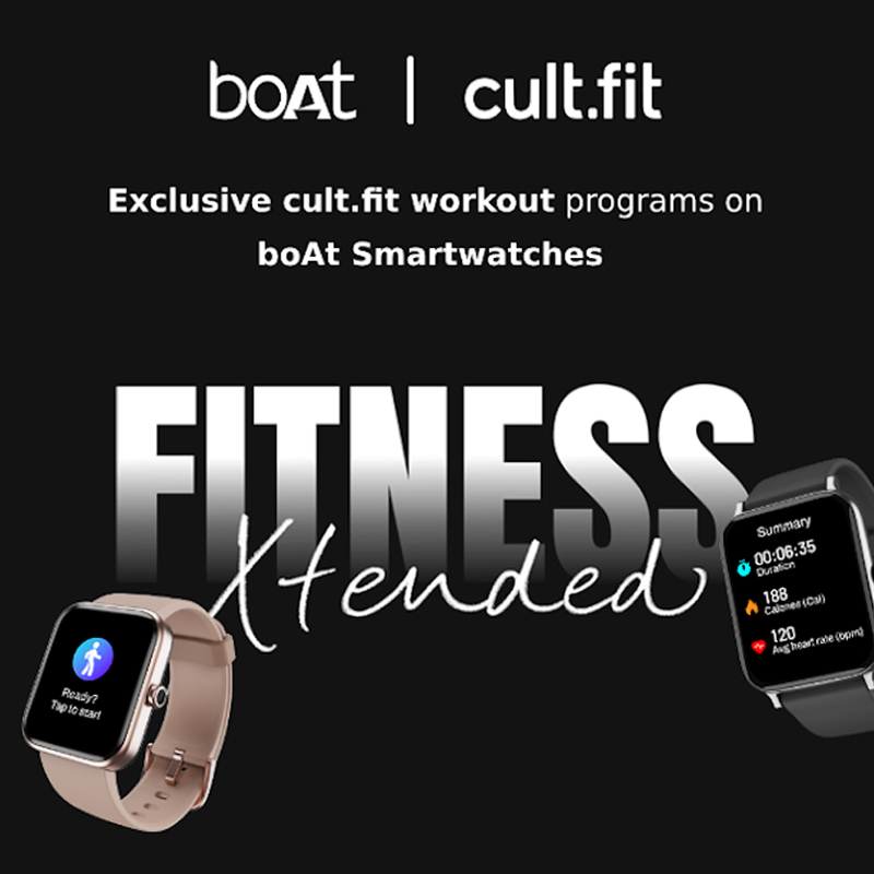
Mumbai: Leading lifestyle & fitness brands boAt and cult.fit have joined hands to launch a first-of-a-kind at-home workout program, Fitness Xtended.

The six-week programme is a combination of yoga, strength and conditioning exercises, and HIIT workouts curated by some of the most popular fitness & lifestyle coaches, including Suvini Mehra, Naveen Sharma, Carolyn Theresa Simon, and Niran Ponnappa.

This partnership emphasises the beauty of performing fitness along with accurate tracking and the impact that it can have when done together.

Advertisement

The programme provides exclusive fitness videos on boAt’s crest app that can be accessed by anyone who owns select boAt smartwatches. The content is also available on the cult.fit app.

The programme includes two phases of three weeks each and will cover 24 sessions over six weeks. Going forward, both brands plan to come up with more unique content and initiate various promotional activities on digital under the ‘Fitness Xtended’ campaign to reach a larger audience.

Expressing his thoughts about the partnership, cult.fit growth and business head Naresh Krishnaswamy said. “We have always emphasised the importance and value of fitness. To bring about a shift in people’s attitude towards fitness and make India a healthier country, we are happy to engage with our audience in creative ways. This partnership with boAt is a new approach to influencing people about fitness, with the power of accurately tracking vitals, so each of us can understand our unique bodies better and find the best way to stay fit and healthy.”

Advertisement

Adding to it, boAt brand manager Siya Wadhawan said, “In collaboration with the cult.fit, we’re excited to be part of this fitness revolution. By customising workout routines and running plans, our smartwatches enable users to move beyond basic activity tracking and advance in their fitness journeys. With this partnership, we continue to inspire and support boAtheads with products that support healthy living and enable them to select a fitter lifestyle.”

Click to comment

Leave a Reply

Your email address will not be published. Required fields are marked *

Brands

Godrej clarifies ‘GI’ identifier after logo similarity debate

Says GI is not a logo, will not replace Godrej signature across products.

Published

on

MUMBAI: In a branding storm where shapes did the talking, Godrej is now spelling things out. Godrej Industries Group (GIG) has issued a clarification on its newly introduced ‘GI’ identifier, addressing questions around its purpose and design following a wave of online criticism. At the centre of the debate were two concerns: whether the new mark replaces the long-standing Godrej logo, and whether its geometric design mirrors other corporate identities.

The company has drawn a clear line. The Godrej signature logo, it said, remains unchanged and continues to be the sole logo across all consumer-facing products and services. The ‘GI’ mark, by contrast, is not a logo but a corporate group identifier intended for use alongside the Godrej signature or company name, and aimed at stakeholders such as investors, media and talent rather than consumers.

The need for such a distinction stems from the 2024 restructuring of the broader Godrej Group into two separate business entities. With both continuing to operate under the same Godrej name and signature, the identifier is positioned as a way to differentiate the Godrej Industries Group at a corporate level.

Advertisement

The rollout, however, triggered a broader conversation on design originality. Critics pointed to similarities between the GI mark’s geometric composition and logos used by companies globally, raising questions about distinctiveness.

Responding to this, GIG said its intellectual property and legal review found that such overlaps are common in minimalist, geometry-led design systems. Basic forms such as circles and rectangles appear across dozens of brand identities worldwide, the company noted.

It added that the identifier emerged from an extensive design process and was chosen for its simplicity, allowing it to sit alongside the Godrej signature without competing visually. While acknowledging that elemental shapes may appear less distinctive in isolation, the group emphasised that the mark is part of a broader identity system that includes a custom typeface, sonic branding and other proprietary elements.

Advertisement

Following legal and ethical assessments, the company said it found no impediment to using the identifier, reiterating that the GI mark is a corporate tool not a consumer-facing symbol.

In short, the logo isn’t changing but the conversation around it certainly has.

Advertisement
Continue Reading

Advertisement News18
Advertisement
Advertisement
Advertisement
Advertisement Whtasapp
Advertisement Year Enders

Indian Television Dot Com Pvt Ltd

Signup for news and special offers!

Copyright © 2026 Indian Television Dot Com PVT LTD

This will close in 10 seconds