Brands
Bisleri acquires branding rights of Mumbai’s metro station
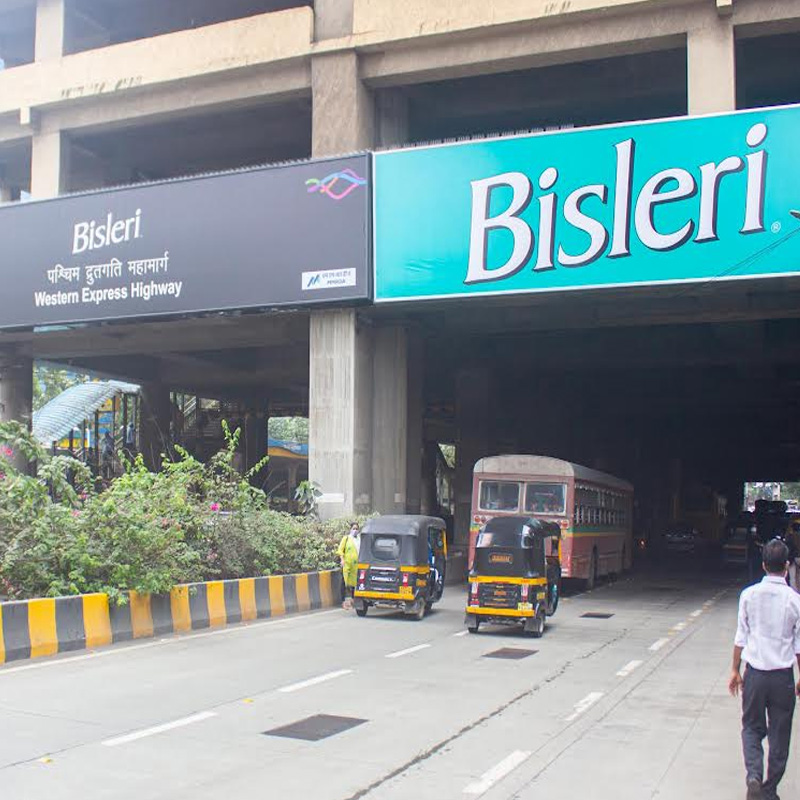
Mumbai: Mineral water brand Bisleri International Pvt Ltd has acquired Station Branding Rights (SBR) of the Western Express Highway metro station. With this, the station will now be called ‘Bisleri Western Express Highway’ metro station.
The brand has also entered into an agreement with Mumbai Metro for putting up multiple kiosks across key stations making healthy mineral water easily accessible to commuters. Apart from selling the range of water, fizzy fruit drinks, and purifiers, the kiosks will also offer consumers to experience their newly launched hand purifiers aiding consumers to maintain hygiene, said the statement.
The newly christened station was inaugurated on Monday at an event which was attended by top management of Bisleri, Times OOH & Mumbai Metro officials. “Station branding is an established concept in the Indian OOH industry. This opportunity helps the brand build a unique and distinctive brand asset. Bisleri was keen to be present in a big way at Mumbai Metro. We worked closely with them and Mumbai Metro One Pvt Ltd for the execution of this one-of-its-kind campaign,” stated Times OOH COO Rohit Chopra.
Speaking about this new initiative, Bisleri International Pvt Ltd CEO Angelo George said, “We are proud to join hands with the Mumbai Metro Authority to obtain the naming rights of one of Mumbai’s centrally located metro stations. Bisleri Western Express Highway metro station, previously known as Western Express Highway, is a bustling hub on the remarkably seamless multi-rail transit network serving commuters, offering them immense value and connectivity.”
“At Bisleri, we are constantly evolving ways to improve our consumer engagement through multiple touchpoints. Bisleri kiosks will be placed across all stations in the Metro for commuters to buy our products. With a customized look and feel of station branding and the kiosks, Bisleri aims to create brand experiences that will become an integral part of commuters’ daily life,” he added.
As a part of its social responsibility program called ‘Bottles for Change,’ Bisleri will also install plastic recycling bins across the station & educative communication to create awareness about proper ways to dispose of used plastic, the brand stated.
Brands
Godrej clarifies ‘GI’ identifier after logo similarity debate
Says GI is not a logo, will not replace Godrej signature across products.
MUMBAI: In a branding storm where shapes did the talking, Godrej is now spelling things out. Godrej Industries Group (GIG) has issued a clarification on its newly introduced ‘GI’ identifier, addressing questions around its purpose and design following a wave of online criticism. At the centre of the debate were two concerns: whether the new mark replaces the long-standing Godrej logo, and whether its geometric design mirrors other corporate identities.
The company has drawn a clear line. The Godrej signature logo, it said, remains unchanged and continues to be the sole logo across all consumer-facing products and services. The ‘GI’ mark, by contrast, is not a logo but a corporate group identifier intended for use alongside the Godrej signature or company name, and aimed at stakeholders such as investors, media and talent rather than consumers.
The need for such a distinction stems from the 2024 restructuring of the broader Godrej Group into two separate business entities. With both continuing to operate under the same Godrej name and signature, the identifier is positioned as a way to differentiate the Godrej Industries Group at a corporate level.
The rollout, however, triggered a broader conversation on design originality. Critics pointed to similarities between the GI mark’s geometric composition and logos used by companies globally, raising questions about distinctiveness.
Responding to this, GIG said its intellectual property and legal review found that such overlaps are common in minimalist, geometry-led design systems. Basic forms such as circles and rectangles appear across dozens of brand identities worldwide, the company noted.
It added that the identifier emerged from an extensive design process and was chosen for its simplicity, allowing it to sit alongside the Godrej signature without competing visually. While acknowledging that elemental shapes may appear less distinctive in isolation, the group emphasised that the mark is part of a broader identity system that includes a custom typeface, sonic branding and other proprietary elements.
Following legal and ethical assessments, the company said it found no impediment to using the identifier, reiterating that the GI mark is a corporate tool not a consumer-facing symbol.
In short, the logo isn’t changing but the conversation around it certainly has.


