Brands
‘Awsum’ idea: Immunity booster chocolate brand launches in India
Mumbai: Amid the Covid2019 pandemic, with people going gaga over immunity boosters, here’s a new one – now, chocolates made of Ayurvedic herbs and botanicals to boost your immunity.
Designed to help the urban working millennials deal with their modern-day lifestyle disorders, Pranav Sharma and Kritik Thakur have launched India’s first functional chocolate brand, Awsum – a first of its kind chocolate brand which uses Ayurvedic principles to make products healthier without compromising on taste. Awsum uses the ancient wisdom of Ayurveda and combines it with premium dark and milk chocolate to create exciting products that come with functional benefits.
Functional chocolate as a category is very new and novel for the Indian markets with no similar brands available in the same space. These chocolates are packed with herbs and nutrients that help the body to deal with modern-day lifestyle health disorders and are very relevant for the current scenario where we are all dealing with a pandemic like Covid, the brand said in a press release. The chocolates have a rich and smooth texture and do not come at a compromise of taste.
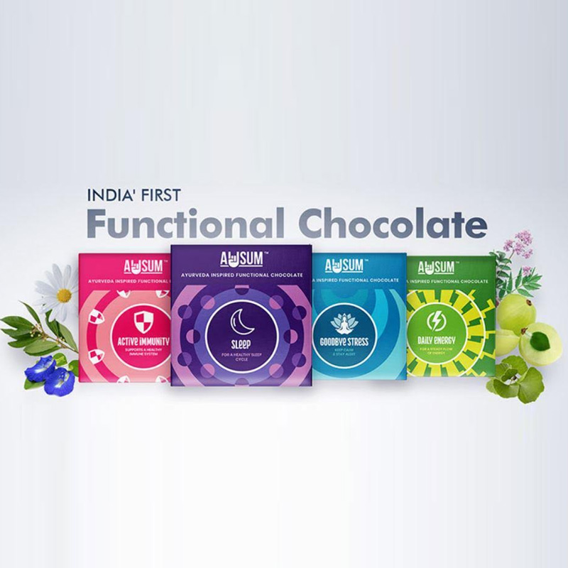
Awsum has launched four variants to start off with: Daily Energy, Sleep, Goodbye Stress, and Active Immunity.
“The mission of the brand is to inspire lifelong healthy habits by bringing simplicity, inspiration and delight to the world of supplements and nutraceuticals. These functional chocolates immensely help you to fight and deal with modern-day lifestyle problems- from sleep deprivation to stress and anxiety,” said Awsum co-founders, Pranav Sharma and Kritik Thakur.
The idea of Awsum was conceived in the backdrop of nationwide lockdown declared by the government last year in 2020 when the co-founders themselves grappled with problems such as sleep deprivation, day time lethargy, and anxiety. And their own experience led to the creation of the brand that aims to help people deal with these problems in a more convenient and palatable way.
Brands
Godrej clarifies ‘GI’ identifier after logo similarity debate
Says GI is not a logo, will not replace Godrej signature across products.
MUMBAI: In a branding storm where shapes did the talking, Godrej is now spelling things out. Godrej Industries Group (GIG) has issued a clarification on its newly introduced ‘GI’ identifier, addressing questions around its purpose and design following a wave of online criticism. At the centre of the debate were two concerns: whether the new mark replaces the long-standing Godrej logo, and whether its geometric design mirrors other corporate identities.
The company has drawn a clear line. The Godrej signature logo, it said, remains unchanged and continues to be the sole logo across all consumer-facing products and services. The ‘GI’ mark, by contrast, is not a logo but a corporate group identifier intended for use alongside the Godrej signature or company name, and aimed at stakeholders such as investors, media and talent rather than consumers.
The need for such a distinction stems from the 2024 restructuring of the broader Godrej Group into two separate business entities. With both continuing to operate under the same Godrej name and signature, the identifier is positioned as a way to differentiate the Godrej Industries Group at a corporate level.
The rollout, however, triggered a broader conversation on design originality. Critics pointed to similarities between the GI mark’s geometric composition and logos used by companies globally, raising questions about distinctiveness.
Responding to this, GIG said its intellectual property and legal review found that such overlaps are common in minimalist, geometry-led design systems. Basic forms such as circles and rectangles appear across dozens of brand identities worldwide, the company noted.
It added that the identifier emerged from an extensive design process and was chosen for its simplicity, allowing it to sit alongside the Godrej signature without competing visually. While acknowledging that elemental shapes may appear less distinctive in isolation, the group emphasised that the mark is part of a broader identity system that includes a custom typeface, sonic branding and other proprietary elements.
Following legal and ethical assessments, the company said it found no impediment to using the identifier, reiterating that the GI mark is a corporate tool not a consumer-facing symbol.
In short, the logo isn’t changing but the conversation around it certainly has.


