Brands
Asian Paints Presents Fibre Ulla Ultima Protek: NEW TVC – Josettan’s Classroom
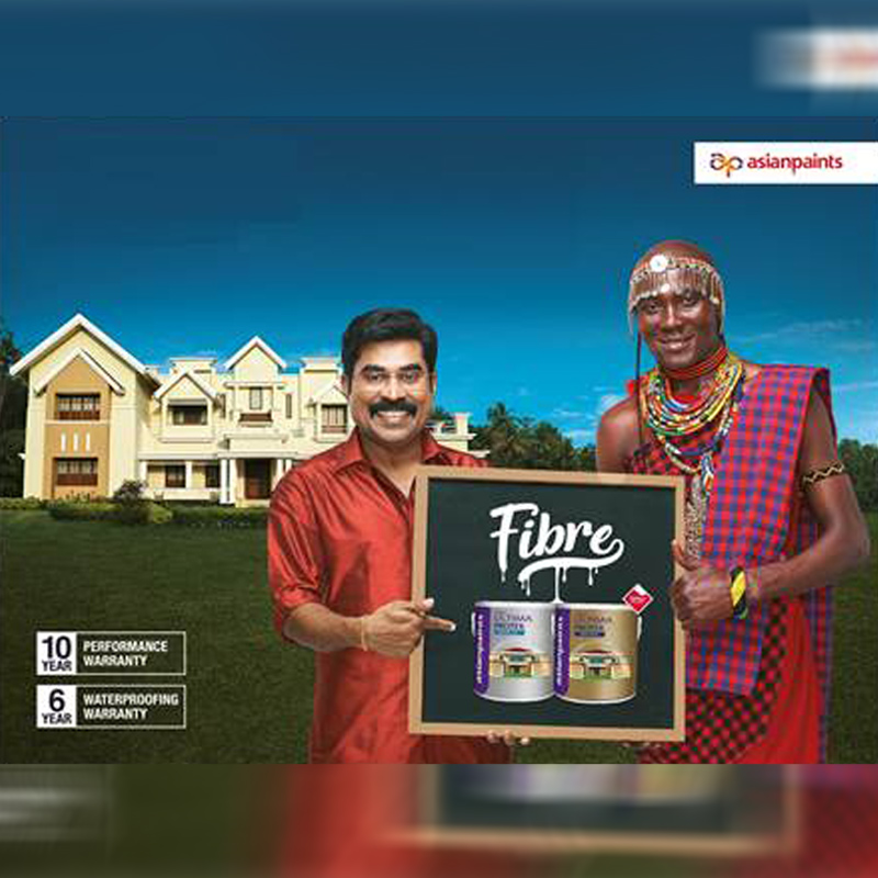
December 12, 2019: Homes in Kerala tell a story of tradition, beauty and magnificence, clearly the most important asset for people of Kerala and to keep it beautiful they need the best. Vagaries of weather in Kerala expose the houses to two of the biggest problems in Exterior that is Villal (crack) and Paayal (algae). The Unique Fibre infused Technology in Ultima Protek provides complete protection against Cracks and Algae along with 10 years of warranty.
Keeping the objective at the core, Asian Paints has launched a New TVC to clearly establish Ultima Protek as the Gold Standard of Exterior Emulsion. Conceptualized by Ogilvy India, the ad is directed by renowned director, Manoj Pillai. The film picks the popular character Josettan from the last blockbuster campaign of 2016 on Ultima Protek, and the same is being played by the very talented Suraj Venjaramoodu. The Story opens with the fact that Josettan’s Beautiful House has become a point of attraction from across the world and he is hosting a CLASSROOM to share secret of his beautiful House is Fibre which gives complete protection against villal (cracks) and paayal (algae).
Speaking about the new TV ad, Jaideep Kanse, CMO, Asian Paints Limited said, “Kerala has always been a flagbearer in the country to set the roadmap as far as the Exterior Painting is concerned. The consumers of Kerala clearly understand their requirements from the exteriors considering the vagaries of weather the state undergoes. Asian Paints has always pioneered technology led innovation through its products to bring to consumers nothing but the best. This campaign is yet another step in that direction where Ultima Protek will be one stop solution to all the current problems pertaining to exterior walls”.
Kiran Anthony, CCO, Ogilvy India also added saying “A world renowned home needs a world-class paint that keeps paayal (algae) and vilal (cracks) away. In this series, Joesettan is seen sharing this recipe to a stunning home freely with a worldwide audience drawn to the beauty of his home”.
Watch the new TVC from Asian Paints on the below link:
So, when you turn on your TV, make sure don’t miss our latest commercial.
Brands
Godrej clarifies ‘GI’ identifier after logo similarity debate
Says GI is not a logo, will not replace Godrej signature across products.
MUMBAI: In a branding storm where shapes did the talking, Godrej is now spelling things out. Godrej Industries Group (GIG) has issued a clarification on its newly introduced ‘GI’ identifier, addressing questions around its purpose and design following a wave of online criticism. At the centre of the debate were two concerns: whether the new mark replaces the long-standing Godrej logo, and whether its geometric design mirrors other corporate identities.
The company has drawn a clear line. The Godrej signature logo, it said, remains unchanged and continues to be the sole logo across all consumer-facing products and services. The ‘GI’ mark, by contrast, is not a logo but a corporate group identifier intended for use alongside the Godrej signature or company name, and aimed at stakeholders such as investors, media and talent rather than consumers.
The need for such a distinction stems from the 2024 restructuring of the broader Godrej Group into two separate business entities. With both continuing to operate under the same Godrej name and signature, the identifier is positioned as a way to differentiate the Godrej Industries Group at a corporate level.
The rollout, however, triggered a broader conversation on design originality. Critics pointed to similarities between the GI mark’s geometric composition and logos used by companies globally, raising questions about distinctiveness.
Responding to this, GIG said its intellectual property and legal review found that such overlaps are common in minimalist, geometry-led design systems. Basic forms such as circles and rectangles appear across dozens of brand identities worldwide, the company noted.
It added that the identifier emerged from an extensive design process and was chosen for its simplicity, allowing it to sit alongside the Godrej signature without competing visually. While acknowledging that elemental shapes may appear less distinctive in isolation, the group emphasised that the mark is part of a broader identity system that includes a custom typeface, sonic branding and other proprietary elements.
Following legal and ethical assessments, the company said it found no impediment to using the identifier, reiterating that the GI mark is a corporate tool not a consumer-facing symbol.
In short, the logo isn’t changing but the conversation around it certainly has.


