Brands
Acer rolls out fiery Nitro GPUs for DIY gamers with a taste for power and polish
MUMBAI: Acer has fired up its DIY hardware game with a swanky new lineup of Nitro graphics cards, giving both Intel and AMD loyalists something to cheer about. The new entrants include two white-hot Intel Arc models and a pair of Radeon RX 9060 XT OC beasts, each ready to supercharge gaming rigs with eye-watering visuals and AI-savvy wizardry.
Topping the charts is the Nitro Intel Arc B580 OC 12GB, now strutting out in a crisp white finish—ideal for gamers who like their builds as clean as their killstreaks. It clocks in at a blistering 2,740 MHz, supports up to 8K resolution, and packs Intel’s Xe2 microarchitecture for silky smooth ray tracing and XeSS-powered frame boosts. The cherry on top? Acer’s FrostBlade cooling cuts noise by 8 per cent, so the only thing screaming is your gameplay.
Then there’s the Nitro Arc A380 LP 6GB, a low-profile dynamo armed with Intel XMX AI muscle and 3D acceleration. Its 2,000 MHz game clock and support for DirectX 12 Ultimate tech means buttery gameplay and creative workflows, even for 8K HDR video.
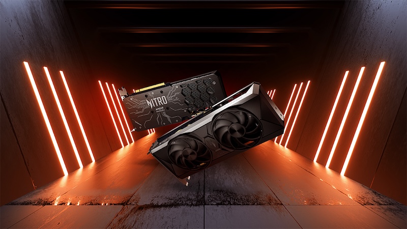
Flipping to Team Red, the Nitro Radeon RX 9060 XT OC cards—available in 16GB and 8GB variants—bring serious heat. These RDNA 4-driven monsters hit 3,320 MHz boost clocks and game clocks up to 2,780 MHz, with AMD’s FidelityFX Super Resolution 4 and HYPR-RX tech turbocharging performance and trimming latency.
Both Radeon cards run cool under pressure, thanks to dual axial fans with dual ball bearings and whisper-quiet oil-lubricated performance.
Gamers and creators alike will appreciate Acer Intelligence Space and ProCam smarts baked into all models—think AI-assisted app recommendations, gameplay highlights, and an aim assist system that’s legal but lethal.
Price check: The Nitro Intel Arc B580 OC 12GB starts at €329, while the Radeon RX 9060 XT OC 16GB and 8GB land in June in EMEA, priced at €649.99 and €599.99, respectively.
For a full spec check or to find out when they’re hitting shelves in your region, head over to acer.com. DIY never looked this slick—or this savage.
Brands
Godrej clarifies ‘GI’ identifier after logo similarity debate
Says GI is not a logo, will not replace Godrej signature across products.
MUMBAI: In a branding storm where shapes did the talking, Godrej is now spelling things out. Godrej Industries Group (GIG) has issued a clarification on its newly introduced ‘GI’ identifier, addressing questions around its purpose and design following a wave of online criticism. At the centre of the debate were two concerns: whether the new mark replaces the long-standing Godrej logo, and whether its geometric design mirrors other corporate identities.
The company has drawn a clear line. The Godrej signature logo, it said, remains unchanged and continues to be the sole logo across all consumer-facing products and services. The ‘GI’ mark, by contrast, is not a logo but a corporate group identifier intended for use alongside the Godrej signature or company name, and aimed at stakeholders such as investors, media and talent rather than consumers.
The need for such a distinction stems from the 2024 restructuring of the broader Godrej Group into two separate business entities. With both continuing to operate under the same Godrej name and signature, the identifier is positioned as a way to differentiate the Godrej Industries Group at a corporate level.
The rollout, however, triggered a broader conversation on design originality. Critics pointed to similarities between the GI mark’s geometric composition and logos used by companies globally, raising questions about distinctiveness.
Responding to this, GIG said its intellectual property and legal review found that such overlaps are common in minimalist, geometry-led design systems. Basic forms such as circles and rectangles appear across dozens of brand identities worldwide, the company noted.
It added that the identifier emerged from an extensive design process and was chosen for its simplicity, allowing it to sit alongside the Godrej signature without competing visually. While acknowledging that elemental shapes may appear less distinctive in isolation, the group emphasised that the mark is part of a broader identity system that includes a custom typeface, sonic branding and other proprietary elements.
Following legal and ethical assessments, the company said it found no impediment to using the identifier, reiterating that the GI mark is a corporate tool not a consumer-facing symbol.
In short, the logo isn’t changing but the conversation around it certainly has.


