Brands
With Rs 1000 cr investment, Thomson forays into home appliance segment
MUMBAI: Super Plastronics Private Ltd, the brand licensee for French electronics Thomson in India, is all set to expand into the home appliance segment by launching its washing machine, starting 23 June. The company is also looking to strengthen its overall presence across India’s consumer electronics sector and has also invested in a new plant in Uttar Pradesh.
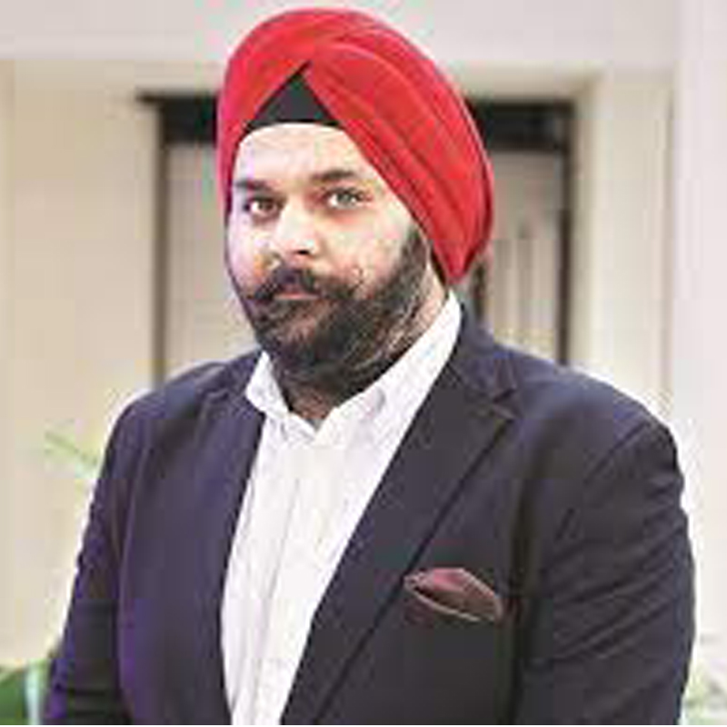
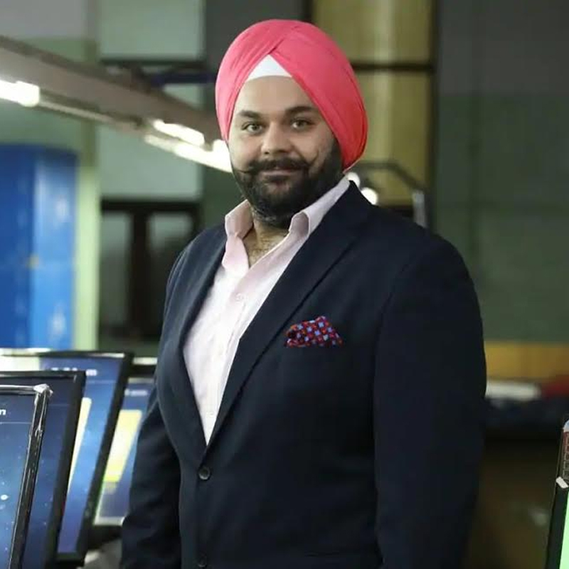
Like its television portfolio, Thomson’s washing machines will be entirely made in India. Starting with its semi-automatic range under Thomson brand, which will be exclusively available on e-commerce platform Flipkart. SPPL CEO Avneet Singh Marwah told Indiantelevision.com, “We will be investing over Rs 1000 crore in the next five years to strengthen home appliance segment. And we will have a make-in-India product strategy, our focus is now local manufacturing. If a brand wants to survive in India, it has to produce or should have its own manufacturing facilities otherwise it will be difficult for them to survive as it’s a cut throat competition. The spending powers have really gone down. The only thing that matters the most is affordability and best of spends. Therefore, we thought of our own manufacturing plant. We have already acquired the land. We aim to complete the construction of the plant in the next two years.”
SSPL has witnessed a 300 per cent growth in the last one month, thanks to the ease in lockdown. “As restrictions are lifting and pockets of spending return, business does seem to be getting back on track in next few months. Due to the outbreak of the pandemic, consumers are spending more time at home and want to become self-reliant. Absence of domestic help and ‘work from home’ in the lockdown has created demand for appliances, there has been a spike in the use of washing machines too. We have a pipeline of new launches, for the coming months and every year we will continue to broaden our portfolio across the home appliance category. As consumers seek convenience, we hope to see strong demand from first-time buyers and nuclear families for washing machines,” he added.
On the marketing front, Marwah shared that the company plans to spend heavily on digital. “We’re planning to spend heavily on digital to spread the word. Digital has always helped us and we’ve always preferred digital over any other medium. We’ll be targeting our own potential buyers, we’ll be investing huge on Flipkart and other digital platforms as well.”
The company will also unveil its campaign called ‘Life ka undo button.’