Brands
VOX lays it down with durable Primerra SPC floors for busy spaces
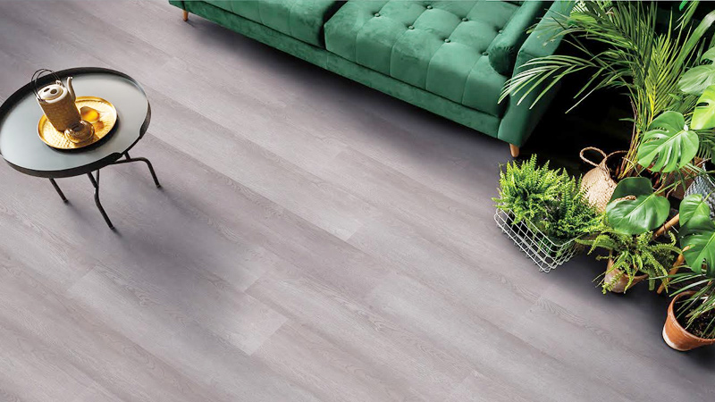
MUMBAI: VOX India is rolling out the red carpet only this one’s tougher than it looks. The interior solutions brand has launched a new variant of its Primerra SPC Flooring, designed especially for high-traffic commercial spaces, where style must stand its ground against endless footfall. The upgraded collection pairs advanced SPC layers with IXPE backing, creating floors that shrug off scratches, stains, and spills while offering comfort underfoot and sound insulation. Thanks to I4F Drop-Lock technology, installation is a quick snap literally with panels locking into place without gaps, whether short or long.
Inspired by the timeless charm of wood, the range brings oak-textured finishes and bold brick patterns, perfect for interiors that want both warmth and contemporary flair. From offices and retail outlets to hospitality projects, the designs promise adaptability, while also doubling up as fresh ideas for bedrooms and homes looking for modern flooring with character.
VOX India isn’t just making a style statement; it’s also guaranteeing peace of mind. Each installation is backed by a 10-year commercial warranty, making it as reliable as it is refined.
“This new Primerra SPC flooring variant has been developed to withstand heavy commercial usage without compromising on style,” said VOX India founder Varun Poddar. “It reflects our focus on blending innovation, functionality, and design for modern interiors.”
With this launch, VOX India strengthens its Primerra portfolio, expanding a lineup that already resonates with architects and designers. By fusing global design sensibilities with Indian commercial needs, the brand is ensuring that durability and design no longer walk separate paths, they’re laid side by side, plank by plank.
Brands
Godrej clarifies ‘GI’ identifier after logo similarity debate
Says GI is not a logo, will not replace Godrej signature across products.
MUMBAI: In a branding storm where shapes did the talking, Godrej is now spelling things out. Godrej Industries Group (GIG) has issued a clarification on its newly introduced ‘GI’ identifier, addressing questions around its purpose and design following a wave of online criticism. At the centre of the debate were two concerns: whether the new mark replaces the long-standing Godrej logo, and whether its geometric design mirrors other corporate identities.
The company has drawn a clear line. The Godrej signature logo, it said, remains unchanged and continues to be the sole logo across all consumer-facing products and services. The ‘GI’ mark, by contrast, is not a logo but a corporate group identifier intended for use alongside the Godrej signature or company name, and aimed at stakeholders such as investors, media and talent rather than consumers.
The need for such a distinction stems from the 2024 restructuring of the broader Godrej Group into two separate business entities. With both continuing to operate under the same Godrej name and signature, the identifier is positioned as a way to differentiate the Godrej Industries Group at a corporate level.
The rollout, however, triggered a broader conversation on design originality. Critics pointed to similarities between the GI mark’s geometric composition and logos used by companies globally, raising questions about distinctiveness.
Responding to this, GIG said its intellectual property and legal review found that such overlaps are common in minimalist, geometry-led design systems. Basic forms such as circles and rectangles appear across dozens of brand identities worldwide, the company noted.
It added that the identifier emerged from an extensive design process and was chosen for its simplicity, allowing it to sit alongside the Godrej signature without competing visually. While acknowledging that elemental shapes may appear less distinctive in isolation, the group emphasised that the mark is part of a broader identity system that includes a custom typeface, sonic branding and other proprietary elements.
Following legal and ethical assessments, the company said it found no impediment to using the identifier, reiterating that the GI mark is a corporate tool not a consumer-facing symbol.
In short, the logo isn’t changing but the conversation around it certainly has.


