Brands
United Breweries launches Kingfisher Flavours, expands beer portfolio
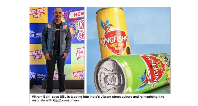
MUMBAI: It’s brewing up new flavours for its bubbly and frothy beer. India’s largest beer maker United Breweries Limited (UBL) and part of the Heineken, has expanded its Kingfisher brand with the launch of Kingfisher Flavours, featuring two unique variants: lemon masala and mango berry twist. Inspired by the vibrant energy of Indian street culture, these new flavors aim to redefine the beer experience in the flavored beer category.
The Kingfisher Flavours range merges innovation with consumer preferences for premium beer experiences, appealing particularly to a younger demographic seeking bold and unconventional tastes.
UBL chief marketing officer Vikram Bahl stated: “With Kingfisher Flavours, we’re tapping into India’s vibrant street culture and reimagining it to resonate with GenZ consumers. These flavors celebrate local ingredients and the spirit of experimentation.”
Currently available in Goa and Daman, Kingfisher Flavours plans to expand to other regions soon, offering more consumers a taste of this innovative product line.
The launch event in Mumbai featured live performances and merchandise unveilings from artists including Karan Kanchan, Yung Raja, and Rhea Chakraborty, further amplifying the celebration of local culture and creativity.
Brands
Godrej clarifies ‘GI’ identifier after logo similarity debate
Says GI is not a logo, will not replace Godrej signature across products.
MUMBAI: In a branding storm where shapes did the talking, Godrej is now spelling things out. Godrej Industries Group (GIG) has issued a clarification on its newly introduced ‘GI’ identifier, addressing questions around its purpose and design following a wave of online criticism. At the centre of the debate were two concerns: whether the new mark replaces the long-standing Godrej logo, and whether its geometric design mirrors other corporate identities.
The company has drawn a clear line. The Godrej signature logo, it said, remains unchanged and continues to be the sole logo across all consumer-facing products and services. The ‘GI’ mark, by contrast, is not a logo but a corporate group identifier intended for use alongside the Godrej signature or company name, and aimed at stakeholders such as investors, media and talent rather than consumers.
The need for such a distinction stems from the 2024 restructuring of the broader Godrej Group into two separate business entities. With both continuing to operate under the same Godrej name and signature, the identifier is positioned as a way to differentiate the Godrej Industries Group at a corporate level.
The rollout, however, triggered a broader conversation on design originality. Critics pointed to similarities between the GI mark’s geometric composition and logos used by companies globally, raising questions about distinctiveness.
Responding to this, GIG said its intellectual property and legal review found that such overlaps are common in minimalist, geometry-led design systems. Basic forms such as circles and rectangles appear across dozens of brand identities worldwide, the company noted.
It added that the identifier emerged from an extensive design process and was chosen for its simplicity, allowing it to sit alongside the Godrej signature without competing visually. While acknowledging that elemental shapes may appear less distinctive in isolation, the group emphasised that the mark is part of a broader identity system that includes a custom typeface, sonic branding and other proprietary elements.
Following legal and ethical assessments, the company said it found no impediment to using the identifier, reiterating that the GI mark is a corporate tool not a consumer-facing symbol.
In short, the logo isn’t changing but the conversation around it certainly has.


