Brands
Tissot Launches Dedicated Asian Games Collection
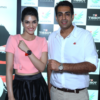
MUMBAI: Tissot, famous Swiss watch brand, known for its accuracy, added one of the world’s largest sporting events to its portfolio of partnerships, becoming Official Timekeeper of the 17th Asian Games Incheon 2014. Whether it is for the athletes themselves or the billions of fans across Asia, Tissot has created a special collection for all, to make this time memorable, keeping the dynamic nature of the games in mind. The Tissot Asian Games Collection is comprised of watches from classic to sporty, with unique designs to suit every taste. The watches are synonymous with Tissot’s Timekeeping precision. To mark the occasion, Indian trap shooter specialist Manavjit Singh Sandhu was joined by model and actress Kriti Sanon, for an exclusive event at Select City Walk Tissot Boutique in New Delhi.
Speaking about the event, Manavjit Singh Sandhu said, “the Asian Games is one of the largest sporting events in the world and it gives me great pleasure to be a part of the celebrations with Tissot, right before the Games kick off. I am delighted with my Tissot Asian Games Collection watch. It is a souvenir that I will always cherish. I wish all the players the very best and hope India brings in many laurels.”
The Tissot Asian Games Collection includes –
• Tissot PR 100 Automatic Asian Games Special Editions 2014 – Tradition in action
• Tissot PRC 200 Chrono Quartz Asian Games Special Editions 2014 – Class in action
• Tissot Luxury Automatic Asian Games Limited Editions 2014 – Style in action
• Tissot Asian Games Special Edition 2014 – Dynamism in action
• Tissot T-Touch II Asian Games Limited Edition 2014 – Innovation in action
Priced between INR 54400 and INR 28000, The Asian Games Collection is definitely something one will treasure for a lifetime.
Brands
Godrej clarifies ‘GI’ identifier after logo similarity debate
Says GI is not a logo, will not replace Godrej signature across products.
MUMBAI: In a branding storm where shapes did the talking, Godrej is now spelling things out. Godrej Industries Group (GIG) has issued a clarification on its newly introduced ‘GI’ identifier, addressing questions around its purpose and design following a wave of online criticism. At the centre of the debate were two concerns: whether the new mark replaces the long-standing Godrej logo, and whether its geometric design mirrors other corporate identities.
The company has drawn a clear line. The Godrej signature logo, it said, remains unchanged and continues to be the sole logo across all consumer-facing products and services. The ‘GI’ mark, by contrast, is not a logo but a corporate group identifier intended for use alongside the Godrej signature or company name, and aimed at stakeholders such as investors, media and talent rather than consumers.
The need for such a distinction stems from the 2024 restructuring of the broader Godrej Group into two separate business entities. With both continuing to operate under the same Godrej name and signature, the identifier is positioned as a way to differentiate the Godrej Industries Group at a corporate level.
The rollout, however, triggered a broader conversation on design originality. Critics pointed to similarities between the GI mark’s geometric composition and logos used by companies globally, raising questions about distinctiveness.
Responding to this, GIG said its intellectual property and legal review found that such overlaps are common in minimalist, geometry-led design systems. Basic forms such as circles and rectangles appear across dozens of brand identities worldwide, the company noted.
It added that the identifier emerged from an extensive design process and was chosen for its simplicity, allowing it to sit alongside the Godrej signature without competing visually. While acknowledging that elemental shapes may appear less distinctive in isolation, the group emphasised that the mark is part of a broader identity system that includes a custom typeface, sonic branding and other proprietary elements.
Following legal and ethical assessments, the company said it found no impediment to using the identifier, reiterating that the GI mark is a corporate tool not a consumer-facing symbol.
In short, the logo isn’t changing but the conversation around it certainly has.


