Brands
The Souled Store bags Redwolf to expand its pop culture merchandise empire
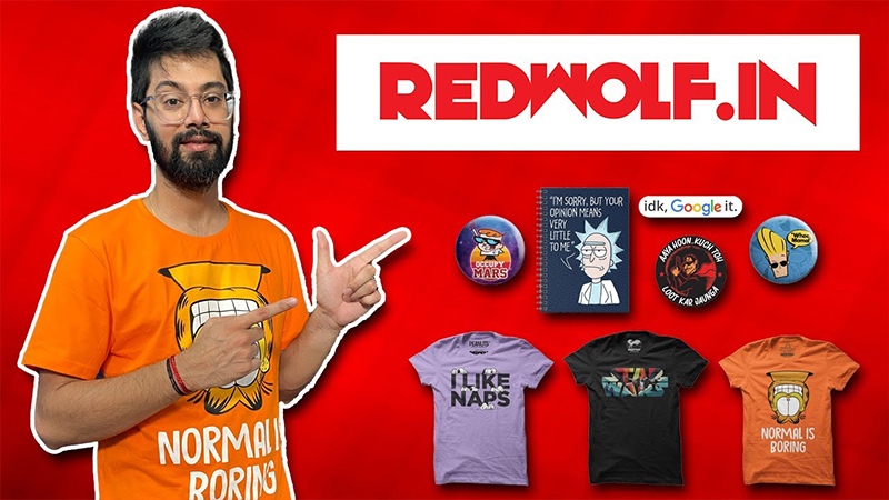
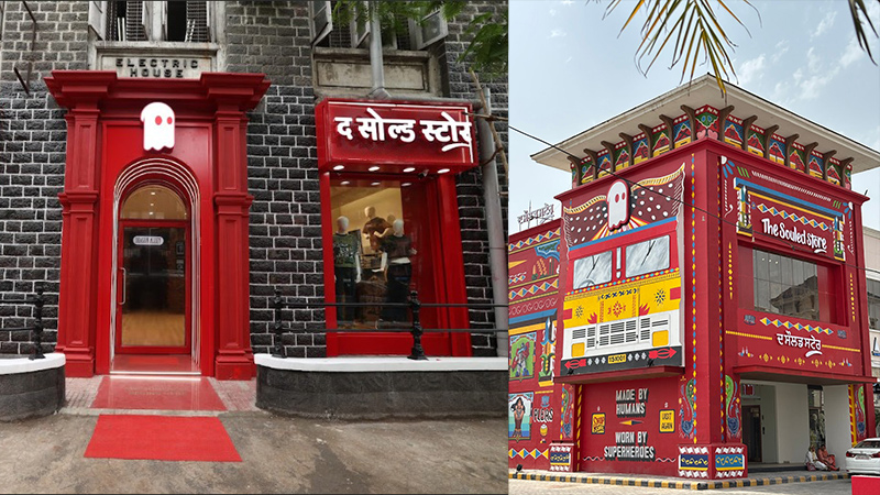
MUMBAI: In a move set to reshape India’s pop culture merchandise landscape, the homegrown brand, The Souled Store announced the acquisition of Redwolf, another popular name in the fandom apparel and collectibles market.
The deal brings Redwolf’s founders—Ameya Thakur, Rahul Jaisheel, and Vivek Malhotra—into The Souled Store fold. Their expertise and passion are expected to supercharge the brand’s mission to create more innovative, fan-driven collections.
“Merging with The Souled Store was the next logical step in realising our vision of bringing the best pop culture merchandise to the Indian audience. All three of us are huge pop-culture geeks ourselves and look forward to leveraging the scale provided by The Souled Store to take the brand to greater heights,” said Malhotra.
The Souled Store co-founder Vedang Patel added, “We are absolutely thrilled to welcome Redwolf to The Souled Store family. Their incredible creativity and commitment to providing fandom-inspired products is a perfect fit. This acquisition will strengthen our mission to become the Home of Pop-culture in India. We are excited to co-build this shared vision with the founders of Redwolf.”
Founded on a love for fandom culture, The Souled Store has built a vibrant space where fans can find products celebrating their favourite movies, TV shows, music, and characters. With Redwolf now part of the family, the brand plans to offer an even bigger and better range of exclusive collaborations and creative products.
This partnership brings The Souled Store closer to its ultimate goal: evolving into a global lifestyle brand that speaks to every fan’s soul.
Brands
Godrej clarifies ‘GI’ identifier after logo similarity debate
Says GI is not a logo, will not replace Godrej signature across products.
MUMBAI: In a branding storm where shapes did the talking, Godrej is now spelling things out. Godrej Industries Group (GIG) has issued a clarification on its newly introduced ‘GI’ identifier, addressing questions around its purpose and design following a wave of online criticism. At the centre of the debate were two concerns: whether the new mark replaces the long-standing Godrej logo, and whether its geometric design mirrors other corporate identities.
The company has drawn a clear line. The Godrej signature logo, it said, remains unchanged and continues to be the sole logo across all consumer-facing products and services. The ‘GI’ mark, by contrast, is not a logo but a corporate group identifier intended for use alongside the Godrej signature or company name, and aimed at stakeholders such as investors, media and talent rather than consumers.
The need for such a distinction stems from the 2024 restructuring of the broader Godrej Group into two separate business entities. With both continuing to operate under the same Godrej name and signature, the identifier is positioned as a way to differentiate the Godrej Industries Group at a corporate level.
The rollout, however, triggered a broader conversation on design originality. Critics pointed to similarities between the GI mark’s geometric composition and logos used by companies globally, raising questions about distinctiveness.
Responding to this, GIG said its intellectual property and legal review found that such overlaps are common in minimalist, geometry-led design systems. Basic forms such as circles and rectangles appear across dozens of brand identities worldwide, the company noted.
It added that the identifier emerged from an extensive design process and was chosen for its simplicity, allowing it to sit alongside the Godrej signature without competing visually. While acknowledging that elemental shapes may appear less distinctive in isolation, the group emphasised that the mark is part of a broader identity system that includes a custom typeface, sonic branding and other proprietary elements.
Following legal and ethical assessments, the company said it found no impediment to using the identifier, reiterating that the GI mark is a corporate tool not a consumer-facing symbol.
In short, the logo isn’t changing but the conversation around it certainly has.


