Brands
Tata Tea brews a stronger cup with wellness twist in premium blend
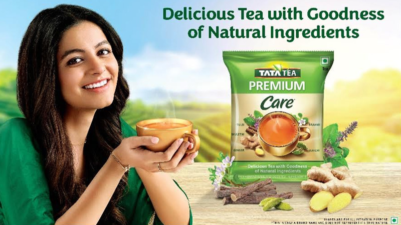
MUMBAI: Nothing beats a strong cup of chai, and Tata Tea Premium is stirring up the perfect blend—a mix of taste and wellness-with the launch of Tata Tea Premium Care. Infused with the natural goodness of Tulsi, Ginger, Brahmi, Elaichi, and Mulethi, this new offering brings kadak chai lovers a flavour-packed, health-boosting experience.
In a world where wellness is brewing into everyday choices, Tata Consumer Products Ltd (TCPL) is doubling down on premiumisation and health-focused innovation. With Tata Tea Premium Care, the brand blends tradition with purpose, giving consumers a cup that’s as comforting as it is beneficial.
“Tata Tea Premium Care is a natural extension of our premiumisation strategy. Indians have a deep emotional connect with tea, and this unique blend brings time-tested natural ingredients into their daily cup, reinforcing our commitment to purposeful and high-quality beverages,” said TCPL president – packaged beverages (India & South Asia) Puneet Das.
To spread the word, the launch is backed by an eye-catching print innovation in leading publications, featuring a design shaped like the Tata Tea Premium Care pack, ensuring it stands out and grabs consumer attention.
Brands
Godrej clarifies ‘GI’ identifier after logo similarity debate
Says GI is not a logo, will not replace Godrej signature across products.
MUMBAI: In a branding storm where shapes did the talking, Godrej is now spelling things out. Godrej Industries Group (GIG) has issued a clarification on its newly introduced ‘GI’ identifier, addressing questions around its purpose and design following a wave of online criticism. At the centre of the debate were two concerns: whether the new mark replaces the long-standing Godrej logo, and whether its geometric design mirrors other corporate identities.
The company has drawn a clear line. The Godrej signature logo, it said, remains unchanged and continues to be the sole logo across all consumer-facing products and services. The ‘GI’ mark, by contrast, is not a logo but a corporate group identifier intended for use alongside the Godrej signature or company name, and aimed at stakeholders such as investors, media and talent rather than consumers.
The need for such a distinction stems from the 2024 restructuring of the broader Godrej Group into two separate business entities. With both continuing to operate under the same Godrej name and signature, the identifier is positioned as a way to differentiate the Godrej Industries Group at a corporate level.
The rollout, however, triggered a broader conversation on design originality. Critics pointed to similarities between the GI mark’s geometric composition and logos used by companies globally, raising questions about distinctiveness.
Responding to this, GIG said its intellectual property and legal review found that such overlaps are common in minimalist, geometry-led design systems. Basic forms such as circles and rectangles appear across dozens of brand identities worldwide, the company noted.
It added that the identifier emerged from an extensive design process and was chosen for its simplicity, allowing it to sit alongside the Godrej signature without competing visually. While acknowledging that elemental shapes may appear less distinctive in isolation, the group emphasised that the mark is part of a broader identity system that includes a custom typeface, sonic branding and other proprietary elements.
Following legal and ethical assessments, the company said it found no impediment to using the identifier, reiterating that the GI mark is a corporate tool not a consumer-facing symbol.
In short, the logo isn’t changing but the conversation around it certainly has.


