Connect with us

Brands

TAM AdEx: Service sector drives 31 per cent of radio ad volumes in Jan-Jun’24

Published

on

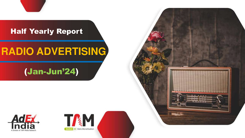
Mumbai: TAM AdEx India has released its half-yearly report on radio advertising for Jan-Jun’24, which showed a three per cent rise in ad volumes compared to the same period in 2023.

The services sector remained the top contributor with thirty-one per cent of total ad volumes. The auto sector climbed to second place with ten per cent, followed by banking/finance/investment at eight per cent. Together, the top three sectors accounted for nearly fifty per cent of the total ad volumes. The top ten sectors remained consistent from 2023, with minor rank shifts.

In the top ten categories, ‘properties/real estates’ and ‘hospital/clinics’ retained first and second positions, contributing sixteen per cent and seven per cent of ad volumes, respectively. ‘Cars’ moved up to third position, recording a fifty-seven per cent growth in ad volumes. ‘Retail outlets-jewellers’ grew by twenty-nine per cent, while ‘multiple courses’ and ‘schools’ entered the top ten categories.

Advertisement

LIC of India held the top spot among advertisers, followed by Maruti Suzuki India. The top ten advertisers accounted for twelve per cent of the ad volumes, with LIC Housing Finance being the leading brand, followed by Alishan and LIC Jeevan Utsav. Notably, three brands in the top ten were from the banking/finance/investment sector, and two were from the auto sector.

Gujarat led the states with a twenty per cent share, followed closely by Maharashtra at nineteen per cent. Among cities, Jaipur topped the list, contributing nine per cent of ad volumes, with Nagpur and New Delhi following.

Evening time (5 pm to 9:59 pm) was the most preferred time band for advertising, contributing thirty-eight per cent of ad volumes, followed by the morning and afternoon slots. Ads of twenty to forty seconds in duration were the most popular, contributing sixty-seven per cent of total ad volumes. Shorter ads (under twenty seconds) saw an increase in share compared to the previous year.

Advertisement
Click to comment

Leave a Reply

Your email address will not be published. Required fields are marked *

Brands

Godrej clarifies ‘GI’ identifier after logo similarity debate

Says GI is not a logo, will not replace Godrej signature across products.

Published

on

MUMBAI: In a branding storm where shapes did the talking, Godrej is now spelling things out. Godrej Industries Group (GIG) has issued a clarification on its newly introduced ‘GI’ identifier, addressing questions around its purpose and design following a wave of online criticism. At the centre of the debate were two concerns: whether the new mark replaces the long-standing Godrej logo, and whether its geometric design mirrors other corporate identities.

The company has drawn a clear line. The Godrej signature logo, it said, remains unchanged and continues to be the sole logo across all consumer-facing products and services. The ‘GI’ mark, by contrast, is not a logo but a corporate group identifier intended for use alongside the Godrej signature or company name, and aimed at stakeholders such as investors, media and talent rather than consumers.

The need for such a distinction stems from the 2024 restructuring of the broader Godrej Group into two separate business entities. With both continuing to operate under the same Godrej name and signature, the identifier is positioned as a way to differentiate the Godrej Industries Group at a corporate level.

Advertisement

The rollout, however, triggered a broader conversation on design originality. Critics pointed to similarities between the GI mark’s geometric composition and logos used by companies globally, raising questions about distinctiveness.

Responding to this, GIG said its intellectual property and legal review found that such overlaps are common in minimalist, geometry-led design systems. Basic forms such as circles and rectangles appear across dozens of brand identities worldwide, the company noted.

It added that the identifier emerged from an extensive design process and was chosen for its simplicity, allowing it to sit alongside the Godrej signature without competing visually. While acknowledging that elemental shapes may appear less distinctive in isolation, the group emphasised that the mark is part of a broader identity system that includes a custom typeface, sonic branding and other proprietary elements.

Advertisement

Following legal and ethical assessments, the company said it found no impediment to using the identifier, reiterating that the GI mark is a corporate tool not a consumer-facing symbol.

In short, the logo isn’t changing but the conversation around it certainly has.

Advertisement
Continue Reading

Advertisement News18
Advertisement
Advertisement
Advertisement
Advertisement Whtasapp
Advertisement Year Enders

Indian Television Dot Com Pvt Ltd

Signup for news and special offers!

Copyright © 2026 Indian Television Dot Com PVT LTD

This will close in 10 seconds