Connect with us

Brands

Stryder Bikes achieves milestone of 50 lakh bicycles

Published

on

Mumbai: Stryder Bikes, part of the esteemed Tata Group, and a pioneer in providing sustainable mobility solutions, has surpassed a global sales milestone of over 50 lakhs during May 2024. This achievement underscores the brand’s commitment in delivering innovative, eco-friendly mobility solutions to customers in India & overseas. Since its inception in 2012, Stryder has grown its presence to over 4000 retail outlets across India and expanded its export operations to SAARC, Africa, and Middle Eastern countries.

“To celebrate this milestone, Stryder launches two new e-bike models– Zeeta and Zeeta Plus 700C on World Bicycle Day. These e-bikes will be offered at an introductory discount of up to 20% to all customers with an aim to promote sustainable living in a world that is being challenged by rapid climate change.  Our commitment to customer centricity and innovation has been the driving force behind our journey to this remarkable achievement. We have seen robust demand coming from urban, rural centers and global markets,” said Stryder Cycles business head Rahul Gupta.

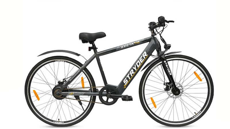
The new models, Zeeta and Zeeta Plus 700C are designed with cutting-edge technology and superior performance to meet the growing demand for sustainable commuting. To make sustainable commuting more accessible, Stryder is offering introductory discounts on both models. Zeeta is priced at Rs. 24,995, and Zeeta Plus 700C at Rs. 27,795, for a limited period.

Advertisement

Zeeta, targeting adventure-seeking individuals offers a range of up to 25 km, while Zeeta Plus 700C, catering to young professionals, boasts a range of up to 30 km. Both models feature dual disc brakes, key-enabled power buttons, with extremely frugal running cost of seven paise per kilometer.

To avail this limited-period offer, and experience the world of Stryder visit www.stryderbikes.com.

Advertisement
Click to comment

Leave a Reply

Your email address will not be published. Required fields are marked *

Brands

Godrej clarifies ‘GI’ identifier after logo similarity debate

Says GI is not a logo, will not replace Godrej signature across products.

Published

on

MUMBAI: In a branding storm where shapes did the talking, Godrej is now spelling things out. Godrej Industries Group (GIG) has issued a clarification on its newly introduced ‘GI’ identifier, addressing questions around its purpose and design following a wave of online criticism. At the centre of the debate were two concerns: whether the new mark replaces the long-standing Godrej logo, and whether its geometric design mirrors other corporate identities.

The company has drawn a clear line. The Godrej signature logo, it said, remains unchanged and continues to be the sole logo across all consumer-facing products and services. The ‘GI’ mark, by contrast, is not a logo but a corporate group identifier intended for use alongside the Godrej signature or company name, and aimed at stakeholders such as investors, media and talent rather than consumers.

The need for such a distinction stems from the 2024 restructuring of the broader Godrej Group into two separate business entities. With both continuing to operate under the same Godrej name and signature, the identifier is positioned as a way to differentiate the Godrej Industries Group at a corporate level.

Advertisement

The rollout, however, triggered a broader conversation on design originality. Critics pointed to similarities between the GI mark’s geometric composition and logos used by companies globally, raising questions about distinctiveness.

Responding to this, GIG said its intellectual property and legal review found that such overlaps are common in minimalist, geometry-led design systems. Basic forms such as circles and rectangles appear across dozens of brand identities worldwide, the company noted.

It added that the identifier emerged from an extensive design process and was chosen for its simplicity, allowing it to sit alongside the Godrej signature without competing visually. While acknowledging that elemental shapes may appear less distinctive in isolation, the group emphasised that the mark is part of a broader identity system that includes a custom typeface, sonic branding and other proprietary elements.

Advertisement

Following legal and ethical assessments, the company said it found no impediment to using the identifier, reiterating that the GI mark is a corporate tool not a consumer-facing symbol.

In short, the logo isn’t changing but the conversation around it certainly has.

Advertisement
Continue Reading

Advertisement News18
Advertisement
Advertisement
Advertisement
Advertisement Whtasapp
Advertisement Year Enders

Indian Television Dot Com Pvt Ltd

Signup for news and special offers!

Copyright © 2026 Indian Television Dot Com PVT LTD

This will close in 10 seconds