Brands
Slurrp Farm and KLAY cook up a tasty lesson in nutrition for preschoolers
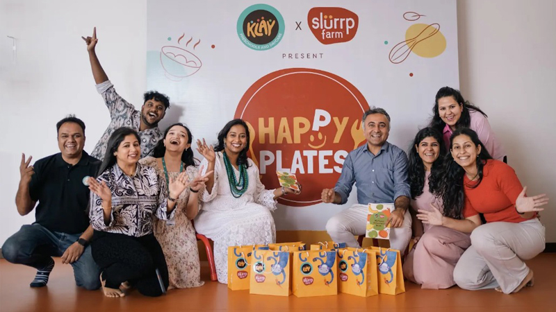
MUMBAI: In a move set to shape the eating habits of India’s youngest minds, millet-based food brand Slurrp Farm has teamed up with early education giant KLAY for a first-of-its-kind initiative to blend food literacy into everyday preschool life.
With research showing that over 90 per cent of brain development happens before age five, the duo is tapping into this critical window — not just to build cognitive skills but to seed lifelong healthy eating behaviours.
Instead of heavy-handed lectures or guilt-ridden lunchbox policing, the collaboration uses play-based formats like stories, routines and sensory play to make children feel at home with good food. Think classroom prompts, singalong storybooks like Kiki and Her Singing, Dancing Food, and interactive nudges designed to make carrots and millet pancakes the new superheroes at snack time.
KLAY brings scale and trust as one of India’s largest preschool and daycare networks, while Slurrp Farm brings its zero-junk, clean-label food ethos to the table. Together, they’re hoping to spark joyful, pressure-free conversations about nutrition — long before unhealthy habits take root.
Commenting on this partnership, Wholsum Foods CMO, Parent company of Slurrp Farm and Mille, Ankit Kapoor shared, “Our mission has always been to change the way families think about food, starting with children. Not through fear or restriction, but through familiarity, joy, and everyday habits that stick. This partnership with KLAY allows us to take that mission into a space that shapes how children learn, explore, and make sense of the world. If we want to build a healthier food culture, we have to begin where it actually begins — in classrooms, conversations, and the small routines that form the foundation of lifelong choices.”
“At KLAY, our philosophy is centred around holistic development. This includes not just academic growth but also emotional wellbeing, physical health, and now – through this partnership – a conscious approach to food. We’re excited to see the ripple effects of this integration, from the classroom to the family dinner table.” said Klay Preschools and Daycare senior vice president – marketing, Shireen Sultana.
By integrating food learning into the rhythms of early education, the programme hopes to flip the script on mealtime struggles, replacing “eat your veggies” with “let’s play with our food.”
Brands
Godrej clarifies ‘GI’ identifier after logo similarity debate
Says GI is not a logo, will not replace Godrej signature across products.
MUMBAI: In a branding storm where shapes did the talking, Godrej is now spelling things out. Godrej Industries Group (GIG) has issued a clarification on its newly introduced ‘GI’ identifier, addressing questions around its purpose and design following a wave of online criticism. At the centre of the debate were two concerns: whether the new mark replaces the long-standing Godrej logo, and whether its geometric design mirrors other corporate identities.
The company has drawn a clear line. The Godrej signature logo, it said, remains unchanged and continues to be the sole logo across all consumer-facing products and services. The ‘GI’ mark, by contrast, is not a logo but a corporate group identifier intended for use alongside the Godrej signature or company name, and aimed at stakeholders such as investors, media and talent rather than consumers.
The need for such a distinction stems from the 2024 restructuring of the broader Godrej Group into two separate business entities. With both continuing to operate under the same Godrej name and signature, the identifier is positioned as a way to differentiate the Godrej Industries Group at a corporate level.
The rollout, however, triggered a broader conversation on design originality. Critics pointed to similarities between the GI mark’s geometric composition and logos used by companies globally, raising questions about distinctiveness.
Responding to this, GIG said its intellectual property and legal review found that such overlaps are common in minimalist, geometry-led design systems. Basic forms such as circles and rectangles appear across dozens of brand identities worldwide, the company noted.
It added that the identifier emerged from an extensive design process and was chosen for its simplicity, allowing it to sit alongside the Godrej signature without competing visually. While acknowledging that elemental shapes may appear less distinctive in isolation, the group emphasised that the mark is part of a broader identity system that includes a custom typeface, sonic branding and other proprietary elements.
Following legal and ethical assessments, the company said it found no impediment to using the identifier, reiterating that the GI mark is a corporate tool not a consumer-facing symbol.
In short, the logo isn’t changing but the conversation around it certainly has.


