Brands
SKY’s the limit as Skyscanner signs Suryakumar Yadav as brand face
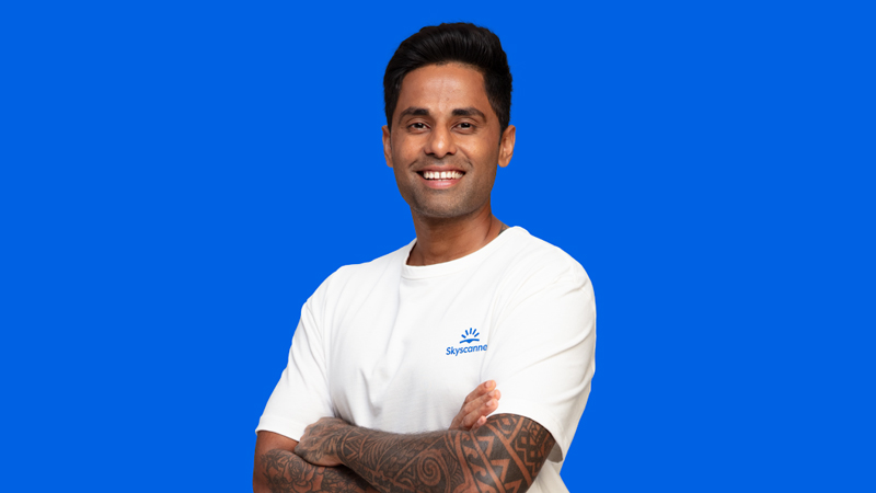
MUMBAI: When cricket’s Mr. 360 takes flight, you know it’s not just sixes soaring into the stands. Suryakumar Yadav, soon to lead India in the Asia Cup, has just been unveiled as Skyscanner’s first-ever brand ambassador in India bringing his flair for all-round play to the world of travel.
The partnership is no shot in the dark. With nearly half of Indians (47 per cent) willing to travel just to watch cricket live, sport-led tourism is booming, as revealed in Skyscanner’s Pitch Perfect Journeys report. Yadav’s adventurous personality and nationwide appeal fit neatly into the travel app’s push to connect with digital-first, lifestyle-hungry audiences. In short, cricket meets check-ins, and boundaries meet boarding passes.
The tie-up kicks off with a fan-driven contest across Skyscanner India and SKY’s own social media, where travellers are invited to design his ultimate personalised itinerary from hidden gems to underrated hotspots. The 10 most creative plans will win fans an exclusive meet-and-greet with the star himself. For Skyscanner, which opened its first India office only last year, roping in SKY is more than just a marketing play, it’s a bold statement of intent to become India’s go-to travel buddy, whether fans are chasing wickets or wanderlust.
Brands
Godrej clarifies ‘GI’ identifier after logo similarity debate
Says GI is not a logo, will not replace Godrej signature across products.
MUMBAI: In a branding storm where shapes did the talking, Godrej is now spelling things out. Godrej Industries Group (GIG) has issued a clarification on its newly introduced ‘GI’ identifier, addressing questions around its purpose and design following a wave of online criticism. At the centre of the debate were two concerns: whether the new mark replaces the long-standing Godrej logo, and whether its geometric design mirrors other corporate identities.
The company has drawn a clear line. The Godrej signature logo, it said, remains unchanged and continues to be the sole logo across all consumer-facing products and services. The ‘GI’ mark, by contrast, is not a logo but a corporate group identifier intended for use alongside the Godrej signature or company name, and aimed at stakeholders such as investors, media and talent rather than consumers.
The need for such a distinction stems from the 2024 restructuring of the broader Godrej Group into two separate business entities. With both continuing to operate under the same Godrej name and signature, the identifier is positioned as a way to differentiate the Godrej Industries Group at a corporate level.
The rollout, however, triggered a broader conversation on design originality. Critics pointed to similarities between the GI mark’s geometric composition and logos used by companies globally, raising questions about distinctiveness.
Responding to this, GIG said its intellectual property and legal review found that such overlaps are common in minimalist, geometry-led design systems. Basic forms such as circles and rectangles appear across dozens of brand identities worldwide, the company noted.
It added that the identifier emerged from an extensive design process and was chosen for its simplicity, allowing it to sit alongside the Godrej signature without competing visually. While acknowledging that elemental shapes may appear less distinctive in isolation, the group emphasised that the mark is part of a broader identity system that includes a custom typeface, sonic branding and other proprietary elements.
Following legal and ethical assessments, the company said it found no impediment to using the identifier, reiterating that the GI mark is a corporate tool not a consumer-facing symbol.
In short, the logo isn’t changing but the conversation around it certainly has.


