Connect with us

Brands

Skechers Performance Run unites runners across 11 Indian cities

Published

on

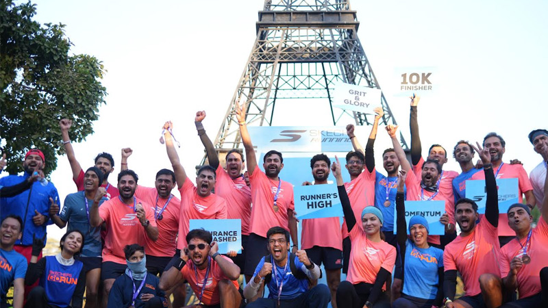
MUMBAI: Skechers India laced up for a nationwide celebration of fitness with the successful conclusion of the Skechers Performance Run, a multi-city 10 km series that brought runners together across 11 cities earlier this month. Held between 6 and 14 December, the event turned city streets into shared running tracks, powered by enthusiasm, community spirit and plenty of comfort underfoot.

Organised under the Skechers Running Club, the initiative drew over 1,800 participants from Mumbai, Ahmedabad, Hyderabad, Chandigarh, Delhi, Pune, Bengaluru, Chennai and Kolkata. Each city added its own flavour to the run, from Mumbai’s high-energy turnout of around 400 runners to strong participation in Hyderabad with over 300 runners, and the committed winter crowd in Chandigarh with 220 participants. Seasoned marathoners ran alongside first-timers, united by a simple love for movement.

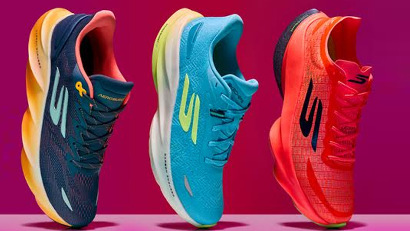
Led by SRC captains and supported by regional fitness creators and local running groups, the series helped Skechers connect closely with India’s diverse running communities. Participants also tested the brand’s latest Aero Series performance footwear, experiencing its signature comfort, responsiveness and stability during the run itself.

Advertisement

Skechers South Asia CEO Rahul Vira, said the Performance Run reflects the brand’s focus on building meaningful, performance-led experiences. “Through the SRC initiative, we want to make running accessible, enjoyable and rewarding for everyone,” he said, adding that the company plans to expand both the event and the community in the years ahead.

The Skechers Aero Series is available at Skechers retail stores and on skechers.com, ready for runners chasing their next personal best or simply a good run with good company.
 

Advertisement
Click to comment

Leave a Reply

Your email address will not be published. Required fields are marked *

Brands

Godrej clarifies ‘GI’ identifier after logo similarity debate

Says GI is not a logo, will not replace Godrej signature across products.

Published

on

MUMBAI: In a branding storm where shapes did the talking, Godrej is now spelling things out. Godrej Industries Group (GIG) has issued a clarification on its newly introduced ‘GI’ identifier, addressing questions around its purpose and design following a wave of online criticism. At the centre of the debate were two concerns: whether the new mark replaces the long-standing Godrej logo, and whether its geometric design mirrors other corporate identities.

The company has drawn a clear line. The Godrej signature logo, it said, remains unchanged and continues to be the sole logo across all consumer-facing products and services. The ‘GI’ mark, by contrast, is not a logo but a corporate group identifier intended for use alongside the Godrej signature or company name, and aimed at stakeholders such as investors, media and talent rather than consumers.

The need for such a distinction stems from the 2024 restructuring of the broader Godrej Group into two separate business entities. With both continuing to operate under the same Godrej name and signature, the identifier is positioned as a way to differentiate the Godrej Industries Group at a corporate level.

Advertisement

The rollout, however, triggered a broader conversation on design originality. Critics pointed to similarities between the GI mark’s geometric composition and logos used by companies globally, raising questions about distinctiveness.

Responding to this, GIG said its intellectual property and legal review found that such overlaps are common in minimalist, geometry-led design systems. Basic forms such as circles and rectangles appear across dozens of brand identities worldwide, the company noted.

It added that the identifier emerged from an extensive design process and was chosen for its simplicity, allowing it to sit alongside the Godrej signature without competing visually. While acknowledging that elemental shapes may appear less distinctive in isolation, the group emphasised that the mark is part of a broader identity system that includes a custom typeface, sonic branding and other proprietary elements.

Advertisement

Following legal and ethical assessments, the company said it found no impediment to using the identifier, reiterating that the GI mark is a corporate tool not a consumer-facing symbol.

In short, the logo isn’t changing but the conversation around it certainly has.

Advertisement
Continue Reading

Advertisement News18
Advertisement
Advertisement
Advertisement
Advertisement Whtasapp
Advertisement Year Enders

Indian Television Dot Com Pvt Ltd

Signup for news and special offers!

Copyright © 2026 Indian Television Dot Com PVT LTD

This will close in 10 seconds