Brands
Senco’s Aham puts the groom back in the wedding spotlight
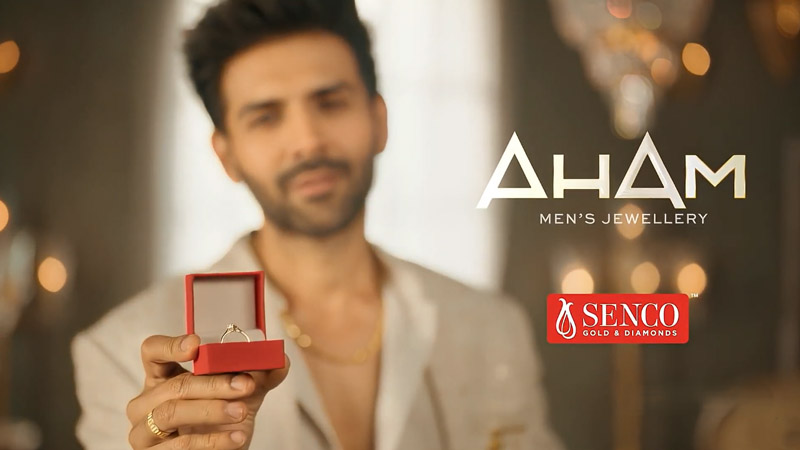
MUMBAI: For decades, Indian weddings have sparkled to a familiar script. The bride dazzles, the groom applauds. Senco Gold and Diamonds is now flipping that narrative with Aham, a wedding jewellery brand created exclusively for men.
Designed for the modern Indian groom, Aham brings masculine elegance to the forefront, offering jewellery that is confident, expressive and unapologetically personal. It is a quiet shift with a bold shine, one that recognises that weddings today are about equal presence, not borrowed spotlight.
The collection spans bold gold chains, sculpted kadas, refined platinum wristwear, diamond-studded rings, sleek cufflinks and contemporary two-tone pieces. Each creation is meticulously handcrafted by Senco’s master kaarigars, balancing tradition with modern design sensibilities.
Aham is built for versatility. Whether worn at pre-wedding festivities, during the ceremony or long after the celebrations fade, the pieces are designed to move effortlessly across occasions. They complement structured sherwanis, tailored bandhgalas, Indo-western silhouettes and even classic evening suits, enhancing the look without overpowering it.
Senco Gold and Diamonds director and head of marketing and designs Joita Sen, says the idea was born from changing relationships and changing tastes. “Today, the groom’s style matters as much as the bride’s. With Aham, we wanted both to shine equally. The collection gives grooms the freedom to express who they are, naturally and effortlessly.”
With Aham, Senco is not just launching jewellery. It is making a statement. In the new-age Indian wedding, the groom is no longer a supporting act. He is centre stage, polished, confident and finally dressed for the part.
Brands
Godrej clarifies ‘GI’ identifier after logo similarity debate
Says GI is not a logo, will not replace Godrej signature across products.
MUMBAI: In a branding storm where shapes did the talking, Godrej is now spelling things out. Godrej Industries Group (GIG) has issued a clarification on its newly introduced ‘GI’ identifier, addressing questions around its purpose and design following a wave of online criticism. At the centre of the debate were two concerns: whether the new mark replaces the long-standing Godrej logo, and whether its geometric design mirrors other corporate identities.
The company has drawn a clear line. The Godrej signature logo, it said, remains unchanged and continues to be the sole logo across all consumer-facing products and services. The ‘GI’ mark, by contrast, is not a logo but a corporate group identifier intended for use alongside the Godrej signature or company name, and aimed at stakeholders such as investors, media and talent rather than consumers.
The need for such a distinction stems from the 2024 restructuring of the broader Godrej Group into two separate business entities. With both continuing to operate under the same Godrej name and signature, the identifier is positioned as a way to differentiate the Godrej Industries Group at a corporate level.
The rollout, however, triggered a broader conversation on design originality. Critics pointed to similarities between the GI mark’s geometric composition and logos used by companies globally, raising questions about distinctiveness.
Responding to this, GIG said its intellectual property and legal review found that such overlaps are common in minimalist, geometry-led design systems. Basic forms such as circles and rectangles appear across dozens of brand identities worldwide, the company noted.
It added that the identifier emerged from an extensive design process and was chosen for its simplicity, allowing it to sit alongside the Godrej signature without competing visually. While acknowledging that elemental shapes may appear less distinctive in isolation, the group emphasised that the mark is part of a broader identity system that includes a custom typeface, sonic branding and other proprietary elements.
Following legal and ethical assessments, the company said it found no impediment to using the identifier, reiterating that the GI mark is a corporate tool not a consumer-facing symbol.
In short, the logo isn’t changing but the conversation around it certainly has.


