Brands
Senco Gold & Diamonds launches ‘PRIDECollection’
MUMBAI: Senco Gold & Diamonds, one of the largest jewellery retail chains of India, launched a special ‘PRIDE Collection’ as a gesture of support for the LGBTQ community.
A unique fashion show titled “Sphulingo – Freedom of Expression” with a group of transgender men and women led by well-known professor (college principal) & LGBT activist Dr Manabi Bandyopadhyay dressed as mythological characters from Indian epics, sashayed down the ramp at Senco Gold & Diamonds’ Mega Shop on CIT Road in Kolkata.
Senco Gold & Diamonds executive director Suvankar Sen said, “We have launched our Pride Collection in honour of the LGBT community, especially the transgender women on the occasion of Pride month. Many of these women have striven hard to achieve what they have in our society despite the odds stacked against them. We salute them and their indomitable spirits through this fashion show. The Pride collection, immaculately crafted and designed, would appeal to all sections of buyers we cater to with different varieties that we offer from our stable.”
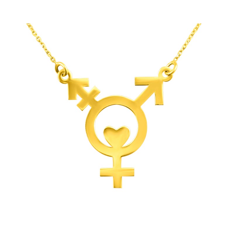
The Pride Collection consists of uniquely designed gold and silver pendants named Trans Hearty, G-Rex and Less More.
Brands
Godrej clarifies ‘GI’ identifier after logo similarity debate
Says GI is not a logo, will not replace Godrej signature across products.
MUMBAI: In a branding storm where shapes did the talking, Godrej is now spelling things out. Godrej Industries Group (GIG) has issued a clarification on its newly introduced ‘GI’ identifier, addressing questions around its purpose and design following a wave of online criticism. At the centre of the debate were two concerns: whether the new mark replaces the long-standing Godrej logo, and whether its geometric design mirrors other corporate identities.
The company has drawn a clear line. The Godrej signature logo, it said, remains unchanged and continues to be the sole logo across all consumer-facing products and services. The ‘GI’ mark, by contrast, is not a logo but a corporate group identifier intended for use alongside the Godrej signature or company name, and aimed at stakeholders such as investors, media and talent rather than consumers.
The need for such a distinction stems from the 2024 restructuring of the broader Godrej Group into two separate business entities. With both continuing to operate under the same Godrej name and signature, the identifier is positioned as a way to differentiate the Godrej Industries Group at a corporate level.
The rollout, however, triggered a broader conversation on design originality. Critics pointed to similarities between the GI mark’s geometric composition and logos used by companies globally, raising questions about distinctiveness.
Responding to this, GIG said its intellectual property and legal review found that such overlaps are common in minimalist, geometry-led design systems. Basic forms such as circles and rectangles appear across dozens of brand identities worldwide, the company noted.
It added that the identifier emerged from an extensive design process and was chosen for its simplicity, allowing it to sit alongside the Godrej signature without competing visually. While acknowledging that elemental shapes may appear less distinctive in isolation, the group emphasised that the mark is part of a broader identity system that includes a custom typeface, sonic branding and other proprietary elements.
Following legal and ethical assessments, the company said it found no impediment to using the identifier, reiterating that the GI mark is a corporate tool not a consumer-facing symbol.
In short, the logo isn’t changing but the conversation around it certainly has.


