Brands
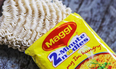
SC revives government case against Nestle Maggi in NCDRC
MUMBAI: Boiling fresh trouble for Nestle, the Supreme Court has revived the four-year-old Consumer Affairs Ministry’s case against its instant noodles Maggi on charges of unfair trade practices, false labeling, and misleading advertisements.
A Bench headed by Justice DY Chandrachud said the report from CFTRI (Central Food Technological Research Institute, Mysuru), where the testing of the Maggi noodle samples was conducted, will form the basis for the proceedings.
The government had filed a complaint in National Consumer Disputes Redressal Commission (NCDRC) in 2015, using a provision for the first time in the nearly three-decade-old Consumer Protection Act, stating that Nestle was causing harm to Indian consumers by allegedly indulging in unfair trade practices and false labeling of its noodles product—Maggi. The ministry had charged that Maggi noodle’s claim of being ‘Tasty Bhi Healthy Bhi’ was misleading as the product contained high amounts of lead and MSG (monosodium glutamate), which are unhealthy for human consumption. It had sought damages of Rs 640 crore from the company. The top court had earlier stayed the proceedings before the NCDRC after Nestle had challenged it.
Brands
Godrej clarifies ‘GI’ identifier after logo similarity debate
Says GI is not a logo, will not replace Godrej signature across products.
MUMBAI: In a branding storm where shapes did the talking, Godrej is now spelling things out. Godrej Industries Group (GIG) has issued a clarification on its newly introduced ‘GI’ identifier, addressing questions around its purpose and design following a wave of online criticism. At the centre of the debate were two concerns: whether the new mark replaces the long-standing Godrej logo, and whether its geometric design mirrors other corporate identities.
The company has drawn a clear line. The Godrej signature logo, it said, remains unchanged and continues to be the sole logo across all consumer-facing products and services. The ‘GI’ mark, by contrast, is not a logo but a corporate group identifier intended for use alongside the Godrej signature or company name, and aimed at stakeholders such as investors, media and talent rather than consumers.
The need for such a distinction stems from the 2024 restructuring of the broader Godrej Group into two separate business entities. With both continuing to operate under the same Godrej name and signature, the identifier is positioned as a way to differentiate the Godrej Industries Group at a corporate level.
The rollout, however, triggered a broader conversation on design originality. Critics pointed to similarities between the GI mark’s geometric composition and logos used by companies globally, raising questions about distinctiveness.
Responding to this, GIG said its intellectual property and legal review found that such overlaps are common in minimalist, geometry-led design systems. Basic forms such as circles and rectangles appear across dozens of brand identities worldwide, the company noted.
It added that the identifier emerged from an extensive design process and was chosen for its simplicity, allowing it to sit alongside the Godrej signature without competing visually. While acknowledging that elemental shapes may appear less distinctive in isolation, the group emphasised that the mark is part of a broader identity system that includes a custom typeface, sonic branding and other proprietary elements.
Following legal and ethical assessments, the company said it found no impediment to using the identifier, reiterating that the GI mark is a corporate tool not a consumer-facing symbol.
In short, the logo isn’t changing but the conversation around it certainly has.


