Connect with us

Brands

Sania serves aces in style as Allen Solly’s first womenswear ambassador

Published

on

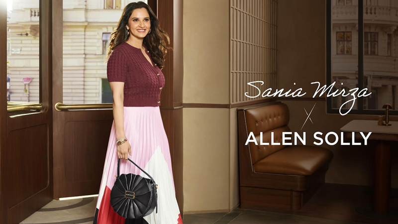
MUMBAI: When sport meets style, the result is nothing short of smashing. Allen Solly Woman, from the house of Aditya Birla Lifestyle Brands Limited (ABLBL), has signed on none other than tennis legend and global fashion icon Sania Mirza as its first-ever brand ambassador. It’s a partnership that brings together aces and accessories, forehands and fashion, under one confident banner.

Sania needs no introduction. From becoming the first Indian woman to win a Grand Slam title to collecting a cabinet of honours including the Major Dhyan Chand Khel Ratna Award in 2015 and the Padma Bhushan in 2016, she has been a pioneer on court and an inspiration off it. Just as effortlessly, she has evolved into a style icon, blending athletic grit with elegance and individuality, embodying the very essence Allen Solly Woman seeks to celebrate.

“Allen Solly has always encouraged people to express themselves freely, something I deeply connect with,” said Sania Mirza. “I’ve lived life on my own terms, both on and off the court, and I am excited to partner with a brand that champions confidence and style for today’s women.”

Advertisement

For the brand, the moment marks a milestone. “We are delighted to welcome Sania Mirza as the face of Allen Solly Womenswear,” said Allen Solly Chief Business Officer Richa Pai. “Sania is a true icon who has broken barriers and inspired women to define success on their own terms. Her blend of confidence, style, and individuality perfectly reflects what Allen Solly stands for. This partnership opens a new chapter for us, one that celebrates women who embrace diversity and self-expression.”

Allen Solly Womenswear has already carved a reputation for rewriting the rulebook on women’s fashion. It pioneered workwear that married professionalism with contemporary flair, created casualwear that resonates with youthful energy, and built one of the largest handbag collections in India. Now, with Sania as its face, the brand is ready to serve an even bolder narrative.

A new campaign film featuring Sania Mirza is set to launch soon, bringing this partnership alive with the same energy she displayed on court, a mix of passion, confidence, and individuality.

Advertisement

From Wimbledon whites to wardrobe whites, Sania Mirza has always been about making her presence felt. With Allen Solly, she’s not just playing the game, she’s setting the style.

Click to comment

Leave a Reply

Your email address will not be published. Required fields are marked *

Brands

Godrej clarifies ‘GI’ identifier after logo similarity debate

Says GI is not a logo, will not replace Godrej signature across products.

Published

on

MUMBAI: In a branding storm where shapes did the talking, Godrej is now spelling things out. Godrej Industries Group (GIG) has issued a clarification on its newly introduced ‘GI’ identifier, addressing questions around its purpose and design following a wave of online criticism. At the centre of the debate were two concerns: whether the new mark replaces the long-standing Godrej logo, and whether its geometric design mirrors other corporate identities.

The company has drawn a clear line. The Godrej signature logo, it said, remains unchanged and continues to be the sole logo across all consumer-facing products and services. The ‘GI’ mark, by contrast, is not a logo but a corporate group identifier intended for use alongside the Godrej signature or company name, and aimed at stakeholders such as investors, media and talent rather than consumers.

The need for such a distinction stems from the 2024 restructuring of the broader Godrej Group into two separate business entities. With both continuing to operate under the same Godrej name and signature, the identifier is positioned as a way to differentiate the Godrej Industries Group at a corporate level.

Advertisement

The rollout, however, triggered a broader conversation on design originality. Critics pointed to similarities between the GI mark’s geometric composition and logos used by companies globally, raising questions about distinctiveness.

Responding to this, GIG said its intellectual property and legal review found that such overlaps are common in minimalist, geometry-led design systems. Basic forms such as circles and rectangles appear across dozens of brand identities worldwide, the company noted.

It added that the identifier emerged from an extensive design process and was chosen for its simplicity, allowing it to sit alongside the Godrej signature without competing visually. While acknowledging that elemental shapes may appear less distinctive in isolation, the group emphasised that the mark is part of a broader identity system that includes a custom typeface, sonic branding and other proprietary elements.

Advertisement

Following legal and ethical assessments, the company said it found no impediment to using the identifier, reiterating that the GI mark is a corporate tool not a consumer-facing symbol.

In short, the logo isn’t changing but the conversation around it certainly has.

Advertisement
Continue Reading

Advertisement News18
Advertisement
Advertisement
Advertisement
Advertisement Whtasapp
Advertisement Year Enders

Indian Television Dot Com Pvt Ltd

Signup for news and special offers!

Copyright © 2026 Indian Television Dot Com PVT LTD

This will close in 10 seconds