Brands
Sandwizzaa’s cRAVE party toasts 40 years of flavour
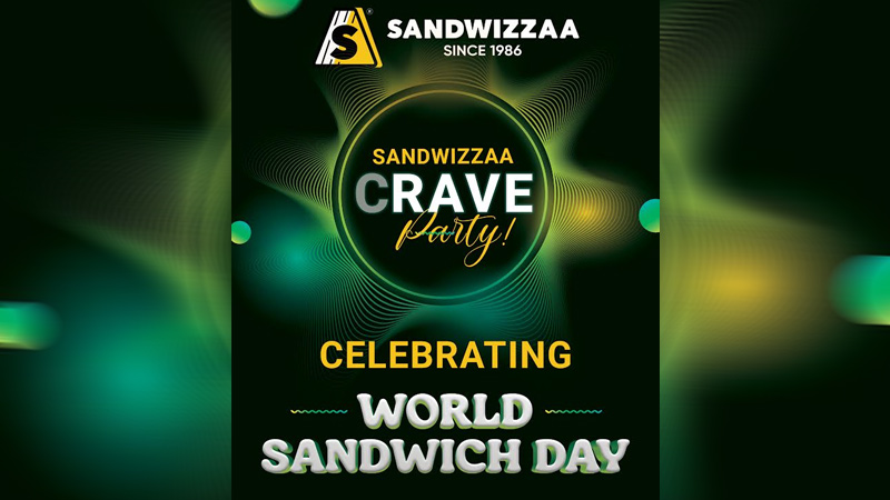
MUMBAI: This World Sandwich Day, Mumbai’s beloved sandwich brand Sandwizzaa is serving more than just its signature chutneys. The city’s iconic pure-veg chain is celebrating with a full-on cRAVE Party, a flavour-packed bash that fuses food, music, and Mumbai’s unmistakable vibe.
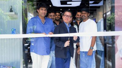
Hosted at Sandwizzaa’s flagship outlet in Vile Parle (East), the invite-only celebration is a nod to the global trend of “sandwich raves,” where food meets festivity. For loyal fans, it’s a delicious mix of nostalgia and novelty, topped with that signature Sandwizzaa freshness.
The event also kicks off the brand’s 40th anniversary journey. From a humble sandwich shop to 20 bustling outlets across the city, Sandwizzaa has built an empire one chutney-layered bite at a time. Known for its inventive vegetarian creations and crowd-favourite classics, it remains a cornerstone of Mumbai’s fast-food culture.
“We wanted to celebrate World Sandwich Day in a way only Sandwizzaa can, with flavour, energy, and the people who made this journey possible,” said Sandwizzaa founder Pankaj Sharma. “The cRAVE Party is our thank-you to Mumbai as we step into our 40th year.”
As the world raises a toast to its favourite handheld meal, Sandwizzaa’s cRAVE Party reminds Mumbai why a good sandwich never goes out of style, especially when it’s made with a little love and a lot of chutney.
Brands
Godrej clarifies ‘GI’ identifier after logo similarity debate
Says GI is not a logo, will not replace Godrej signature across products.
MUMBAI: In a branding storm where shapes did the talking, Godrej is now spelling things out. Godrej Industries Group (GIG) has issued a clarification on its newly introduced ‘GI’ identifier, addressing questions around its purpose and design following a wave of online criticism. At the centre of the debate were two concerns: whether the new mark replaces the long-standing Godrej logo, and whether its geometric design mirrors other corporate identities.
The company has drawn a clear line. The Godrej signature logo, it said, remains unchanged and continues to be the sole logo across all consumer-facing products and services. The ‘GI’ mark, by contrast, is not a logo but a corporate group identifier intended for use alongside the Godrej signature or company name, and aimed at stakeholders such as investors, media and talent rather than consumers.
The need for such a distinction stems from the 2024 restructuring of the broader Godrej Group into two separate business entities. With both continuing to operate under the same Godrej name and signature, the identifier is positioned as a way to differentiate the Godrej Industries Group at a corporate level.
The rollout, however, triggered a broader conversation on design originality. Critics pointed to similarities between the GI mark’s geometric composition and logos used by companies globally, raising questions about distinctiveness.
Responding to this, GIG said its intellectual property and legal review found that such overlaps are common in minimalist, geometry-led design systems. Basic forms such as circles and rectangles appear across dozens of brand identities worldwide, the company noted.
It added that the identifier emerged from an extensive design process and was chosen for its simplicity, allowing it to sit alongside the Godrej signature without competing visually. While acknowledging that elemental shapes may appear less distinctive in isolation, the group emphasised that the mark is part of a broader identity system that includes a custom typeface, sonic branding and other proprietary elements.
Following legal and ethical assessments, the company said it found no impediment to using the identifier, reiterating that the GI mark is a corporate tool not a consumer-facing symbol.
In short, the logo isn’t changing but the conversation around it certainly has.


