Brands
Sacheerome launches ‘The Art of Fragrance’ initiative with visual artist Nupur Kundu
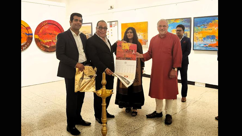
Mumbai: India’s leading fragrance and flavour manufacturing company, Sacheerome, has joined forces with renowned visual artist Nupur Kundu to launch ‘The Art of Fragrance’ initiative, which aims to blend visual art and fragrance creation, fostering emotional connections between scents and artwork.
Against the backdrop of India’s rapidly growing fragrance and flavour (F&F) industry, valued at $900mn plus currently, Sacheerome’s partnership with Nupur Kundu signals a strategic move to tap into the changing preferences of consumers. Market research firm, IMARC expects the Indian F&F market to reach nearly $1.5bn by 2028, driven by rising disposable incomes and evolving lifestyle choices.
Expressing his thoughts on this ground-breaking partnership, Sacheerome’s chief perfumer and MD Manoj Arora said, “Perfumery has long been acknowledged as an art form. Our collaboration with globally acclaimed artist Nupur represents an avant-garde approach to spotlight the synergy between olfactory and visual senses. Combining fragrance with visual art elevates the sensory experience, providing a deeper significance.”
The initiative was inaugurated by Dinesh Vazirani, founder of India’s biggest art auction house, SaffronArt, at Mumbai’s Jehangir Art Gallery.
As per the ‘State of the Indian Art Market Report FY23’ by Grant Thornton Bharat and Indian Art Investor, there has been a nine per cent growth in turnover and a six per cent increase in artworks sold compared to the previous year. This makes FY23 the most successful year for the Indian art market in terms of auctions.
According to Arora, the increasing demand for luxury products in India creates a symbiotic opportunity for the art market. Millennials and Gen Z, seeking avenues to express their aesthetic sensibilities, are turning to contemporary art and fragrances as a means of personal expression.
Commenting on the collaboration, Nupur Kundu, a winner of Sarojini Naidu International Award, highlighted the initiative’s aim to provide a fresh perspective to both art and fragrance. She emphasised the younger generation’s inclination towards unique works of art that resonate with their intense emotions. “Art and fragrance are experienced uniquely by each individual, and the interpretation of the paintings should be left to the recipient,” she said.
Sacheerome has recently announced a $5 million investment plan for establishing a research and innovation centre, application lab, evaluation centre, sales office, and warehouse in the UAE. Additionally, the company is gearing up for a state-of-the-art manufacturing facility in YEIDA, near to the Jewar Airport.