Brands
Reliance’s R|Elan fabric 2.0 gets a Huemn touch at Lakme Fashion Week
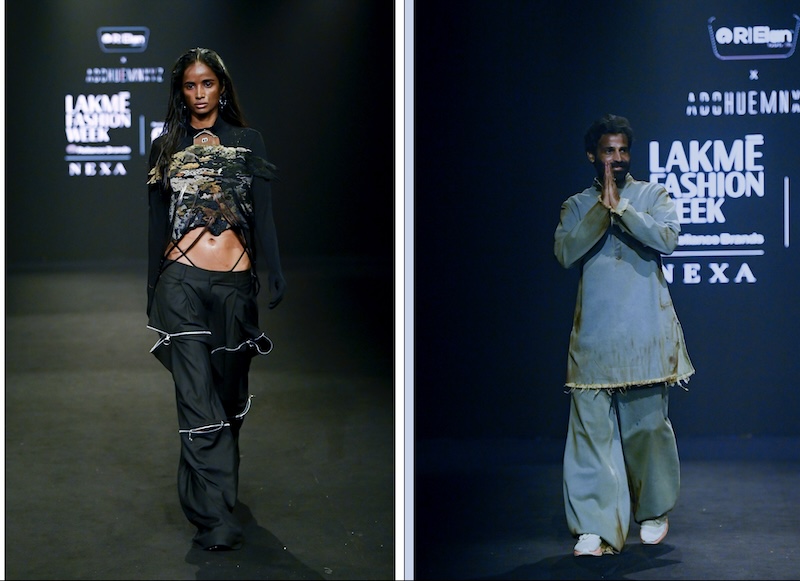
MUMBAI: Reliance Industries Limited’s R|Elan fabrics 2.0, which showcased its innovations at a meet a couple of months ago, has this time partnered with ready to wear home grown label Huemn. The latter presented a collection made from R|Elan fabrics 2.0 at the Lakme Fashion Week in partnership with FDCI on 11 October.
Amongst the fabrics Huemn used for the show include: the eco-friendly R|Elan GreenGold, made from recycled PET bottles, R|Elan Kooltex, combining style with sustainability and R|Elan SmarTex – a revolutionary fabric that enables wearers to stay fresh, active and comfortably cool. It has multiple functional properties like – cool to touch, odour control and UV protection – all in one fabric. By further integrating ethical practices into its design philosophy, Huemn aims to reduce textile waste further, while enhancing garment performance.
“Founded on the principles of inclusivity and empowerment, Huemn constantly navigates the shifting social landscape, unlocking new perspectives through each collaboration and pushing the boundaries of design,” Said Reliance Industries president – polyester Hemant D Sharma. “At the core of Huemns’s vision is the power of the human mind, which shapes culture and communities. This collaboration is a perfect example of how R|Elan’s advanced fabric technology’s performance and sustainability creates a one of a kind experience.”
As part of the collaboration, Huemn embraced eco-friendly fabrics like R|Elan The label, started in 2012 has been making fashion waves ever since its launch. Multi award winner and collaborator with several top brands, designer Pranav Mishra of Huemn, a graduate of the National Institute of Fashion Technology, Bangalore has been the driving force of the brand. Huemn’s latest collab with R|Elan created a fashionable stir on the ramp, during Lakm? Fashion Week in partnership with FDCI.
For each amalgamation it’s a fresh narrative for Pranav and with R|Elan’s sustainable and innovative textiles, the partnership was just perfect, says a press release. The high-performance fabrics of R|Elan by Reliance Industries were turned into trendy gear and exhibited Huemn’s characteristic touches.
The collection reflected the signature elements of Huemn when relaxed statement pieces appeared on the runway. The hand drawn prints were eye catchers, while the inclusive fits and styles offered a variety of options for the unisex buyers. Keeping in mind Indian crafts, there was a profusion of handcrafted textures and surfaces, along with traditional Indian craft techniques, like embroidery that brought a great mix of design. The highlight of the line was the intense fashion innovation for each garment that was directed towards amazing
performance, sustainability and comfort. The Huemn designs were versatile and will resonate with a cross section of buyers.
Said Huemn co-founder & creative director Pranav Misra: “At Huemn, our goal is to create a dialogue that resonates beyond fashion—connecting with people on a deeper level, and reflecting the times we live in. With R|Elan we had yet another opportunity to push the envelope in terms of both design and sustainability, creating pieces that are as responsible as they are relevant. The Huemn X R|Elan collaboration is a dynamic union of creative vision and technological innovation. It is poised to inspire consumers to rethink fashion.”
The Huemn label is a homegrown brand from India that offers contemporary, unisex, handcrafted clothing, which will always be relevant as it is inspired by the social, political and cultural atmosphere of the times., says the press release.