Connect with us

Brands

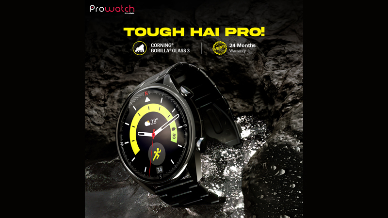
Prowatch confirms expanding the smartwatch portfolio

Published

on

Mumbai: Riding on the wave of the phenomenal response on its ZN and VN Series, Prowatch, the smart wearable brand launched in April 2024 by Lava International Ltd, has confirmed plans to expand its smartwatch portfolio following market sentiments and rising consumer demand.  

The announcement comes against the backdrop of one-month celebrations of Prowatch’s launch sustained through brand campaign, ‘Tough Hain Pro’. Having garnered applauds from the notable tech influencers and media fraternity, the ongoing 360-degree campaign has achieved tremendous traction for the product, creating mass popularity amongst the young generation. Across 1000 retail outlets, Prowatch experiential zones are created for an elevated in-shop experience. With the response being overwhelming from across markets the success of Prowatch indicates at the rising appetite for smart wearables across markets.

Speaking about Prowatch, Lava International Ltd head of marketing Puravansh Maitreya said, “Prowatch is envisioned to redefine affordable technology in the growing smart wearable industry, with quality, accuracy and relatability. From its launch till now, our focus has been on experiential marketing to enable users experience the product in real life scenarios. The early reception has been encouraging as we continue to expand the portfolio with best-in-class affordable technological innovations.”

Advertisement

Under the campaign, as a part of its marketing strategies, Prowatch on-boarded influencers from different walks of life showcasing the utility and value of the product in different facets of life, alongside creating superlative experience for distributors, retail partners and customers across various touchpoints, fostering robust dialogue and collecting real-time reviews. The launch of the Prowatch witnessed the participation of various channel partners, including retailers, distributors, and consumers, and featured key social media influencers, generating over 10,000 pre-registrations, effectively engaging the target group and building substantial buzz.

Designed, developed and tested in India, Prowatch is a made-in-India and made-for-India product, as it caters to unique needs of Indians, starting at Rs 1999 only. Available on Amazon, Lava e-Stores and at Lava outlets nationwide, Prowatch offers over-the-counter replacement (OTCR) service to ensure a hassle-free product replacement experience under warranty at Lava retail outlets.

Advertisement
Click to comment

Leave a Reply

Your email address will not be published. Required fields are marked *

Brands

Godrej clarifies ‘GI’ identifier after logo similarity debate

Says GI is not a logo, will not replace Godrej signature across products.

Published

on

MUMBAI: In a branding storm where shapes did the talking, Godrej is now spelling things out. Godrej Industries Group (GIG) has issued a clarification on its newly introduced ‘GI’ identifier, addressing questions around its purpose and design following a wave of online criticism. At the centre of the debate were two concerns: whether the new mark replaces the long-standing Godrej logo, and whether its geometric design mirrors other corporate identities.

The company has drawn a clear line. The Godrej signature logo, it said, remains unchanged and continues to be the sole logo across all consumer-facing products and services. The ‘GI’ mark, by contrast, is not a logo but a corporate group identifier intended for use alongside the Godrej signature or company name, and aimed at stakeholders such as investors, media and talent rather than consumers.

The need for such a distinction stems from the 2024 restructuring of the broader Godrej Group into two separate business entities. With both continuing to operate under the same Godrej name and signature, the identifier is positioned as a way to differentiate the Godrej Industries Group at a corporate level.

Advertisement

The rollout, however, triggered a broader conversation on design originality. Critics pointed to similarities between the GI mark’s geometric composition and logos used by companies globally, raising questions about distinctiveness.

Responding to this, GIG said its intellectual property and legal review found that such overlaps are common in minimalist, geometry-led design systems. Basic forms such as circles and rectangles appear across dozens of brand identities worldwide, the company noted.

It added that the identifier emerged from an extensive design process and was chosen for its simplicity, allowing it to sit alongside the Godrej signature without competing visually. While acknowledging that elemental shapes may appear less distinctive in isolation, the group emphasised that the mark is part of a broader identity system that includes a custom typeface, sonic branding and other proprietary elements.

Advertisement

Following legal and ethical assessments, the company said it found no impediment to using the identifier, reiterating that the GI mark is a corporate tool not a consumer-facing symbol.

In short, the logo isn’t changing but the conversation around it certainly has.

Advertisement
Continue Reading

Advertisement News18
Advertisement
Advertisement
Advertisement
Advertisement Whtasapp
Advertisement Year Enders

Indian Television Dot Com Pvt Ltd

Signup for news and special offers!

Copyright © 2026 Indian Television Dot Com PVT LTD

This will close in 10 seconds