Connect with us

Brands

Policybazaar’s new spot pushes health & term life insurance

Published

on

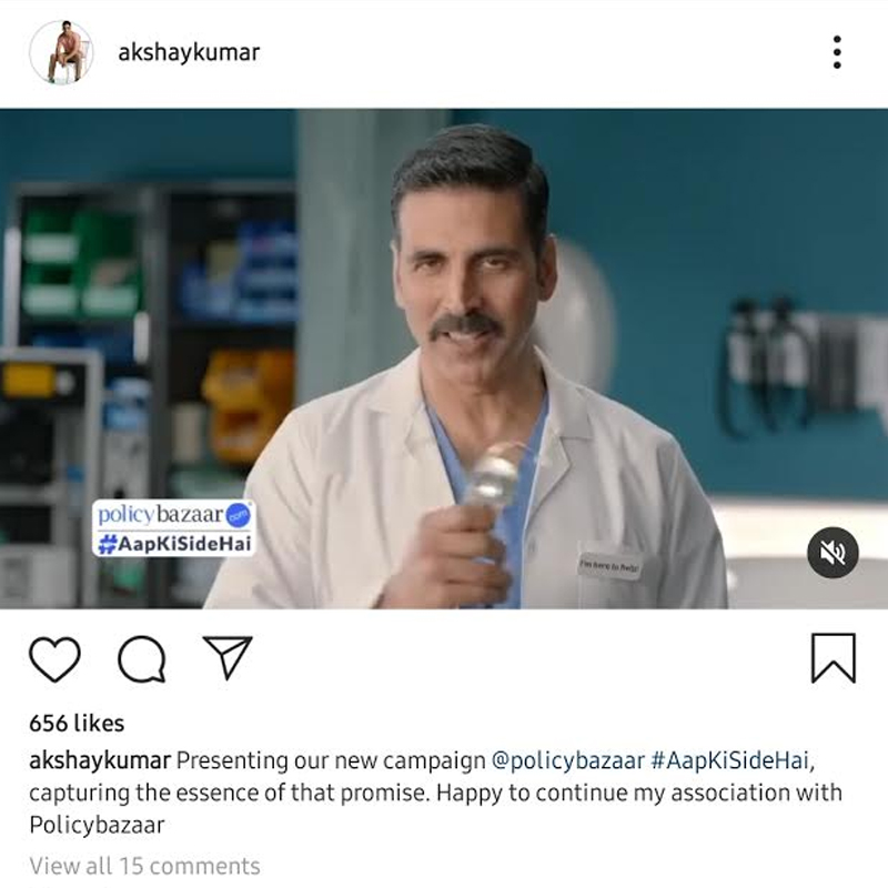
NEW DELHI: Policybazaar.com has launched its new television campaign “AapKiSideHai”. The ad campaign features Policybazaar’s brand ambassador, Akshay Kumar, highlighting the brand's promise of embracing a holistic customer-centric approach while helping to bridge the insurance protection gap in India.

“While we continue to highlight the importance of Health & Term life Insurance through our marketing campaigns, with the brand promise of Policybazaar AapKiSideHai, we also intend to position Policybazaar as a customer-centric brand, that is committed to stand by its customers, both pre and post-purchase”, said Policybazaar.com. head of brand marketing Samir Sethi.

Advertisement

Read more coverage on Policybazaar

The new brand campaign reinforces Policybazaar’s core value of putting the customer first by delivering on its promise of providing a trusted platform for all types of insurance products. The brand is committed to guiding the customer throughout the insurance journey, starting from recommending the right products at affordable pricing, ensuring that the policy issuance process is smooth and fast, and, to providing services and claims assistance when needed.  

Advertisement

The new ad series highlights Policybazaar's unparalleled support to customers while providing them with the ease of comparing and buying term and health plans online with guidance at each & every step.

Speaking about the TVC launch, Policybazaar.com COO Sharat Dhall said, “Our ultimate aim is to provide 360-degree assistance to customers that start from when the policy is bought, to provide assistance when the claim is paid out, should such a situation arise. Winning and maintaining customer trust is a strong ethos within the company and this campaign reflects that. At a time when the world is grappling with a crisis like no other, the brand intends to instill confidence in the customers’ buying decisions by assuring them the protection of their futures with the right insurance products & thorough assistance throughout the journey.”

The new brand campaign in its series displays moments of indecision that people may have while investing in protection products. It addresses these queries & emphasizes the importance of nurturing a bond with the consumers thereby creating customer delight.

Advertisement
Click to comment

Leave a Reply

Your email address will not be published. Required fields are marked *

Brands

Godrej clarifies ‘GI’ identifier after logo similarity debate

Says GI is not a logo, will not replace Godrej signature across products.

Published

on

MUMBAI: In a branding storm where shapes did the talking, Godrej is now spelling things out. Godrej Industries Group (GIG) has issued a clarification on its newly introduced ‘GI’ identifier, addressing questions around its purpose and design following a wave of online criticism. At the centre of the debate were two concerns: whether the new mark replaces the long-standing Godrej logo, and whether its geometric design mirrors other corporate identities.

The company has drawn a clear line. The Godrej signature logo, it said, remains unchanged and continues to be the sole logo across all consumer-facing products and services. The ‘GI’ mark, by contrast, is not a logo but a corporate group identifier intended for use alongside the Godrej signature or company name, and aimed at stakeholders such as investors, media and talent rather than consumers.

The need for such a distinction stems from the 2024 restructuring of the broader Godrej Group into two separate business entities. With both continuing to operate under the same Godrej name and signature, the identifier is positioned as a way to differentiate the Godrej Industries Group at a corporate level.

Advertisement

The rollout, however, triggered a broader conversation on design originality. Critics pointed to similarities between the GI mark’s geometric composition and logos used by companies globally, raising questions about distinctiveness.

Responding to this, GIG said its intellectual property and legal review found that such overlaps are common in minimalist, geometry-led design systems. Basic forms such as circles and rectangles appear across dozens of brand identities worldwide, the company noted.

It added that the identifier emerged from an extensive design process and was chosen for its simplicity, allowing it to sit alongside the Godrej signature without competing visually. While acknowledging that elemental shapes may appear less distinctive in isolation, the group emphasised that the mark is part of a broader identity system that includes a custom typeface, sonic branding and other proprietary elements.

Advertisement

Following legal and ethical assessments, the company said it found no impediment to using the identifier, reiterating that the GI mark is a corporate tool not a consumer-facing symbol.

In short, the logo isn’t changing but the conversation around it certainly has.

Advertisement
Continue Reading

Advertisement News18
Advertisement
Advertisement
Advertisement
Advertisement Whtasapp
Advertisement Year Enders

Indian Television Dot Com Pvt Ltd

Signup for news and special offers!

Copyright © 2026 Indian Television Dot Com PVT LTD

This will close in 10 seconds