Brands
Peps turns 20 and proves great sleep has always been a big idea
MUMBAI:Twenty years on, Peps Industries is still wide awake and so is its imagination. As the spring mattress brand marks two decades in business, it is also celebrating something rarer in the category: advertising that made India laugh, think and finally take sleep seriously.
Since 2005, Peps has steadily rewritten the rulebook on how mattresses are marketed, swapping stiff product claims for storytelling rooted in humour, emotion and everyday insight. At a time when sleep was rarely discussed beyond discounts and density, the brand chose to humanise rest, turning an overlooked household purchase into a conversation about wellbeing.
“Creativity lies at the heart of everything we do,” said Peps Industries managing director G Shankar Ramm. “For 20 years, our mission has been to educate and delight consumers and to show that a mattress isn’t just a product, but a vital part of wellbeing. Our campaigns have helped challenge conventions, shift mindsets and spark smiles along the way.”
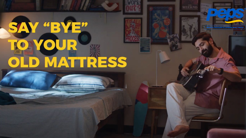
One of Peps’ most talked-about recent ideas, Some Breakups Are Necessary, leaned into relationship humour to make a sharp point. Through a trilogy of witty, multilingual films, the campaign urged consumers to finally part ways with old, unsupportive mattresses, framing poor sleep as a bad relationship that had run its course. The message landed because it felt familiar, funny and uncomfortably true.
Earlier this year, the brand doubled down on accessible storytelling with Spring is King, a hyperlocal, humour-led campaign spanning seven short films. Set in everyday Indian households, the series demystified spring mattress technology using playful narratives, bringing concepts such as the Marvellous Middle Advantage and Zero Disturbance Technology to life without sounding technical or preachy.
Seasonal storytelling has also been central to Peps’ playbook. Festive campaigns around Diwali and regional moments such as Onam reinforced the idea that celebration is incomplete without good sleep. By tying comfort to cultural rituals, the brand ensured it stayed relevant beyond sale seasons, building emotional recall throughout the year.
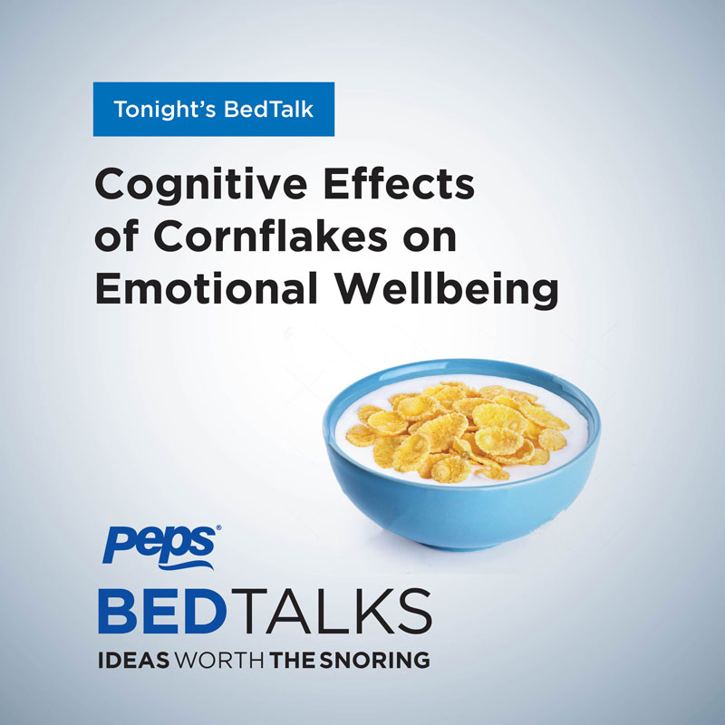
Peps’ creative risk-taking is not new. Among its earlier highlights was BEDTalks, a digital series built around intentionally boring conversations designed to help viewers drift off. The idea stood out precisely because it did the opposite of what advertising usually aims to do, reflecting a brand confident enough to lean into its core promise of better sleep.
Across two decades, Peps has blended science with storytelling, humour with insight, and product innovation with cultural nuance. In doing so, it has elevated mattress advertising from a functional pitch to a human conversation about rest, health and everyday life.
As it enters its third decade, Peps shows no signs of hitting snooze. The brand remains focused on pushing creative boundaries, innovating with purpose and continuing to tell stories that make India sleep and smile, a little better.