Connect with us

Brands

Octanom Tech names COO, family office head, opens Mumbai office

Leadership hires and new base signal push into family offices

Published

on

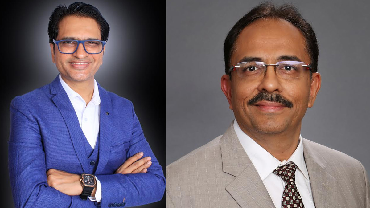
MUMBAI: Octanom Tech has refreshed its leadership bench and planted a new flag in India’s financial capital, appointing Rajesh Vora as chief operating officer and Khushal Devera as head of family office, alongside the opening of its fourth office in Mumbai.

The twin appointments are part of the WealthTech firm’s broader play to scale nationwide and deepen its relationships with family offices, a segment that continues to grow in size and sophistication.

Octanom Tech and Hedged.in, MD and CEO, Rahul Ghose, said the new hires arrive at a pivotal moment. He noted that their experience would help the company quicken its growth pace while sharpening the value it delivers to clients across the country. He also described the Mumbai expansion as a strategic step in strengthening the firm’s presence in key markets.

Advertisement

Vora steps in with more than three decades of experience across capital markets. A gold medallist in MBA finance and an engineering graduate, he previously served as director and business head at Sharekhan.com India. In his new role, he will focus on operational efficiency, innovation and scalable growth, with an eye on keeping the firm’s client-first philosophy intact.

Devera, a CFP with a background in statistics and an MBA in finance, will lead the company’s family office division. With over 17 years of experience working alongside leadership teams at major financial institutions, he is expected to shape data-led, strategic solutions for high net worth families seeking structured and forward-looking wealth strategies.

With the new Mumbai office, Octanom Tech now operates from four locations across India, offering hedged-style, risk-conscious investment products for ultra high net worth individuals and families. The company was also named WealthTech of the Year in both 2024 and 2025, signalling growing industry recognition as it scales its ambitions.

Advertisement
Click to comment

Leave a Reply

Your email address will not be published. Required fields are marked *

Brands

Godrej clarifies ‘GI’ identifier after logo similarity debate

Says GI is not a logo, will not replace Godrej signature across products.

Published

on

MUMBAI: In a branding storm where shapes did the talking, Godrej is now spelling things out. Godrej Industries Group (GIG) has issued a clarification on its newly introduced ‘GI’ identifier, addressing questions around its purpose and design following a wave of online criticism. At the centre of the debate were two concerns: whether the new mark replaces the long-standing Godrej logo, and whether its geometric design mirrors other corporate identities.

The company has drawn a clear line. The Godrej signature logo, it said, remains unchanged and continues to be the sole logo across all consumer-facing products and services. The ‘GI’ mark, by contrast, is not a logo but a corporate group identifier intended for use alongside the Godrej signature or company name, and aimed at stakeholders such as investors, media and talent rather than consumers.

The need for such a distinction stems from the 2024 restructuring of the broader Godrej Group into two separate business entities. With both continuing to operate under the same Godrej name and signature, the identifier is positioned as a way to differentiate the Godrej Industries Group at a corporate level.

Advertisement

The rollout, however, triggered a broader conversation on design originality. Critics pointed to similarities between the GI mark’s geometric composition and logos used by companies globally, raising questions about distinctiveness.

Responding to this, GIG said its intellectual property and legal review found that such overlaps are common in minimalist, geometry-led design systems. Basic forms such as circles and rectangles appear across dozens of brand identities worldwide, the company noted.

It added that the identifier emerged from an extensive design process and was chosen for its simplicity, allowing it to sit alongside the Godrej signature without competing visually. While acknowledging that elemental shapes may appear less distinctive in isolation, the group emphasised that the mark is part of a broader identity system that includes a custom typeface, sonic branding and other proprietary elements.

Advertisement

Following legal and ethical assessments, the company said it found no impediment to using the identifier, reiterating that the GI mark is a corporate tool not a consumer-facing symbol.

In short, the logo isn’t changing but the conversation around it certainly has.

Advertisement
Continue Reading

Advertisement News18
Advertisement
Advertisement
Advertisement
Advertisement Whtasapp
Advertisement Year Enders

Indian Television Dot Com Pvt Ltd

Signup for news and special offers!

Copyright © 2026 Indian Television Dot Com PVT LTD

This will close in 10 seconds