Brands
Oben powers ahead with 50th showroom, eyes 150 outlets by year-end
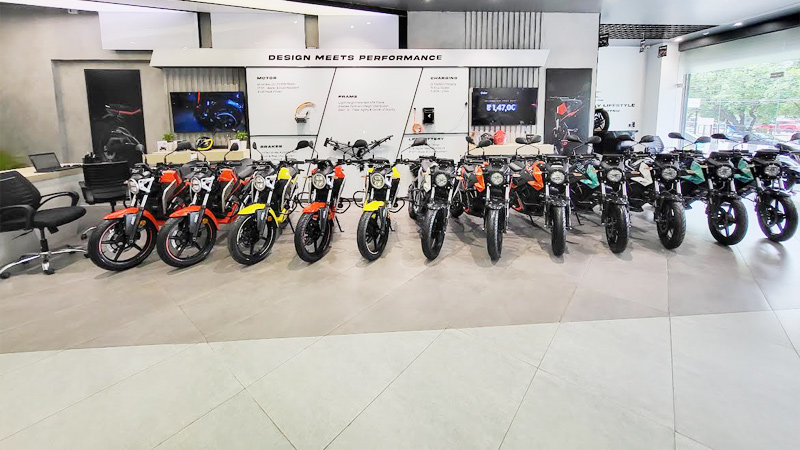
MUMBAI: From zero to fifty, Oben Electric is revving up India’s EV race at full throttle. The homegrown R&D-driven motorcycle brand has just cut the ribbon on its 50th showroom and service centre in Visakhapatnam, Andhra Pradesh marking a pit stop on its road to 150 outlets by the close of this financial year.
The milestone comes on the back of rapid expansion. In recent months, Oben has entered Visakhapatnam and Guntur in Andhra Pradesh, Ranchi in Jharkhand, Jabalpur in Madhya Pradesh, Aligarh and Unnao in Uttar Pradesh, and Palakkad in Kerala. With this, its network now spans 15 states and 37 cities, a footprint fuelled by soaring demand for its flagship Rorr EZ and the newly launched Rorr EZ Sigma.
The Rorr EZ Sigma pitched as the commuter’s next-gen ride builds on the success of the original Rorr EZ with better performance, smarter tech, and everyday practicality. Together, the duo has become the brand’s biggest growth engine, drawing in first-time EV buyers as well as seasoned riders looking for clean mobility alternatives.
“Inaugurating our 50th dealership is a powerful milestone,” said Oben Electric founder & CEO Madhumita Agrawal. “Andhra Pradesh is a key clean mobility market for us, and with in-house manufacturing and customer-focused service, we’re set on raising benchmarks for electric motorcycle ownership across India.”
Oben Electric also stands out in the crowded EV space for its vertical integration: it designs and manufactures critical EV components in-house from high-performance LFP batteries to motors, chargers and vehicle control units. This, the company claims, ensures durability and consistency tailored to India’s diverse riding conditions.
With the Visakhapatnam showroom now open, Oben has 100 more outlets in its sights before March 2026. Each will come equipped with a service centre, promising customers not just a flashy ride but robust after-sales support too.
Brands
Godrej clarifies ‘GI’ identifier after logo similarity debate
Says GI is not a logo, will not replace Godrej signature across products.
MUMBAI: In a branding storm where shapes did the talking, Godrej is now spelling things out. Godrej Industries Group (GIG) has issued a clarification on its newly introduced ‘GI’ identifier, addressing questions around its purpose and design following a wave of online criticism. At the centre of the debate were two concerns: whether the new mark replaces the long-standing Godrej logo, and whether its geometric design mirrors other corporate identities.
The company has drawn a clear line. The Godrej signature logo, it said, remains unchanged and continues to be the sole logo across all consumer-facing products and services. The ‘GI’ mark, by contrast, is not a logo but a corporate group identifier intended for use alongside the Godrej signature or company name, and aimed at stakeholders such as investors, media and talent rather than consumers.
The need for such a distinction stems from the 2024 restructuring of the broader Godrej Group into two separate business entities. With both continuing to operate under the same Godrej name and signature, the identifier is positioned as a way to differentiate the Godrej Industries Group at a corporate level.
The rollout, however, triggered a broader conversation on design originality. Critics pointed to similarities between the GI mark’s geometric composition and logos used by companies globally, raising questions about distinctiveness.
Responding to this, GIG said its intellectual property and legal review found that such overlaps are common in minimalist, geometry-led design systems. Basic forms such as circles and rectangles appear across dozens of brand identities worldwide, the company noted.
It added that the identifier emerged from an extensive design process and was chosen for its simplicity, allowing it to sit alongside the Godrej signature without competing visually. While acknowledging that elemental shapes may appear less distinctive in isolation, the group emphasised that the mark is part of a broader identity system that includes a custom typeface, sonic branding and other proprietary elements.
Following legal and ethical assessments, the company said it found no impediment to using the identifier, reiterating that the GI mark is a corporate tool not a consumer-facing symbol.
In short, the logo isn’t changing but the conversation around it certainly has.


