Brands
NuNectar Super Vita: Combatting hidden hunger in kids
Mumbai: NuNectar Super Vita is a micronutrient-packed health drink designed for kids. Rigorously tested by an NABL-accredited lab, Super Vita addresses the issue of hidden hunger, a micronutrient deficiency in children highlighted by several research studies over time.
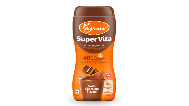
NuNectar Super Vita stands out as a game-changer, boasting 40 essential nutrients crucial for kids’ growth. Unlike many alternatives, it goes beyond the ordinary by eliminating refined sugar, opting instead for natural jaggery, making it a must-have for children aged 4 and above. This delicious health drink not only nourishes but also delights young taste buds with its delicious Swiss Chocolate flavour.
The secret behind Super Vita’s success lies in its three super grains – wheat, barley, and bajra – providing an extra boost of goodness. This health drink is launched at a crucial time, as reports in the public domain highlight that kids in India are at risk of deficiency in vital micronutrients like Vitamins (A, D, E, B), Iron and Zinc. Super Vita aims to combat this ‘hidden hunger’ in kids by delivering significant amounts of essential nutrients.
Formulated to bridge nutritional gaps, Super Vita supports up to 100 per cent of daily vitamin C, 80 per cent of daily calcium and up to 50 per cent of daily iron requirement for kids.
NuNectar Foods is on a mission to redefine nutrition and taste in everyday foods. The founder of NuNectar states, “Regrettably, a majority of popular branded foods available today are laden with unhealthy ingredients, especially concerning children’s growth. In a scenario where diabetes and obesity are on the rise in India, the importance of healthy eating cannot be overstated.”
Super Vita is more than just a health drink; it’s a powerful source of 40 essential nutrients fueling muscle and bone growth, bolstering immunity, and supporting brain function and physical energy. With a no-junk approach, Super Vita champions a commitment to health, free from preservatives or artificial colours.
For parents seeking a wholesome choice for their children, NuNectar’s Super Vita emerges as the go-to health drink for a vibrant and nourished lifestyle.
To know more about the health benefits provided by this power-packed health drink, visit https://nunectar.in/
Brands
Godrej clarifies ‘GI’ identifier after logo similarity debate
Says GI is not a logo, will not replace Godrej signature across products.
MUMBAI: In a branding storm where shapes did the talking, Godrej is now spelling things out. Godrej Industries Group (GIG) has issued a clarification on its newly introduced ‘GI’ identifier, addressing questions around its purpose and design following a wave of online criticism. At the centre of the debate were two concerns: whether the new mark replaces the long-standing Godrej logo, and whether its geometric design mirrors other corporate identities.
The company has drawn a clear line. The Godrej signature logo, it said, remains unchanged and continues to be the sole logo across all consumer-facing products and services. The ‘GI’ mark, by contrast, is not a logo but a corporate group identifier intended for use alongside the Godrej signature or company name, and aimed at stakeholders such as investors, media and talent rather than consumers.
The need for such a distinction stems from the 2024 restructuring of the broader Godrej Group into two separate business entities. With both continuing to operate under the same Godrej name and signature, the identifier is positioned as a way to differentiate the Godrej Industries Group at a corporate level.
The rollout, however, triggered a broader conversation on design originality. Critics pointed to similarities between the GI mark’s geometric composition and logos used by companies globally, raising questions about distinctiveness.
Responding to this, GIG said its intellectual property and legal review found that such overlaps are common in minimalist, geometry-led design systems. Basic forms such as circles and rectangles appear across dozens of brand identities worldwide, the company noted.
It added that the identifier emerged from an extensive design process and was chosen for its simplicity, allowing it to sit alongside the Godrej signature without competing visually. While acknowledging that elemental shapes may appear less distinctive in isolation, the group emphasised that the mark is part of a broader identity system that includes a custom typeface, sonic branding and other proprietary elements.
Following legal and ethical assessments, the company said it found no impediment to using the identifier, reiterating that the GI mark is a corporate tool not a consumer-facing symbol.
In short, the logo isn’t changing but the conversation around it certainly has.


