Connect with us

Brands

Nike Celebrates Rafael Nadal: A Legend’s Legacy in Tennis Greatness

Published

on

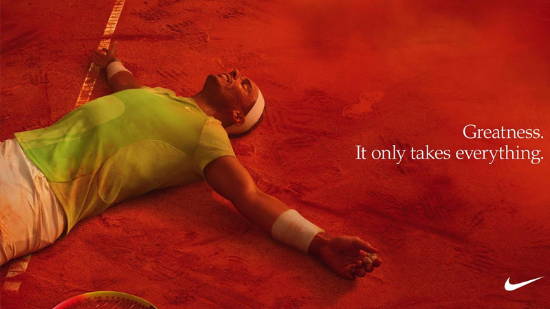
Mumbai: Rafael Nadal, one of tennis’s most celebrated icons, has officially retired, leaving behind an unparalleled legacy of greatness. A Nike athlete since the age of 13, Nadal has captured the hearts of millions with his hallmark passion, energy, and resilience. As he competes in his final professional tournament, Nike honours the King of Clay with a brand film narrated by co-founder and chairman Emeritus Phil Knight, celebrating his incredible journey and unwavering commitment to excellence.  

Nadal’s career speaks volumes of his relentless pursuit of greatness. With 22 Grand Slam titles, including a record-breaking 14 in Paris, two Olympic gold medals, and 92 career titles, he has set benchmarks few can match. Over his 23-year career, Nadal has played more than 1,500 official matches, winning nearly 1,100 of them, and has maintained an astounding 17-plus years in the top 10 rankings.  

Phil Knight reflected on Nadal’s impact, stating: “Rafa has been the perfect representative for the brand. He’s embodied our mentality to never give up and is maybe the most ferocious competitor that’s ever lived.” Knight also lauded Nadal’s signature Raging Bull symbol, which has become synonymous with his unparalleled energy and strength on the court.  

Advertisement

Nadal’s legacy transcends tennis statistics. His unbreakable will and ability to endure challenges inspired countless fans and athletes to embrace the sport. He taught generations that greatness is built on sacrifice, endurance, and perseverance. As Nadal himself said, “Enduring means accepting. Accepting things as they are and not as you would wish them to be, and then looking ahead, not behind.”

Beyond the court, Nadal’s contributions extend to philanthropy and education through the Rafa Nadal Foundation, which empowers youth through sport, and the Rafa Nadal Academy, which trains young athletes on and off the court.  

As Nike celebrates his extraordinary career, Nadal’s impact as a global ambassador of resilience, sportsmanship, and excellence remains unmatched, cementing his place as one of the greatest tennis players of all time.  

Advertisement


Click to comment

Leave a Reply

Your email address will not be published. Required fields are marked *

Brands

Godrej clarifies ‘GI’ identifier after logo similarity debate

Says GI is not a logo, will not replace Godrej signature across products.

Published

on

MUMBAI: In a branding storm where shapes did the talking, Godrej is now spelling things out. Godrej Industries Group (GIG) has issued a clarification on its newly introduced ‘GI’ identifier, addressing questions around its purpose and design following a wave of online criticism. At the centre of the debate were two concerns: whether the new mark replaces the long-standing Godrej logo, and whether its geometric design mirrors other corporate identities.

The company has drawn a clear line. The Godrej signature logo, it said, remains unchanged and continues to be the sole logo across all consumer-facing products and services. The ‘GI’ mark, by contrast, is not a logo but a corporate group identifier intended for use alongside the Godrej signature or company name, and aimed at stakeholders such as investors, media and talent rather than consumers.

The need for such a distinction stems from the 2024 restructuring of the broader Godrej Group into two separate business entities. With both continuing to operate under the same Godrej name and signature, the identifier is positioned as a way to differentiate the Godrej Industries Group at a corporate level.

Advertisement

The rollout, however, triggered a broader conversation on design originality. Critics pointed to similarities between the GI mark’s geometric composition and logos used by companies globally, raising questions about distinctiveness.

Responding to this, GIG said its intellectual property and legal review found that such overlaps are common in minimalist, geometry-led design systems. Basic forms such as circles and rectangles appear across dozens of brand identities worldwide, the company noted.

It added that the identifier emerged from an extensive design process and was chosen for its simplicity, allowing it to sit alongside the Godrej signature without competing visually. While acknowledging that elemental shapes may appear less distinctive in isolation, the group emphasised that the mark is part of a broader identity system that includes a custom typeface, sonic branding and other proprietary elements.

Advertisement

Following legal and ethical assessments, the company said it found no impediment to using the identifier, reiterating that the GI mark is a corporate tool not a consumer-facing symbol.

In short, the logo isn’t changing but the conversation around it certainly has.

Advertisement
Continue Reading

Advertisement News18
Advertisement
Advertisement
Advertisement
Advertisement Whtasapp
Advertisement Year Enders

Indian Television Dot Com Pvt Ltd

Signup for news and special offers!

Copyright © 2026 Indian Television Dot Com PVT LTD

This will close in 10 seconds