Connect with us

Brands

Maruti Suzuki shuffles executive deck

Published

on

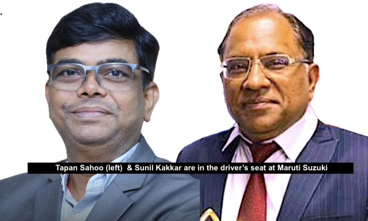
MUMBAI: Maruti Suzuki has turbocharged its leadership lineup with two heavyweight appointments that promise to rev up the company’s strategic engines.

Sunil Kakkar, a 35-year veteran of the automotive trenches, will slide into the director (corporate planning) role from 1 April 2025. An IIT Kanpur engineer with an MBA  gold medal, Kakkar arrives with a portfolio that reads like a automotive industry roadmap—from supply chain mastery to international joint venture architecting.

His corporate credentials include chairing industry bodies like SIAM’s Aatmanirbhar Bharat Sourcing Group and holding directorial seats across multiple associate companies. With awards like supply chain leader of the year, Kakkar has the right credentials. 

Advertisement

Joining the corporate pit crew is Tapan Sahoo, designated head of digital enterprise and information & cyber security. An IIT Delhi alumnus with a PhD and “fellow” status from prestigious engineering academies, Sahoo brings 33 years of technology management firepower.

His brief? Turbocharg digital transformation, leverage AI/ML  technologies, and collaborate with startups and academia. With multiple patents and research publications under his belt, Sahoo looks set to be Maruti Suzuki’s digital alchemist.

These appointments signal Maruti Suzuki’s intent to blend traditional automotive expertise with cutting-edge technological innovation—a strategic chess move in an increasingly complex mobility landscape.

Advertisement
Click to comment

Leave a Reply

Your email address will not be published. Required fields are marked *

Brands

Godrej clarifies ‘GI’ identifier after logo similarity debate

Says GI is not a logo, will not replace Godrej signature across products.

Published

on

MUMBAI: In a branding storm where shapes did the talking, Godrej is now spelling things out. Godrej Industries Group (GIG) has issued a clarification on its newly introduced ‘GI’ identifier, addressing questions around its purpose and design following a wave of online criticism. At the centre of the debate were two concerns: whether the new mark replaces the long-standing Godrej logo, and whether its geometric design mirrors other corporate identities.

The company has drawn a clear line. The Godrej signature logo, it said, remains unchanged and continues to be the sole logo across all consumer-facing products and services. The ‘GI’ mark, by contrast, is not a logo but a corporate group identifier intended for use alongside the Godrej signature or company name, and aimed at stakeholders such as investors, media and talent rather than consumers.

The need for such a distinction stems from the 2024 restructuring of the broader Godrej Group into two separate business entities. With both continuing to operate under the same Godrej name and signature, the identifier is positioned as a way to differentiate the Godrej Industries Group at a corporate level.

Advertisement

The rollout, however, triggered a broader conversation on design originality. Critics pointed to similarities between the GI mark’s geometric composition and logos used by companies globally, raising questions about distinctiveness.

Responding to this, GIG said its intellectual property and legal review found that such overlaps are common in minimalist, geometry-led design systems. Basic forms such as circles and rectangles appear across dozens of brand identities worldwide, the company noted.

It added that the identifier emerged from an extensive design process and was chosen for its simplicity, allowing it to sit alongside the Godrej signature without competing visually. While acknowledging that elemental shapes may appear less distinctive in isolation, the group emphasised that the mark is part of a broader identity system that includes a custom typeface, sonic branding and other proprietary elements.

Advertisement

Following legal and ethical assessments, the company said it found no impediment to using the identifier, reiterating that the GI mark is a corporate tool not a consumer-facing symbol.

In short, the logo isn’t changing but the conversation around it certainly has.

Advertisement
Continue Reading

Advertisement News18
Advertisement
Advertisement
Advertisement
Advertisement Whtasapp
Advertisement Year Enders

Indian Television Dot Com Pvt Ltd

Signup for news and special offers!

Copyright © 2026 Indian Television Dot Com PVT LTD

This will close in 10 seconds