Brands
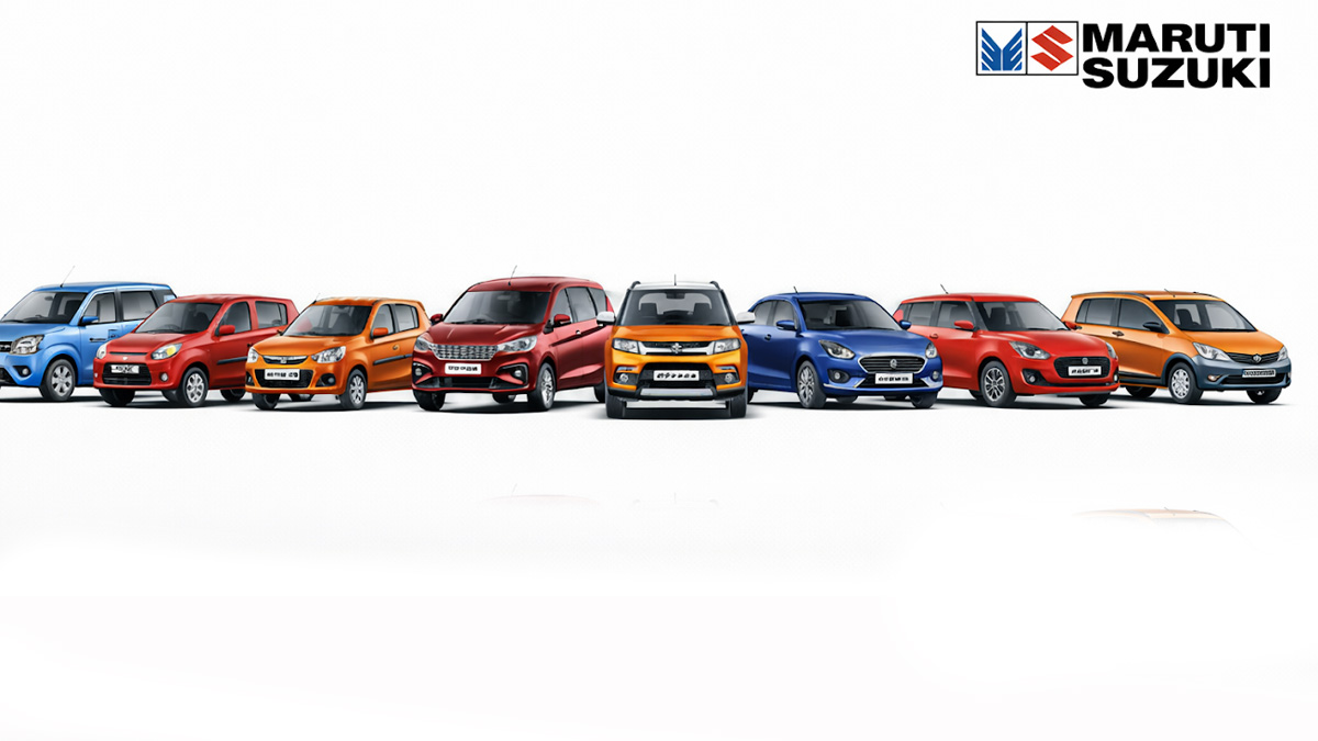
Maruti Suzuki posts all-time high Q3 sales of Rs 475,344 million
NEW DELHI: Maruti Suzuki India has posted its strongest-ever quarterly sales, riding a sharp recovery in the passenger vehicle market triggered by recent GST reforms and a renewed surge in demand for small cars.
For the October–December quarter of FY 2025–26, the country’s largest carmaker clocked record domestic sales of 564,669 units, up from 466,993 units a year earlier. The small car segment in the 18 per cent GST bracket accounted for more than two-thirds of the incremental volume, underscoring the price-sensitive revival.
Total sales for the quarter touched an all-time high of 667,769 units, including exports of 103,100 units, compared with 566,213 units in the same period last year.
The volume surge translated into record quarterly net sales of Rs 475,344 million, up from Rs 368,020 million a year ago. Net profit rose modestly to Rs 37,940 million, from Rs 36,593 million, weighed down by a one-time provision of Rs 5,939 million linked to the implementation of new labour codes.
For the nine months ended December 2025, Maruti Suzuki also delivered its highest-ever sales volume, revenue and profit. Total sales reached 1,746,504 units, up from 1,629,631 units a year earlier, with domestic sales at 1,435,945 units and exports at 310,559 units.
Net sales for the nine-month period climbed to Rs 1,242,908 million, from Rs 1,062,589 million, while net profit rose to Rs 108,549 million, compared with Rs 104,403 million in the previous year.
The company also noted that Suzuki Motor Gujarat, its wholly owned manufacturing arm, was amalgamated into Maruti Suzuki India from 1 December, 2025, with financials restarted from 1 April, 2025.
Brands
Godrej clarifies ‘GI’ identifier after logo similarity debate
Says GI is not a logo, will not replace Godrej signature across products.
MUMBAI: In a branding storm where shapes did the talking, Godrej is now spelling things out. Godrej Industries Group (GIG) has issued a clarification on its newly introduced ‘GI’ identifier, addressing questions around its purpose and design following a wave of online criticism. At the centre of the debate were two concerns: whether the new mark replaces the long-standing Godrej logo, and whether its geometric design mirrors other corporate identities.
The company has drawn a clear line. The Godrej signature logo, it said, remains unchanged and continues to be the sole logo across all consumer-facing products and services. The ‘GI’ mark, by contrast, is not a logo but a corporate group identifier intended for use alongside the Godrej signature or company name, and aimed at stakeholders such as investors, media and talent rather than consumers.
The need for such a distinction stems from the 2024 restructuring of the broader Godrej Group into two separate business entities. With both continuing to operate under the same Godrej name and signature, the identifier is positioned as a way to differentiate the Godrej Industries Group at a corporate level.
The rollout, however, triggered a broader conversation on design originality. Critics pointed to similarities between the GI mark’s geometric composition and logos used by companies globally, raising questions about distinctiveness.
Responding to this, GIG said its intellectual property and legal review found that such overlaps are common in minimalist, geometry-led design systems. Basic forms such as circles and rectangles appear across dozens of brand identities worldwide, the company noted.
It added that the identifier emerged from an extensive design process and was chosen for its simplicity, allowing it to sit alongside the Godrej signature without competing visually. While acknowledging that elemental shapes may appear less distinctive in isolation, the group emphasised that the mark is part of a broader identity system that includes a custom typeface, sonic branding and other proprietary elements.
Following legal and ethical assessments, the company said it found no impediment to using the identifier, reiterating that the GI mark is a corporate tool not a consumer-facing symbol.
In short, the logo isn’t changing but the conversation around it certainly has.


