Connect with us

Brands

Maddock Films snares Sonia Huria in brand, consumer & social communications role

Published

on

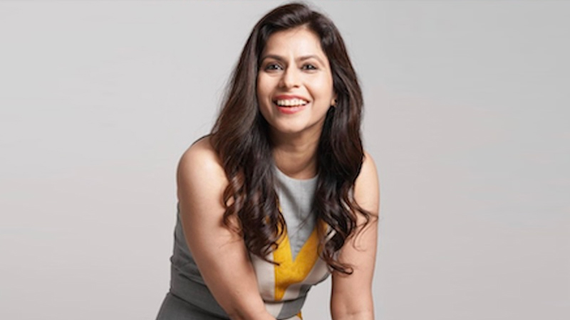
MUMBAI: For long she’s been on the other side and she’s endeared herself to all who she has been associated with. Now the very familiar and affable face in the entertainment industry, Sonia Huria,  has hopped onto Dinesh Vijan’s Maddock Films as head brand, consumer and social communications.

Maddock Films had a fabulous 2024 with three films raking it in at the box office: Teri Baaton mein Uljha Jiya (Rs 133 crore), Munjya (Rs 132 crore) and the biggest of them all – Stree 2 (Rs 900 crore). It has lined up a slate of films which will figure in the Maddock Horror Comedy Universe , two of which are to be released in 2025: Thama (Diwali) and Shakti Shalini (31 December).

So it definitely needs all the professional help it can to build up the brands. And Sonia has oodles of it (22 years) with her last position being that of head of communications , Asia Pacific for four years at Prime Video and Amazon MGM studios(October 2020-January 2025), where she handled the launch campaigns of over  100 shows and films in India, Japan and Singapore.

Advertisement

Prior to that, she was senior vice-president at Viacom18 Media where over nearly 13 years  (April 2008-Octo 2020) she spearheaded the launch of its Hindi general entertainment channel Colors which quickly claimed the No 1 spot, beating back long-standing number one’s in the space. Additionally, she also worked on social impact initiatives with the Bill and Melinda Gates Foundation. Finally, two of the initiatives – the #OpenNewWorlds brand promise and the #OneTogether campaign – she championed helped build stability in the organisation.

Before the two corporate assignments, she was employed with agencies like Weber Shandwick in Mumbai then Genesis Burson Marstellar first in Singapore and then in India for around six years.

“After an enriching journey in television and streaming, I’m thrilled to embark on this new chapter with a studio that consistently sets benchmarks and redefines success in both theatrical and streaming entertainment,” posted Sonia on Instagram. “Maddock Films has always been known for its ability to craft stories that resonate deeply with audiences. In my new role, I’m eager to bring together the storytelling touch points across social, PR, and consumer communication to create immersive and engaging experiences for viewers. By connecting these threads seamlessly, we can build a dynamic and interconnected audience journey, amplifying the magic of our narratives and ensuring they captivate and delight at every interaction. With an incredible lineup of projects ahead, I look forward to collaborating with Maddock’s visionary creators and talented team to take our stories beyond screens and into the hearts of audiences everywhere.

Advertisement


Click to comment

Leave a Reply

Your email address will not be published. Required fields are marked *

Brands

Godrej clarifies ‘GI’ identifier after logo similarity debate

Says GI is not a logo, will not replace Godrej signature across products.

Published

on

MUMBAI: In a branding storm where shapes did the talking, Godrej is now spelling things out. Godrej Industries Group (GIG) has issued a clarification on its newly introduced ‘GI’ identifier, addressing questions around its purpose and design following a wave of online criticism. At the centre of the debate were two concerns: whether the new mark replaces the long-standing Godrej logo, and whether its geometric design mirrors other corporate identities.

The company has drawn a clear line. The Godrej signature logo, it said, remains unchanged and continues to be the sole logo across all consumer-facing products and services. The ‘GI’ mark, by contrast, is not a logo but a corporate group identifier intended for use alongside the Godrej signature or company name, and aimed at stakeholders such as investors, media and talent rather than consumers.

The need for such a distinction stems from the 2024 restructuring of the broader Godrej Group into two separate business entities. With both continuing to operate under the same Godrej name and signature, the identifier is positioned as a way to differentiate the Godrej Industries Group at a corporate level.

Advertisement

The rollout, however, triggered a broader conversation on design originality. Critics pointed to similarities between the GI mark’s geometric composition and logos used by companies globally, raising questions about distinctiveness.

Responding to this, GIG said its intellectual property and legal review found that such overlaps are common in minimalist, geometry-led design systems. Basic forms such as circles and rectangles appear across dozens of brand identities worldwide, the company noted.

It added that the identifier emerged from an extensive design process and was chosen for its simplicity, allowing it to sit alongside the Godrej signature without competing visually. While acknowledging that elemental shapes may appear less distinctive in isolation, the group emphasised that the mark is part of a broader identity system that includes a custom typeface, sonic branding and other proprietary elements.

Advertisement

Following legal and ethical assessments, the company said it found no impediment to using the identifier, reiterating that the GI mark is a corporate tool not a consumer-facing symbol.

In short, the logo isn’t changing but the conversation around it certainly has.

Advertisement
Continue Reading

Advertisement News18
Advertisement
Advertisement
Advertisement
Advertisement Whtasapp
Advertisement Year Enders

Indian Television Dot Com Pvt Ltd

Signup for news and special offers!

Copyright © 2026 Indian Television Dot Com PVT LTD

This will close in 10 seconds