Brands
Kriti Sanon buys into balanced nutrition as Supply6 signs her on
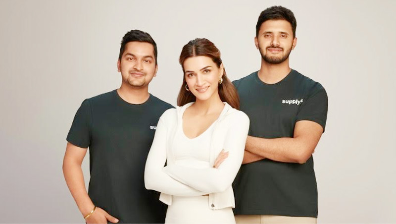
MUMBAI: From hydration habits to ownership stakes, this is one partnership that grew out of daily routine rather than a photoshoot. Bengaluru-based D2C nutrition brand Supply6 has roped in actor and entrepreneur Kriti Sanon as both brand ambassador and investor, signalling a shift away from headline-grabbing endorsements towards belief-led alliances.
The association did not begin in a boardroom. Sanon first encountered the brand as a consumer, using Supply6 Salts, its zero-sugar electrolyte, as part of her everyday routine. Over time, familiarity with the products and confidence in the brand’s science-backed philosophy prompted her to deepen the relationship from user to stakeholder.
Founded in 2019 by Vaibhav Bhandari and Rahul Jacob, Supply6 positions itself as an antidote to fad-driven fitness culture. Its product line, which includes a daily nutrition drink, electrolytes and protein-based wafers, focuses on plugging routine dietary gaps rather than promising dramatic transformations. The pitch is consistency over intensity.
For Supply6, the timing matters. The brand recently raised Rs 9.1 crore in seed funding led by Zeropearl VC and has launched a protein wafer bar containing 10g protein with no maida or added sugar. It is also stepping beyond India, with expansion plans underway in markets including the United States.
With Sanon on board, the company is sharpening its focus on urban, health-conscious consumers looking for practical wellness solutions that fit into busy lives. “This is about credibility, not clout,” said Supply6 co-founder Vaibhav Bhandari, noting that the aim is to reach the next 10 lakh consumers with a message rooted in everyday behaviour.
Sanon echoed that sentiment, describing the appeal of Supply6 as its refusal to chase trends. The brand’s emphasis on hydration, balance and long-term habits, she said, aligns with how she approaches health off camera.
The move also builds on Supply6’s earlier strategy of belief-led partnerships. Former South African cricketer AB de Villiers had previously joined the company as an investor and ambassador, reinforcing its preference for long-term alignment over short-term buzz.
In a wellness market crowded with superlatives, Supply6 is betting that moderation and partners who genuinely practise it might be the strongest selling point of all.
Brands
Godrej clarifies ‘GI’ identifier after logo similarity debate
Says GI is not a logo, will not replace Godrej signature across products.
MUMBAI: In a branding storm where shapes did the talking, Godrej is now spelling things out. Godrej Industries Group (GIG) has issued a clarification on its newly introduced ‘GI’ identifier, addressing questions around its purpose and design following a wave of online criticism. At the centre of the debate were two concerns: whether the new mark replaces the long-standing Godrej logo, and whether its geometric design mirrors other corporate identities.
The company has drawn a clear line. The Godrej signature logo, it said, remains unchanged and continues to be the sole logo across all consumer-facing products and services. The ‘GI’ mark, by contrast, is not a logo but a corporate group identifier intended for use alongside the Godrej signature or company name, and aimed at stakeholders such as investors, media and talent rather than consumers.
The need for such a distinction stems from the 2024 restructuring of the broader Godrej Group into two separate business entities. With both continuing to operate under the same Godrej name and signature, the identifier is positioned as a way to differentiate the Godrej Industries Group at a corporate level.
The rollout, however, triggered a broader conversation on design originality. Critics pointed to similarities between the GI mark’s geometric composition and logos used by companies globally, raising questions about distinctiveness.
Responding to this, GIG said its intellectual property and legal review found that such overlaps are common in minimalist, geometry-led design systems. Basic forms such as circles and rectangles appear across dozens of brand identities worldwide, the company noted.
It added that the identifier emerged from an extensive design process and was chosen for its simplicity, allowing it to sit alongside the Godrej signature without competing visually. While acknowledging that elemental shapes may appear less distinctive in isolation, the group emphasised that the mark is part of a broader identity system that includes a custom typeface, sonic branding and other proprietary elements.
Following legal and ethical assessments, the company said it found no impediment to using the identifier, reiterating that the GI mark is a corporate tool not a consumer-facing symbol.
In short, the logo isn’t changing but the conversation around it certainly has.


