Brands
Kidzania ties up with Nutella
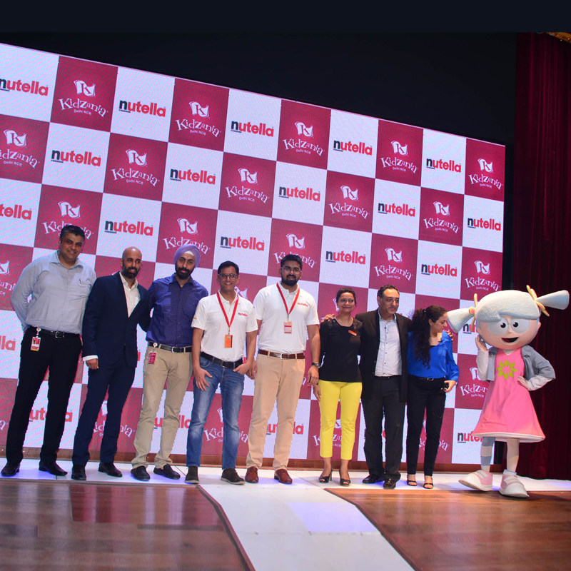
MUMBAI: KidZania Delhi NCR, an indoor theme park that inspires and educates children, has partnered with Nutella via the launch of the ‘Nutella Breakfast Deli’ establishment.
This association will allow children to play the role of a ‘Breakfast Chef’ and prepare fun and tasty breakfast recipes with Nutella according to the recipe provided. Kids are explained the importance of breakfast in their daily diet and prepare an exciting recipe using Nutella.
Thereafter, kids can consume their own breakfast or share it with their family and friends. Every child would get a specially created ‘Nutella Recipe Booklet’ as part of a giveaway at the end of the activity. As an additional giveaway, kids can take home a Nutella spife exclusively during the launch month. These activities will inculcate different values like psychomotor, cognitive, emotional and social skills via experiential learning.
KidZania India director – strategic partnerships Sona Mazumdar said, “The Breakfast Deli activity will impart the importance of a healthy breakfast in a child’s daily diet along with the balanced nutrients which go into making a breakfast healthy using different recipes. The activity will trigger cognitive and psychomotor development in them.”
Nutella head of marketing Vidya Sagar Singh, “Through the partnership, we want to grow this love for our brand bigger in India with our little fans.”
Brands
Godrej clarifies ‘GI’ identifier after logo similarity debate
Says GI is not a logo, will not replace Godrej signature across products.
MUMBAI: In a branding storm where shapes did the talking, Godrej is now spelling things out. Godrej Industries Group (GIG) has issued a clarification on its newly introduced ‘GI’ identifier, addressing questions around its purpose and design following a wave of online criticism. At the centre of the debate were two concerns: whether the new mark replaces the long-standing Godrej logo, and whether its geometric design mirrors other corporate identities.
The company has drawn a clear line. The Godrej signature logo, it said, remains unchanged and continues to be the sole logo across all consumer-facing products and services. The ‘GI’ mark, by contrast, is not a logo but a corporate group identifier intended for use alongside the Godrej signature or company name, and aimed at stakeholders such as investors, media and talent rather than consumers.
The need for such a distinction stems from the 2024 restructuring of the broader Godrej Group into two separate business entities. With both continuing to operate under the same Godrej name and signature, the identifier is positioned as a way to differentiate the Godrej Industries Group at a corporate level.
The rollout, however, triggered a broader conversation on design originality. Critics pointed to similarities between the GI mark’s geometric composition and logos used by companies globally, raising questions about distinctiveness.
Responding to this, GIG said its intellectual property and legal review found that such overlaps are common in minimalist, geometry-led design systems. Basic forms such as circles and rectangles appear across dozens of brand identities worldwide, the company noted.
It added that the identifier emerged from an extensive design process and was chosen for its simplicity, allowing it to sit alongside the Godrej signature without competing visually. While acknowledging that elemental shapes may appear less distinctive in isolation, the group emphasised that the mark is part of a broader identity system that includes a custom typeface, sonic branding and other proprietary elements.
Following legal and ethical assessments, the company said it found no impediment to using the identifier, reiterating that the GI mark is a corporate tool not a consumer-facing symbol.
In short, the logo isn’t changing but the conversation around it certainly has.


