Brands
Justin Langer steps up as NiviCap’s new brand ambassador
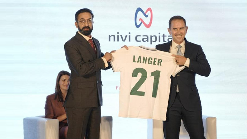
DELHI: Cricket has found a fresh pitch to play on, and this time the action is off the field. NiviCap, billed as India’s first digital solutions platform dedicated to students eyeing an Australian education, has made its debut with Justin Langer padded up as its brand ambassador.
Launched in Delhi on 19 November 2025, NiviCap positions itself as a fast, fair and family-approved companion for students navigating the financial maze of overseas study. Australia remains a top draw for Indian students thanks to its global-ranked universities, inclusive culture and strong post-study pathways. With more than 137,000 Indian students studying there this year, the demand is strong, but the financing journey often remains scattered and stressful.
Supported by the Australian Trade and Investment Commission, the platform promises to streamline every step with a unified set of non-banking services. Built by the founder of Ziksu Australia, one of the country’s leading fintech players, NiviCap connects pre-admission to post-arrival through loan discovery, application support, forex guidance and on-ground assistance.
NiviCap’s Indian born Australian founder Karthik Srinivasan, said the idea was born from personal experience. He recalled the anxiety of managing paperwork, finances and distance as a student, later compounded by the complexities he witnessed while working across banking and fintech in both countries. He said these challenges convinced him that technology led with empathy could make the student journey far smoother.
Langer echoed that sentiment with a characteristically sporting analogy. As a father, coach and long-time admirer of India’s bond with Australia, he said NiviCap reminded him of a dependable coach, steady, supportive and unwavering under pressure. He added that the platform gives students the confidence to perform and parents the reassurance that their children are cared for.
Austrade’s Mukund Narayanamurti welcomed the initiative, noting that Indian students enrich Australian campuses and communities and play a central role in strengthening bilateral ties.
NiviCap’s first phase rolls out education loans, enabling families to explore, apply and manage financing digitally. Features for forex and post-arrival support are set to follow in stages.
With its warm positioning and all-in-one approach, NiviCap aims to feel less like a platform and more like an extended hand from home. Its message is simple and spirited, studying in Australia should come with no limits, only possibilities, because dreams deserve a clear path, not a complicated one.