Connect with us

Brands

Jharkhand consumers can savor ITC’s innovative Aashirvaad dairy products

Published

on

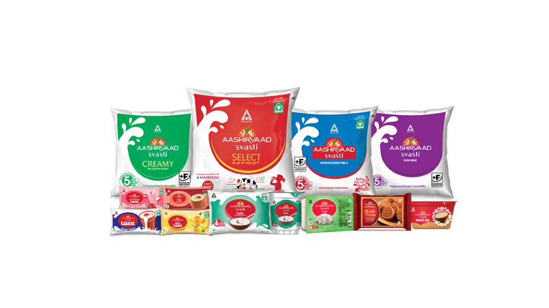
Mumbai: ITC Ltd’s Aashirvaad Svasti, a leading dairy brand in East India, today announced the extension of its fresh dairy portfolio to the state of Jharkhand. The brand enjoys strong consumer franchise across Bihar and West Bengal and with its launch in the state, Aashirvaad Svasti is set to delight consumers of Jharkhand with a slew of dairy offerings which includes select milk, creamy milk, toned milk, as well as curd, paneer, lassi, mishti doi and peda. Through this portfolio launch in Ranchi and beyond, the brand aims to bring the goodness of fresh dairy products to consumers across the state.

Aashirvaad Select Milk – the flagship pouch milk variant will be made available to consumers of Jharkhand from today.  This milk is homogenised which ensures milk cream is evenly distributed throughout the milk thus making it thicker and tastier, hence standing true to its brand proposition of “Doodh Ki Malai Doodh Mein”. Further, to maintain complete transparency, for the first time, consumers can check quality quotient of their milk packet everyday through “Doodh ka Report Card”, an industry-first unique feature.

The ‘Doodh ka Report Card’ consists of 28 quality parameters which are checked at five stages including some of those most relevant for milk like adulterants (urea, starch, vegetable oil, detergents), preservatives etc. thereby assuring consumers of superior quality, thick, tasty, nutritious milk every day. Consumers can access the report by just sending the code number of their milk pack on WhatsApp number 810-583-5222.

Advertisement

Commenting on the launch of the dairy portfolio in Jharkhand, ITC Ltd chief operating officer – dairy and beverage Sanjay Singal said, “We are excited to embark on this journey of expansion into Jharkhand, introducing Aashirvaad Svasti’s differentiated and innovative dairy offerings to consumers in the region. Aashirvaad Svasti’s success story in Eastern India stems from our unwavering commitment to ensuring the highest benchmarks of quality and consumer delight through product differentiation. Our consumers have embraced our products, making Aashirvaad Svasti a leading dairy brand in Eastern India in a short span of five years. With this launch, we aim to redefine the dairy experience for the people of Jharkhand, similar to what we have done in Bihar and West Bengal”.

Aashirvaad Svasti fresh dairy products will be available across over 2000 general trade and modern trade outlets across the state.

Advertisement
Click to comment

Leave a Reply

Your email address will not be published. Required fields are marked *

Brands

Godrej clarifies ‘GI’ identifier after logo similarity debate

Says GI is not a logo, will not replace Godrej signature across products.

Published

on

MUMBAI: In a branding storm where shapes did the talking, Godrej is now spelling things out. Godrej Industries Group (GIG) has issued a clarification on its newly introduced ‘GI’ identifier, addressing questions around its purpose and design following a wave of online criticism. At the centre of the debate were two concerns: whether the new mark replaces the long-standing Godrej logo, and whether its geometric design mirrors other corporate identities.

The company has drawn a clear line. The Godrej signature logo, it said, remains unchanged and continues to be the sole logo across all consumer-facing products and services. The ‘GI’ mark, by contrast, is not a logo but a corporate group identifier intended for use alongside the Godrej signature or company name, and aimed at stakeholders such as investors, media and talent rather than consumers.

The need for such a distinction stems from the 2024 restructuring of the broader Godrej Group into two separate business entities. With both continuing to operate under the same Godrej name and signature, the identifier is positioned as a way to differentiate the Godrej Industries Group at a corporate level.

Advertisement

The rollout, however, triggered a broader conversation on design originality. Critics pointed to similarities between the GI mark’s geometric composition and logos used by companies globally, raising questions about distinctiveness.

Responding to this, GIG said its intellectual property and legal review found that such overlaps are common in minimalist, geometry-led design systems. Basic forms such as circles and rectangles appear across dozens of brand identities worldwide, the company noted.

It added that the identifier emerged from an extensive design process and was chosen for its simplicity, allowing it to sit alongside the Godrej signature without competing visually. While acknowledging that elemental shapes may appear less distinctive in isolation, the group emphasised that the mark is part of a broader identity system that includes a custom typeface, sonic branding and other proprietary elements.

Advertisement

Following legal and ethical assessments, the company said it found no impediment to using the identifier, reiterating that the GI mark is a corporate tool not a consumer-facing symbol.

In short, the logo isn’t changing but the conversation around it certainly has.

Advertisement
Continue Reading

Advertisement News18
Advertisement
Advertisement
Advertisement
Advertisement Whtasapp
Advertisement Year Enders

Indian Television Dot Com Pvt Ltd

Signup for news and special offers!

Copyright © 2026 Indian Television Dot Com PVT LTD

This will close in 10 seconds