Brands
ITBP deploys 60 Maruti Suzuki Jimny SUVs for tough border terrains
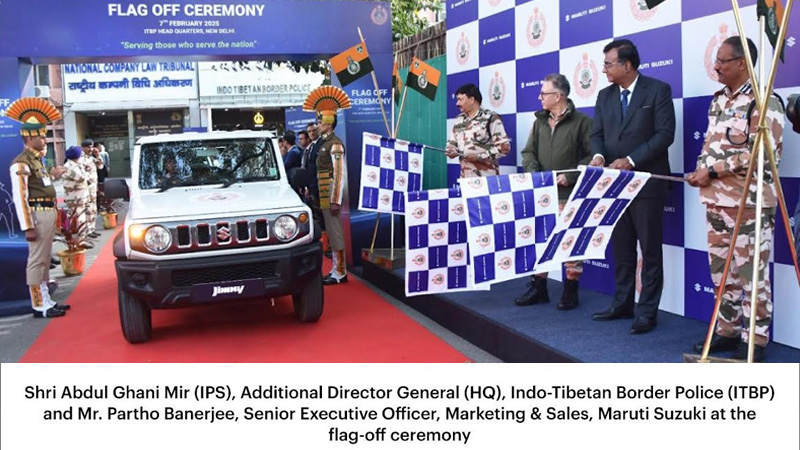
MUMBAI : The Indo-Tibetan Border Police (ITBP) is adding the rugged Maruti Suzuki Jimny to its fleet, with 60 units set to tackle the harsh landscapes of Leh-Ladakh and Arunachal Pradesh. Designed for tough terrain, the off-road SUVs are expected to enhance mobility in some of India’s most challenging border regions.
The handover ceremony took place at ITBP Headquarters in New Delhi, attended by ITBP additional director general (HQ) Abdul Ghani Mir (IPS), and Maruti Suzuki senior executive officer for marketing & sales Partho Banerjee.
The ITBP operates in extreme Himalayan conditions, with temperatures plummeting to -45°C in winter and landscapes ranging from glaciers to snow-covered mountains. The rugged terrain necessitates reliable, all-terrain vehicles for patrolling and border security operations.
Maruti Suzuki Partho Banerjee stated, “This is a proud moment for us as we deliver the Jimny to the ITBP. The Jimny’s ‘Never Turn Back’ spirit aligns with the unwavering resolve of our soldiers. Maruti Suzuki has a long-standing association with the Armed Forces, with the Gypsy serving as a trusted companion for decades. With the Jimny, we continue this legacy, providing a vehicle designed to tackle the toughest terrains and support our forces at the frontiers.”
Brands
Godrej clarifies ‘GI’ identifier after logo similarity debate
Says GI is not a logo, will not replace Godrej signature across products.
MUMBAI: In a branding storm where shapes did the talking, Godrej is now spelling things out. Godrej Industries Group (GIG) has issued a clarification on its newly introduced ‘GI’ identifier, addressing questions around its purpose and design following a wave of online criticism. At the centre of the debate were two concerns: whether the new mark replaces the long-standing Godrej logo, and whether its geometric design mirrors other corporate identities.
The company has drawn a clear line. The Godrej signature logo, it said, remains unchanged and continues to be the sole logo across all consumer-facing products and services. The ‘GI’ mark, by contrast, is not a logo but a corporate group identifier intended for use alongside the Godrej signature or company name, and aimed at stakeholders such as investors, media and talent rather than consumers.
The need for such a distinction stems from the 2024 restructuring of the broader Godrej Group into two separate business entities. With both continuing to operate under the same Godrej name and signature, the identifier is positioned as a way to differentiate the Godrej Industries Group at a corporate level.
The rollout, however, triggered a broader conversation on design originality. Critics pointed to similarities between the GI mark’s geometric composition and logos used by companies globally, raising questions about distinctiveness.
Responding to this, GIG said its intellectual property and legal review found that such overlaps are common in minimalist, geometry-led design systems. Basic forms such as circles and rectangles appear across dozens of brand identities worldwide, the company noted.
It added that the identifier emerged from an extensive design process and was chosen for its simplicity, allowing it to sit alongside the Godrej signature without competing visually. While acknowledging that elemental shapes may appear less distinctive in isolation, the group emphasised that the mark is part of a broader identity system that includes a custom typeface, sonic branding and other proprietary elements.
Following legal and ethical assessments, the company said it found no impediment to using the identifier, reiterating that the GI mark is a corporate tool not a consumer-facing symbol.
In short, the logo isn’t changing but the conversation around it certainly has.


