Brands
IPL 2022: Capri Global signs multi-year partnership with Gujarat Titans
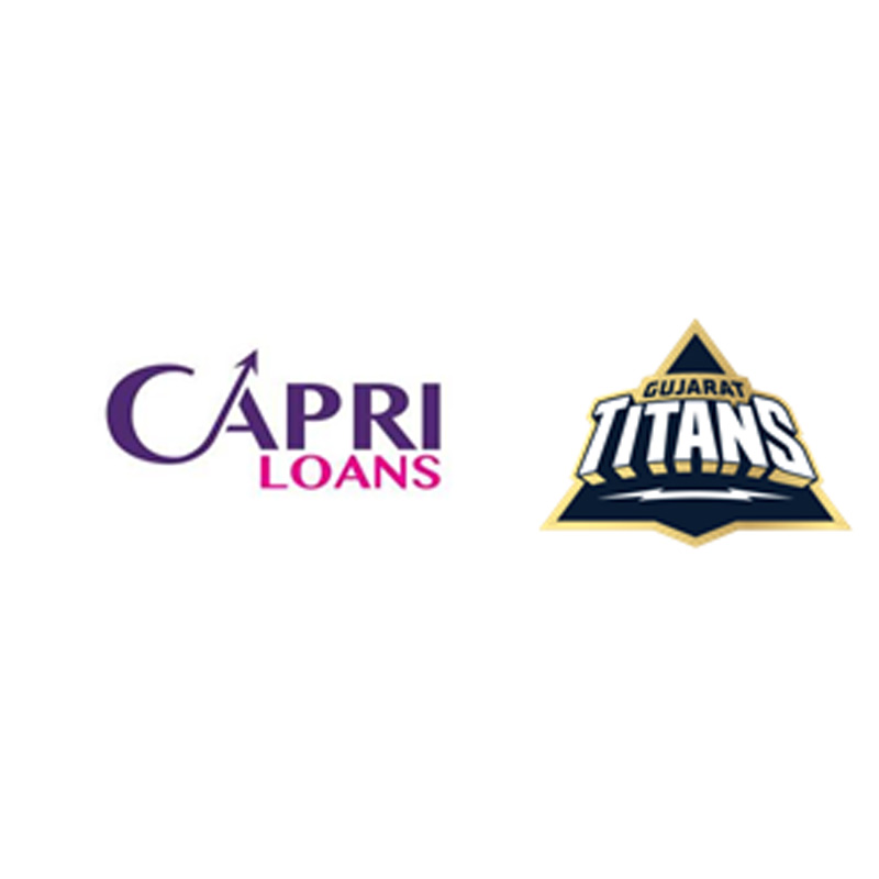
Mumbai: Capri Global has signed a multi-year partnership with the Gujarat Titans, the newly formed Ahmedabad-based franchise in the Indian Premier League (IPL).
The Gujarat Titans will debut in the 15th season of the IPL. The partnership will see the Capri logo on the right chest of the Gujarat Titans’ official team jerseys.
“As the latest entrant into the IPL, the zeal to make a difference in a highly competitive cricket environment provides a unique opportunity for Gujarat Titans,” said Gujarat Titans chief operating officer Arvinder Singh. “We are happy to associate with Capri Global, a company that has been working successfully in India’s financial sector over the years. This strategic tie-up builds on the ethos of both brands, as both are poised for growth in their respective fields. Our joint debut in the IPL aims to pay tribute to the state’s rich cricketing legacy.”
Promoted by first-generation entrepreneur Rajesh Sharma, Capri Global has varied interests across sectors including key ventures such as a non-banking financial company, stressed assets fund and sports venture. Its subsidiary Capri Global Capital is a non-deposit-taking systemically important non-banking financial company with a $ one billion+ market cap, said the statement.
“Capri Global is happy to associate with Gujarat Titans,” said Capri Global Capital Limited managing director Rajesh Sharma. “We are at the cusp of introducing a new business vertical and through this partnership, we want to reach out to different audiences and create more awareness about our brand. We are confident that this association with Gujarat Titans will give an impetus to our brand recognition and recall. Gujarat has always been one of the key markets for us and the debut of Gujarat Titans marks our debut too in the IPL.”
Brands
Godrej clarifies ‘GI’ identifier after logo similarity debate
Says GI is not a logo, will not replace Godrej signature across products.
MUMBAI: In a branding storm where shapes did the talking, Godrej is now spelling things out. Godrej Industries Group (GIG) has issued a clarification on its newly introduced ‘GI’ identifier, addressing questions around its purpose and design following a wave of online criticism. At the centre of the debate were two concerns: whether the new mark replaces the long-standing Godrej logo, and whether its geometric design mirrors other corporate identities.
The company has drawn a clear line. The Godrej signature logo, it said, remains unchanged and continues to be the sole logo across all consumer-facing products and services. The ‘GI’ mark, by contrast, is not a logo but a corporate group identifier intended for use alongside the Godrej signature or company name, and aimed at stakeholders such as investors, media and talent rather than consumers.
The need for such a distinction stems from the 2024 restructuring of the broader Godrej Group into two separate business entities. With both continuing to operate under the same Godrej name and signature, the identifier is positioned as a way to differentiate the Godrej Industries Group at a corporate level.
The rollout, however, triggered a broader conversation on design originality. Critics pointed to similarities between the GI mark’s geometric composition and logos used by companies globally, raising questions about distinctiveness.
Responding to this, GIG said its intellectual property and legal review found that such overlaps are common in minimalist, geometry-led design systems. Basic forms such as circles and rectangles appear across dozens of brand identities worldwide, the company noted.
It added that the identifier emerged from an extensive design process and was chosen for its simplicity, allowing it to sit alongside the Godrej signature without competing visually. While acknowledging that elemental shapes may appear less distinctive in isolation, the group emphasised that the mark is part of a broader identity system that includes a custom typeface, sonic branding and other proprietary elements.
Following legal and ethical assessments, the company said it found no impediment to using the identifier, reiterating that the GI mark is a corporate tool not a consumer-facing symbol.
In short, the logo isn’t changing but the conversation around it certainly has.


