Brands
India through LG’s (curved) eyes!
MUMBAI: If the penetration of mobile phones in the country is anything to go by, we would realise that talking to our loved ones is one of the most treasured activities.
And giving the consumers the best way to enjoy their conversations are the mobile companies which come up with new technology with the launch of new models every now and then. This time around, it is LG that launched its G-Flex mobile handset.
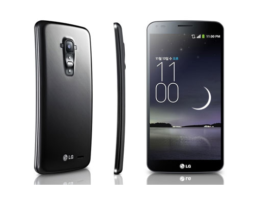
The hi-end phone was officially launched in the country today (6 Feb). LG G Flex, the latest device in LG’s premium G Series, is designed to fit the palm of the hand and follow the contour of the face.
To showcase its special features, the mobile company collaborated with photographer Atul Kasbekar and his 12 photographers to come up with a campaign – “India at 67”.
“The main aim of the campaign is to showcase India as it is in the present. It also symbolises the ‘now’ and the ever changing future of India which is similar to a transformative and disruptive brand like LG,” says LG Mobiles marketing head Amit Gujral.
On Republic Day, the 12 photographers stepped out to capture “India” over 24 hours from midnight to midnight through the G-Flex. The campaign (showcasing these pictures) will be promoted on the digital platforms which according to the company will give it the most exposure. The campaign will be created and promoted in-house before other platforms are explored.
When asked about how different the phone is from the rest, Gujral remarks, “It is the world’s first phone which has curves and flexible displays,” adding that the vertical curve creates an environment where users can be immersed when viewing videos or playing games in landscape mode.
The six-inch OLED screen android is priced at Rs 69,999. Commenting on the hi-end price, Gujral says that today the market has an equal opportunity wherein people are willing to shell out a lot of money for the quality provided.
Brands
Godrej clarifies ‘GI’ identifier after logo similarity debate
Says GI is not a logo, will not replace Godrej signature across products.
MUMBAI: In a branding storm where shapes did the talking, Godrej is now spelling things out. Godrej Industries Group (GIG) has issued a clarification on its newly introduced ‘GI’ identifier, addressing questions around its purpose and design following a wave of online criticism. At the centre of the debate were two concerns: whether the new mark replaces the long-standing Godrej logo, and whether its geometric design mirrors other corporate identities.
The company has drawn a clear line. The Godrej signature logo, it said, remains unchanged and continues to be the sole logo across all consumer-facing products and services. The ‘GI’ mark, by contrast, is not a logo but a corporate group identifier intended for use alongside the Godrej signature or company name, and aimed at stakeholders such as investors, media and talent rather than consumers.
The need for such a distinction stems from the 2024 restructuring of the broader Godrej Group into two separate business entities. With both continuing to operate under the same Godrej name and signature, the identifier is positioned as a way to differentiate the Godrej Industries Group at a corporate level.
The rollout, however, triggered a broader conversation on design originality. Critics pointed to similarities between the GI mark’s geometric composition and logos used by companies globally, raising questions about distinctiveness.
Responding to this, GIG said its intellectual property and legal review found that such overlaps are common in minimalist, geometry-led design systems. Basic forms such as circles and rectangles appear across dozens of brand identities worldwide, the company noted.
It added that the identifier emerged from an extensive design process and was chosen for its simplicity, allowing it to sit alongside the Godrej signature without competing visually. While acknowledging that elemental shapes may appear less distinctive in isolation, the group emphasised that the mark is part of a broader identity system that includes a custom typeface, sonic branding and other proprietary elements.
Following legal and ethical assessments, the company said it found no impediment to using the identifier, reiterating that the GI mark is a corporate tool not a consumer-facing symbol.
In short, the logo isn’t changing but the conversation around it certainly has.


