Brands
IHCL checks in with 100 new hotels, portfolio bulges to 380
MUMBAI: India’s hospitality heavyweight IHCL has flexed its muscles with a staggering 100 new properties in the last fiscal year, comprising 74 signings and 26 openings. The Tata Group behemoth, which operates the iconic Taj brand, now boasts a portfolio bulging at 380 hotels.
Executive vice president for real estate and development Suma Venkatesh highlighted the company’s “industry leading pipeline” of 137 hotels, crediting IHCL’s “strong brand presence” and “sustained demand buoyancy” for the achievement. The firm’s ambitious “Accelerate 2030” roadmap appears to be motoring along nicely, with upscale and midscale segments—Gateway and Ginger brands—garnering the lion’s share of signings.
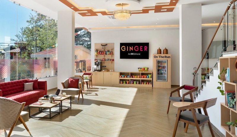
“Ginger crossed a 100-hotel portfolio and Vivanta reached the 50+ hotel mark,” Venkatesh noted, clearly delighted with the milestone.
The company hasn’t confined its expansion to domestic shores. It has ventured into fresh middle eastern territory with properties in Bahrain and Ras Al Khaimah, adding over 800 keys to its international collection.
Executive vice president for hotel openings and new businesses Deepika Rao highlighted Ginger’s particularly prolific year, with nine new establishments springing up across commercial hubs, industrial townships, leisure destinations and state capitals.
Not content with conventional locations, IHCL has also played pioneer in virgin tourism territory. “Building on its legacy, IHCL pioneered new tourism destinations with SeleQtions and Gateway hotels in Diu and expanded its presence in spiritual destinations with a Taj resort in Puri,” Rao explained.
The hiring spree accompanying this expansion has been equally impressive, with over 2,500 new jobs created across the 26 new properties.
IHCL, which was founded when Jamsetji Tata opened The Taj Mahal Palace in Mumbai in 1903, is now hurtling toward its “Accelerate 2030” goal of a 700-hotel portfolio. For a company recently crowned with the “World’s Strongest Hotel Brand 2024” title by Brand Finance, the sky—or perhaps the penthouse suite—appears to be the limit.
Brands
Godrej clarifies ‘GI’ identifier after logo similarity debate
Says GI is not a logo, will not replace Godrej signature across products.
MUMBAI: In a branding storm where shapes did the talking, Godrej is now spelling things out. Godrej Industries Group (GIG) has issued a clarification on its newly introduced ‘GI’ identifier, addressing questions around its purpose and design following a wave of online criticism. At the centre of the debate were two concerns: whether the new mark replaces the long-standing Godrej logo, and whether its geometric design mirrors other corporate identities.
The company has drawn a clear line. The Godrej signature logo, it said, remains unchanged and continues to be the sole logo across all consumer-facing products and services. The ‘GI’ mark, by contrast, is not a logo but a corporate group identifier intended for use alongside the Godrej signature or company name, and aimed at stakeholders such as investors, media and talent rather than consumers.
The need for such a distinction stems from the 2024 restructuring of the broader Godrej Group into two separate business entities. With both continuing to operate under the same Godrej name and signature, the identifier is positioned as a way to differentiate the Godrej Industries Group at a corporate level.
The rollout, however, triggered a broader conversation on design originality. Critics pointed to similarities between the GI mark’s geometric composition and logos used by companies globally, raising questions about distinctiveness.
Responding to this, GIG said its intellectual property and legal review found that such overlaps are common in minimalist, geometry-led design systems. Basic forms such as circles and rectangles appear across dozens of brand identities worldwide, the company noted.
It added that the identifier emerged from an extensive design process and was chosen for its simplicity, allowing it to sit alongside the Godrej signature without competing visually. While acknowledging that elemental shapes may appear less distinctive in isolation, the group emphasised that the mark is part of a broader identity system that includes a custom typeface, sonic branding and other proprietary elements.
Following legal and ethical assessments, the company said it found no impediment to using the identifier, reiterating that the GI mark is a corporate tool not a consumer-facing symbol.
In short, the logo isn’t changing but the conversation around it certainly has.


