Brands
Honda launches 2025 CB650R and CBR650R with game-changing E-clutch
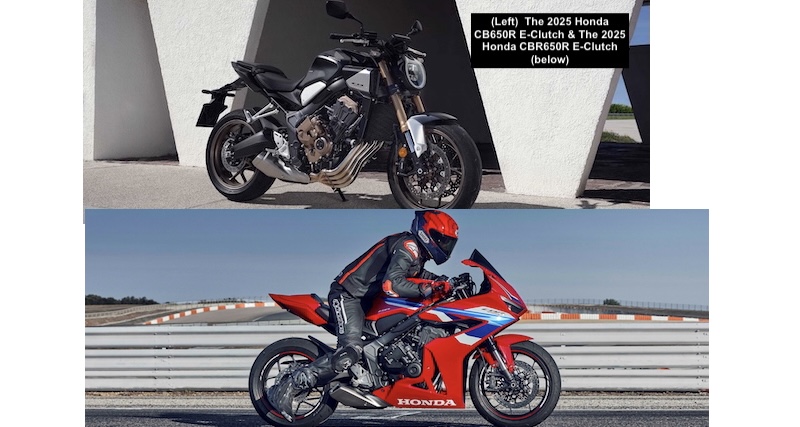
MUMBAI: Honda Motorcycle & Scooter India (HMSI) has shifted gears in India’s premium motorcycle market with the launch of the 2025 CB650R and CBR650R, both powered by Honda’s revolutionary E-clutch technology — a first for Indian riders. Bookings are now open at all BigWing dealerships, with deliveries set to rev up by the end of May.
The 2025 Honda CB650R, with its minimalist neo sports café styling, is priced at Rs 9.60 lakh (ex-showroom Delhi), while the aggressive, race-ready CBR650R retails at Rs 10.40 lakh. Both models are powered by a 649cc, liquid-cooled, inline four-cylinder engine that churns out 70 kW of power at 12,000 RPM and 63 Nm of torque at 9,500 RPM — now enhanced with Honda’s E-clutch for smoother shifts without the clutch lever.
The E-clutch system, first developed by Honda in 2023, automatically manages the clutch, offering seamless starts and gear changes. Whether you’re cruising in the city or carving corners, the E-clutch ensures a fatigue-free ride.
Sporting Honda’s signature neo sports café design, the CB650R blends a rugged yet refined look with modern tech. Key highlights include a round LED headlamp, sculpted fuel tank, a 5.0-inch TFT display with smartphone connectivity via Honda RoadSync, and high-performance Showa 41 mm SFF-BP front forks. The bike is available in candy chromosphere red and matte gunpowder black metallic.
Inspired by Honda’s supersport DNA, the CBR650R features aggressive styling, aerodynamic fairing, and a sporty riding stance. It shares the same powerhouse engine with the CB650R but adds Honda selectable torque control (HSTC) for enhanced traction. Available in grand prix red and matt gunpowder black metallic, it’s designed for those who crave speed.
Both models feature premium hardware — Showa 41 mm SFF-BP inverted front forks, adjustable rear monoshock, dual radial-mounted 310 mm floating discs at the front, a 240 mm rear disc, and dual-channel ABS. Riders get a full-colour 5.0-inch TFT display with smartphone connectivity via the Honda RoadSync app for calls, messages, and navigation.
Brands
Godrej clarifies ‘GI’ identifier after logo similarity debate
Says GI is not a logo, will not replace Godrej signature across products.
MUMBAI: In a branding storm where shapes did the talking, Godrej is now spelling things out. Godrej Industries Group (GIG) has issued a clarification on its newly introduced ‘GI’ identifier, addressing questions around its purpose and design following a wave of online criticism. At the centre of the debate were two concerns: whether the new mark replaces the long-standing Godrej logo, and whether its geometric design mirrors other corporate identities.
The company has drawn a clear line. The Godrej signature logo, it said, remains unchanged and continues to be the sole logo across all consumer-facing products and services. The ‘GI’ mark, by contrast, is not a logo but a corporate group identifier intended for use alongside the Godrej signature or company name, and aimed at stakeholders such as investors, media and talent rather than consumers.
The need for such a distinction stems from the 2024 restructuring of the broader Godrej Group into two separate business entities. With both continuing to operate under the same Godrej name and signature, the identifier is positioned as a way to differentiate the Godrej Industries Group at a corporate level.
The rollout, however, triggered a broader conversation on design originality. Critics pointed to similarities between the GI mark’s geometric composition and logos used by companies globally, raising questions about distinctiveness.
Responding to this, GIG said its intellectual property and legal review found that such overlaps are common in minimalist, geometry-led design systems. Basic forms such as circles and rectangles appear across dozens of brand identities worldwide, the company noted.
It added that the identifier emerged from an extensive design process and was chosen for its simplicity, allowing it to sit alongside the Godrej signature without competing visually. While acknowledging that elemental shapes may appear less distinctive in isolation, the group emphasised that the mark is part of a broader identity system that includes a custom typeface, sonic branding and other proprietary elements.
Following legal and ethical assessments, the company said it found no impediment to using the identifier, reiterating that the GI mark is a corporate tool not a consumer-facing symbol.
In short, the logo isn’t changing but the conversation around it certainly has.


