Connect with us

Brands

Himalayan water launches new Peace in a Bottle campaign film

Published

on

NEW DELHI: In a world that rarely slows down, Himalayan, The Natural Mineral Water, has chosen to do just that. The Tata Consumer Products brand has unveiled its latest digital campaign film, Peace in a Bottle, a cinematic meditation on modern chaos and the quiet luxury of calm.

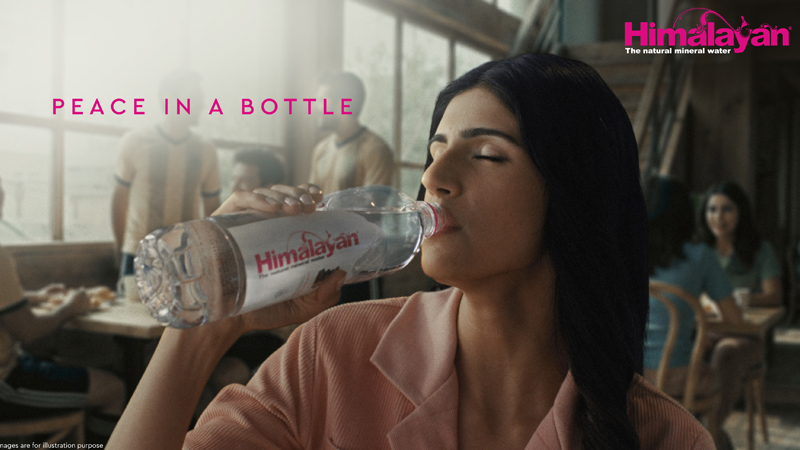
Set in the familiar frenzy of an urban café, the film opens on a moment many will recognise. Clattering cups, overlapping conversations and constant movement blur into sensory overload. In the midst of it all, a young woman makes a simple request. She asks for “one bottle of peace”.

Advertisement

What follows is a visual exhale. The café dissolves into sweeping Himalayan landscapes, with glaciers, flowing streams and snow-clad peaks taking centre stage. The contrast is deliberate and soothing. It mirrors the emotional shift the brand wants to evoke, from everyday noise to inner balance.

The idea at the heart of the campaign is straightforward yet resonant. True refreshment, Himalayan suggests, is not just about hydration. It is about pause, purity and perspective. Naturally filtered over decades and sourced from the Himalayas, the water becomes a symbol of calm in an overstimulated world.

Tata Consumer Products president and head of RTD business Partha Biswas, said the campaign reflects a universal longing. “There is an innate desire to find peace within everyday chaos. The film shows how moments of calm can exist even in fast-paced environments, while reinforcing our focus on building a premium, purpose-led brand rooted in authenticity and quality.”

Advertisement

He added that the campaign strengthens Himalayan’s positioning as a natural mineral water known for purity, provenance and consistent quality.

Creative partner 82.5 India leaned into emotion rather than volume. Chief creative officer Anuraag Khandelwal, said that in a category crowded with similar claims, meaning matters more than noise. “Provenance is the starting point. What truly differentiates a brand is the emotional payoff. The Himalayas are not just a place, they are a state of mind.”

That thinking shaped the campaign’s central question. What if the Himalayas could come to you?

Advertisement

Back in the café, a single sip signals the shift. The noise softens, focus returns and calm settles in. The film closes on a serene visual of the Himalayan bottle framed by waterfalls and ice-capped peaks, quietly reinforcing its origins and promise of balance.

With minimal dialogue, immersive sound design and a reliance on mood over messaging, Peace in a Bottle positions Himalayan not just as water, but as a mindful pause in the middle of the day. For anyone feeling the hum of modern life, that idea lands refreshingly close to home.

Advertisement
Click to comment

Leave a Reply

Your email address will not be published. Required fields are marked *

Brands

Godrej clarifies ‘GI’ identifier after logo similarity debate

Says GI is not a logo, will not replace Godrej signature across products.

Published

on

MUMBAI: In a branding storm where shapes did the talking, Godrej is now spelling things out. Godrej Industries Group (GIG) has issued a clarification on its newly introduced ‘GI’ identifier, addressing questions around its purpose and design following a wave of online criticism. At the centre of the debate were two concerns: whether the new mark replaces the long-standing Godrej logo, and whether its geometric design mirrors other corporate identities.

The company has drawn a clear line. The Godrej signature logo, it said, remains unchanged and continues to be the sole logo across all consumer-facing products and services. The ‘GI’ mark, by contrast, is not a logo but a corporate group identifier intended for use alongside the Godrej signature or company name, and aimed at stakeholders such as investors, media and talent rather than consumers.

The need for such a distinction stems from the 2024 restructuring of the broader Godrej Group into two separate business entities. With both continuing to operate under the same Godrej name and signature, the identifier is positioned as a way to differentiate the Godrej Industries Group at a corporate level.

Advertisement

The rollout, however, triggered a broader conversation on design originality. Critics pointed to similarities between the GI mark’s geometric composition and logos used by companies globally, raising questions about distinctiveness.

Responding to this, GIG said its intellectual property and legal review found that such overlaps are common in minimalist, geometry-led design systems. Basic forms such as circles and rectangles appear across dozens of brand identities worldwide, the company noted.

It added that the identifier emerged from an extensive design process and was chosen for its simplicity, allowing it to sit alongside the Godrej signature without competing visually. While acknowledging that elemental shapes may appear less distinctive in isolation, the group emphasised that the mark is part of a broader identity system that includes a custom typeface, sonic branding and other proprietary elements.

Advertisement

Following legal and ethical assessments, the company said it found no impediment to using the identifier, reiterating that the GI mark is a corporate tool not a consumer-facing symbol.

In short, the logo isn’t changing but the conversation around it certainly has.

Advertisement
Continue Reading

Advertisement News18
Advertisement
Advertisement
Advertisement
Advertisement Whtasapp
Advertisement Year Enders

Indian Television Dot Com Pvt Ltd

Signup for news and special offers!

Copyright © 2026 Indian Television Dot Com PVT LTD

This will close in 10 seconds