Connect with us

Brands

Guru Samruddhi serves up GS Delhi Aces with Leander Paes as ambassador

Published

on

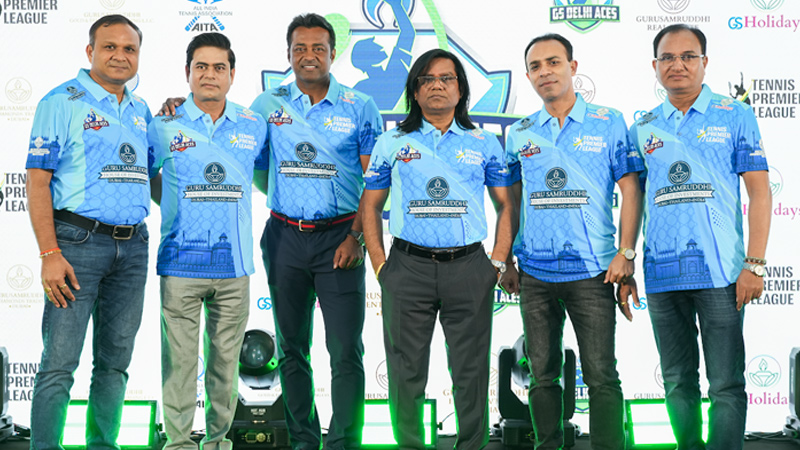
MUMBAI: Guru Samruddhi House of Investments has stepped onto the sporting court with the acquisition of the GS Delhi Aces franchise in the Tennis Premier League (TPL). The announcement comes ahead of the league’s seventh edition, with tennis icon Leander Paes joining as brand ambassador.

The launch, held in Dubai on 10 September, was a historic first for TPL as the team unveiled itself on an international stage. The evening drew over 500 attendees, with Paes receiving a rousing welcome alongside blessings from Sadguru Shri Guruji. [sic]

18-time Grand Slam champion and Olympic medallist, Paes said, “I have been a part of TPL since its inception. This year is a special one for the league as it will become India’s fourth sporting league to complete seven successful seasons, and I am delighted to be associated with GS Delhi Aces.”

Advertisement

With this acquisition, Guru Samruddhi, a diversified group spanning co-operative societies, insurance, tourism, and real estate, has added professional sport to its portfolio. CMD Vijay Pusdekar said, “We are immensely proud to represent the confidence of putting on a good show for tennis fans in Delhi and across the country.”

The Tennis Premier League, featuring eight franchises, continues to expand its star-studded roster. Alongside Paes, the league boasts ambassadors and owners such as Sania Mirza (Gurgaon Grand Slammers), Mahesh Bhupathi (SG Sports), Rakul Preet Singh (Hyderabad Strikers), and Sonali Bendre (Chennai Smashers).

Welcoming the new team, TPL co-founder Kunal Thakkur said, “This year, for the very first time, the league will feature ATP top-ranked players within 30–50.” Fellow co-founder Mrunal Jain added, “With visionary partners like Guru Samruddhi, we are confident this season will be historic, competitive, and truly memorable. 

Advertisement
Click to comment

Leave a Reply

Your email address will not be published. Required fields are marked *

Brands

Godrej clarifies ‘GI’ identifier after logo similarity debate

Says GI is not a logo, will not replace Godrej signature across products.

Published

on

MUMBAI: In a branding storm where shapes did the talking, Godrej is now spelling things out. Godrej Industries Group (GIG) has issued a clarification on its newly introduced ‘GI’ identifier, addressing questions around its purpose and design following a wave of online criticism. At the centre of the debate were two concerns: whether the new mark replaces the long-standing Godrej logo, and whether its geometric design mirrors other corporate identities.

The company has drawn a clear line. The Godrej signature logo, it said, remains unchanged and continues to be the sole logo across all consumer-facing products and services. The ‘GI’ mark, by contrast, is not a logo but a corporate group identifier intended for use alongside the Godrej signature or company name, and aimed at stakeholders such as investors, media and talent rather than consumers.

The need for such a distinction stems from the 2024 restructuring of the broader Godrej Group into two separate business entities. With both continuing to operate under the same Godrej name and signature, the identifier is positioned as a way to differentiate the Godrej Industries Group at a corporate level.

Advertisement

The rollout, however, triggered a broader conversation on design originality. Critics pointed to similarities between the GI mark’s geometric composition and logos used by companies globally, raising questions about distinctiveness.

Responding to this, GIG said its intellectual property and legal review found that such overlaps are common in minimalist, geometry-led design systems. Basic forms such as circles and rectangles appear across dozens of brand identities worldwide, the company noted.

It added that the identifier emerged from an extensive design process and was chosen for its simplicity, allowing it to sit alongside the Godrej signature without competing visually. While acknowledging that elemental shapes may appear less distinctive in isolation, the group emphasised that the mark is part of a broader identity system that includes a custom typeface, sonic branding and other proprietary elements.

Advertisement

Following legal and ethical assessments, the company said it found no impediment to using the identifier, reiterating that the GI mark is a corporate tool not a consumer-facing symbol.

In short, the logo isn’t changing but the conversation around it certainly has.

Advertisement
Continue Reading

Advertisement News18
Advertisement
Advertisement
Advertisement
Advertisement Whtasapp
Advertisement Year Enders

Indian Television Dot Com Pvt Ltd

Signup for news and special offers!

Copyright © 2026 Indian Television Dot Com PVT LTD

This will close in 10 seconds