Connect with us

Brands

Greaves Electric Mobility appoints Pranesh Urs as head of marketing

Industry veteran to steer brand strategy and marketing push across EV portfolio

Published

on

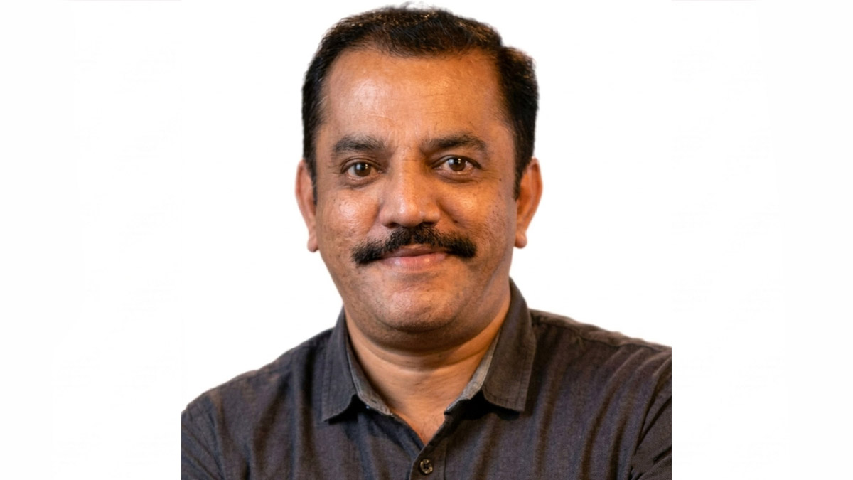
MUMBAI: Greaves Electric Mobility has appointed Pranesh Urs as head of marketing, bringing on board a seasoned marketer with more than thirteen years of experience across the automobile and consumer electronics sectors.

In his new role, Urs will report to Vikas Singh, managing director and chief financial officer of Greaves Electric Mobility. He will lead the company’s marketing function, with a mandate to sharpen the brand positioning of Ampere, Ele and Eltra while driving integrated campaigns across the company’s electric two-wheeler and three-wheeler portfolio.

The appointment comes at a time when the electric mobility sector in India is shifting gears, moving beyond specifications and technology to focus on everyday usability and customer experience. Urs will work towards strengthening brand visibility while supporting the company’s broader mission of delivering sustainable and intelligent mobility solutions.

Advertisement

Welcoming the appointment, Vikas Singh said Pranesh’s experience across consumer technology and green mobility businesses will bring a valuable perspective to the company’s marketing efforts. He added that as the EV sector evolves towards practical, everyday mobility, Urs’s leadership will help advance Greaves Electric Mobility’s focus on accessible and reliable electric transport for customers across the country.

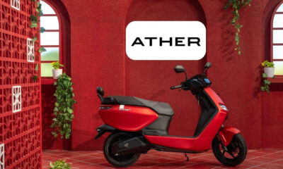
Over the course of his career, Urs has worked with several leading organisations including Ather Energy, Samsung India Electronics and Hewlett Packard India Sales Private Limited, gaining experience across both consumer electronics and the fast-growing electric mobility space.

He holds a bachelor’s degree in mechanical engineering from Mangalore University and a Masters Diploma in Business Administration from the Symbiosis Institute of Management Studies in Pune.

Advertisement

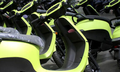
As Greaves Electric Mobility continues to expand its portfolio of electric two and three wheelers and widen its retail and service network, Urs’s appointment signals a renewed focus on building stronger brand connections while delivering practical mobility solutions for Indian consumers.

Click to comment

Leave a Reply

Your email address will not be published. Required fields are marked *

Brands

Godrej clarifies ‘GI’ identifier after logo similarity debate

Says GI is not a logo, will not replace Godrej signature across products.

Published

on

MUMBAI: In a branding storm where shapes did the talking, Godrej is now spelling things out. Godrej Industries Group (GIG) has issued a clarification on its newly introduced ‘GI’ identifier, addressing questions around its purpose and design following a wave of online criticism. At the centre of the debate were two concerns: whether the new mark replaces the long-standing Godrej logo, and whether its geometric design mirrors other corporate identities.

The company has drawn a clear line. The Godrej signature logo, it said, remains unchanged and continues to be the sole logo across all consumer-facing products and services. The ‘GI’ mark, by contrast, is not a logo but a corporate group identifier intended for use alongside the Godrej signature or company name, and aimed at stakeholders such as investors, media and talent rather than consumers.

The need for such a distinction stems from the 2024 restructuring of the broader Godrej Group into two separate business entities. With both continuing to operate under the same Godrej name and signature, the identifier is positioned as a way to differentiate the Godrej Industries Group at a corporate level.

Advertisement

The rollout, however, triggered a broader conversation on design originality. Critics pointed to similarities between the GI mark’s geometric composition and logos used by companies globally, raising questions about distinctiveness.

Responding to this, GIG said its intellectual property and legal review found that such overlaps are common in minimalist, geometry-led design systems. Basic forms such as circles and rectangles appear across dozens of brand identities worldwide, the company noted.

It added that the identifier emerged from an extensive design process and was chosen for its simplicity, allowing it to sit alongside the Godrej signature without competing visually. While acknowledging that elemental shapes may appear less distinctive in isolation, the group emphasised that the mark is part of a broader identity system that includes a custom typeface, sonic branding and other proprietary elements.

Advertisement

Following legal and ethical assessments, the company said it found no impediment to using the identifier, reiterating that the GI mark is a corporate tool not a consumer-facing symbol.

In short, the logo isn’t changing but the conversation around it certainly has.

Advertisement
Continue Reading

Advertisement News18
Advertisement
Advertisement
Advertisement
Advertisement Whtasapp
Advertisement Year Enders

Indian Television Dot Com Pvt Ltd

Signup for news and special offers!

Copyright © 2026 Indian Television Dot Com PVT LTD

This will close in 10 seconds