Brands
Godrej’s AI smart fridge rolls out the red velvet carpet for cooling
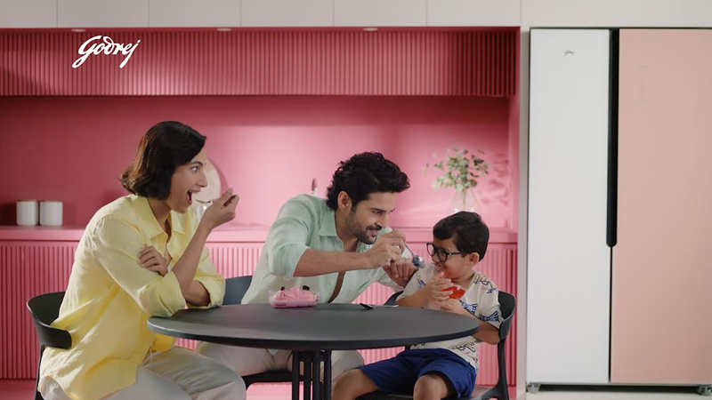
MUMBAI: If your fridge knew your midnight munchies were coming, would you still call it an appliance or a companion? Godrej & Boyce, the flagship of the Godrej Enterprises Group, is turning up the cool factor with the launch of its AI-powered Side-by-Side Eon Velvet refrigerators, a premium offering that’s as intuitive as it is stunning. The campaign, crafted by Creativeland Asia, isn’t just showing off another fridge, it’s showcasing a smart sidekick for your snacks, leftovers and late-night cravings.
Running across TV, digital, social media, OOH and retail, the campaign taps into the modern Indian’s holy trinity of consumer expectations: convenience, technology, and sleek design. At the heart of the narrative is the fridge’s AI tech, which learns how often the doors are opened, adapts cooling based on what you stuff inside, and even saves energy while doing it.
Speaking on this campaign Godrej Enterprises Group head of marketing at appliances business Swati Rathi said, “The modern Indian consumers evaluate all their purchases through the lens of convenience, technology and aesthetics and our new launch more than meets the consumer expectations on each of these fronts. With outstanding looks, inbuilt intelligence and convenience, the new Eon Velvet series is already winning consumer hearts at the stores and with the new video campaign, we are unveiling it to a wider audience.”
The premium series is available in three eye-catching shades Opera Rose, Opera Black and Opera Blue and promises to double as both kitchen showstopper and silent workhorse. A digital touch panel, inverter compressor, and whisper-quiet cooling round out the list of features.
From eye-level hoardings in top metros to influencer-led peeks inside these luxury coolers, the campaign aims to make a household appliance feel like a lifestyle upgrade.
So if your fridge can now outsmart your snack habits and still match your kitchen aesthetics maybe it’s time to stop calling it “just a refrigerator.” The Eon Velvet is here, and it’s cool in every sense.
Brands
Godrej clarifies ‘GI’ identifier after logo similarity debate
Says GI is not a logo, will not replace Godrej signature across products.
MUMBAI: In a branding storm where shapes did the talking, Godrej is now spelling things out. Godrej Industries Group (GIG) has issued a clarification on its newly introduced ‘GI’ identifier, addressing questions around its purpose and design following a wave of online criticism. At the centre of the debate were two concerns: whether the new mark replaces the long-standing Godrej logo, and whether its geometric design mirrors other corporate identities.
The company has drawn a clear line. The Godrej signature logo, it said, remains unchanged and continues to be the sole logo across all consumer-facing products and services. The ‘GI’ mark, by contrast, is not a logo but a corporate group identifier intended for use alongside the Godrej signature or company name, and aimed at stakeholders such as investors, media and talent rather than consumers.
The need for such a distinction stems from the 2024 restructuring of the broader Godrej Group into two separate business entities. With both continuing to operate under the same Godrej name and signature, the identifier is positioned as a way to differentiate the Godrej Industries Group at a corporate level.
The rollout, however, triggered a broader conversation on design originality. Critics pointed to similarities between the GI mark’s geometric composition and logos used by companies globally, raising questions about distinctiveness.
Responding to this, GIG said its intellectual property and legal review found that such overlaps are common in minimalist, geometry-led design systems. Basic forms such as circles and rectangles appear across dozens of brand identities worldwide, the company noted.
It added that the identifier emerged from an extensive design process and was chosen for its simplicity, allowing it to sit alongside the Godrej signature without competing visually. While acknowledging that elemental shapes may appear less distinctive in isolation, the group emphasised that the mark is part of a broader identity system that includes a custom typeface, sonic branding and other proprietary elements.
Following legal and ethical assessments, the company said it found no impediment to using the identifier, reiterating that the GI mark is a corporate tool not a consumer-facing symbol.
In short, the logo isn’t changing but the conversation around it certainly has.


