Brands
Farah Khan and Sufi Motiwala add a festive twist to fashion in Myntra’s Iftar campaign
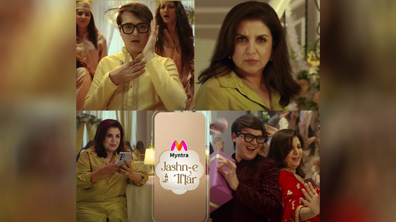
MUMBAI: Myntra has unveiled its latest campaign, Jashn-e-Iftar, turning a fashion duel into a festive extravaganza. The campaign stars film choreographer Farah Khan and fashion critic Sufi Motiwala in a lively qawwali showdown, bringing together humour, style, and the spirit of celebration.
Set against the backdrop of an elegant Iftar gathering, the film opens with Sufi taking the stage, dishing out his signature sharp-witted fashion critiques. Just as he delivers his verdict, Farah steps in, playfully countering him with her own qawwali-style verses. What begins as a battle of wits soon transforms into a joyful celebration of personal style, highlighting the fun and freedom of festive dressing.
Myntra director of brand & digital marketing Abhishek Gour shared, “Festivals are all about expressing yourself with confidence, and this campaign captures that essence perfectly. With our extensive range of ethnic wear, luxury gifts, and home décor, we make it easy for everyone to embrace the festive spirit in style.”
Farah added, “Festivals bring people together, and what better way to celebrate than with fashion and fun? This campaign perfectly captures the joy of dressing up, making a statement, and creating memories.”
Sufi remarked, “Fashion is meant to be expressive and bold. This campaign flips the script on my usual critiques, making it a playful and entertaining celebration of personal style. Working with Farah was an absolute delight.”
The creative minds at toaster India brought the campaign to life, with chief creative officer Ira G describing the concept as a beautiful blend of banter and tradition.
The campaign showcases Myntra’s curated selection of ethnic fashion, luxurious gifting options, and elegant home décor, making it the go-to destination for festive shopping this season.
Brands
Godrej clarifies ‘GI’ identifier after logo similarity debate
Says GI is not a logo, will not replace Godrej signature across products.
MUMBAI: In a branding storm where shapes did the talking, Godrej is now spelling things out. Godrej Industries Group (GIG) has issued a clarification on its newly introduced ‘GI’ identifier, addressing questions around its purpose and design following a wave of online criticism. At the centre of the debate were two concerns: whether the new mark replaces the long-standing Godrej logo, and whether its geometric design mirrors other corporate identities.
The company has drawn a clear line. The Godrej signature logo, it said, remains unchanged and continues to be the sole logo across all consumer-facing products and services. The ‘GI’ mark, by contrast, is not a logo but a corporate group identifier intended for use alongside the Godrej signature or company name, and aimed at stakeholders such as investors, media and talent rather than consumers.
The need for such a distinction stems from the 2024 restructuring of the broader Godrej Group into two separate business entities. With both continuing to operate under the same Godrej name and signature, the identifier is positioned as a way to differentiate the Godrej Industries Group at a corporate level.
The rollout, however, triggered a broader conversation on design originality. Critics pointed to similarities between the GI mark’s geometric composition and logos used by companies globally, raising questions about distinctiveness.
Responding to this, GIG said its intellectual property and legal review found that such overlaps are common in minimalist, geometry-led design systems. Basic forms such as circles and rectangles appear across dozens of brand identities worldwide, the company noted.
It added that the identifier emerged from an extensive design process and was chosen for its simplicity, allowing it to sit alongside the Godrej signature without competing visually. While acknowledging that elemental shapes may appear less distinctive in isolation, the group emphasised that the mark is part of a broader identity system that includes a custom typeface, sonic branding and other proprietary elements.
Following legal and ethical assessments, the company said it found no impediment to using the identifier, reiterating that the GI mark is a corporate tool not a consumer-facing symbol.
In short, the logo isn’t changing but the conversation around it certainly has.


